Fluent in Yammer
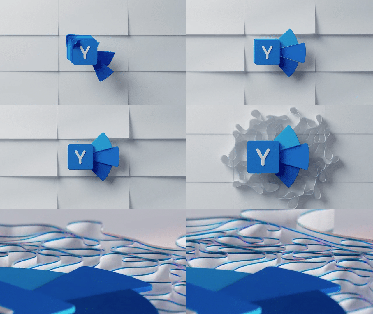
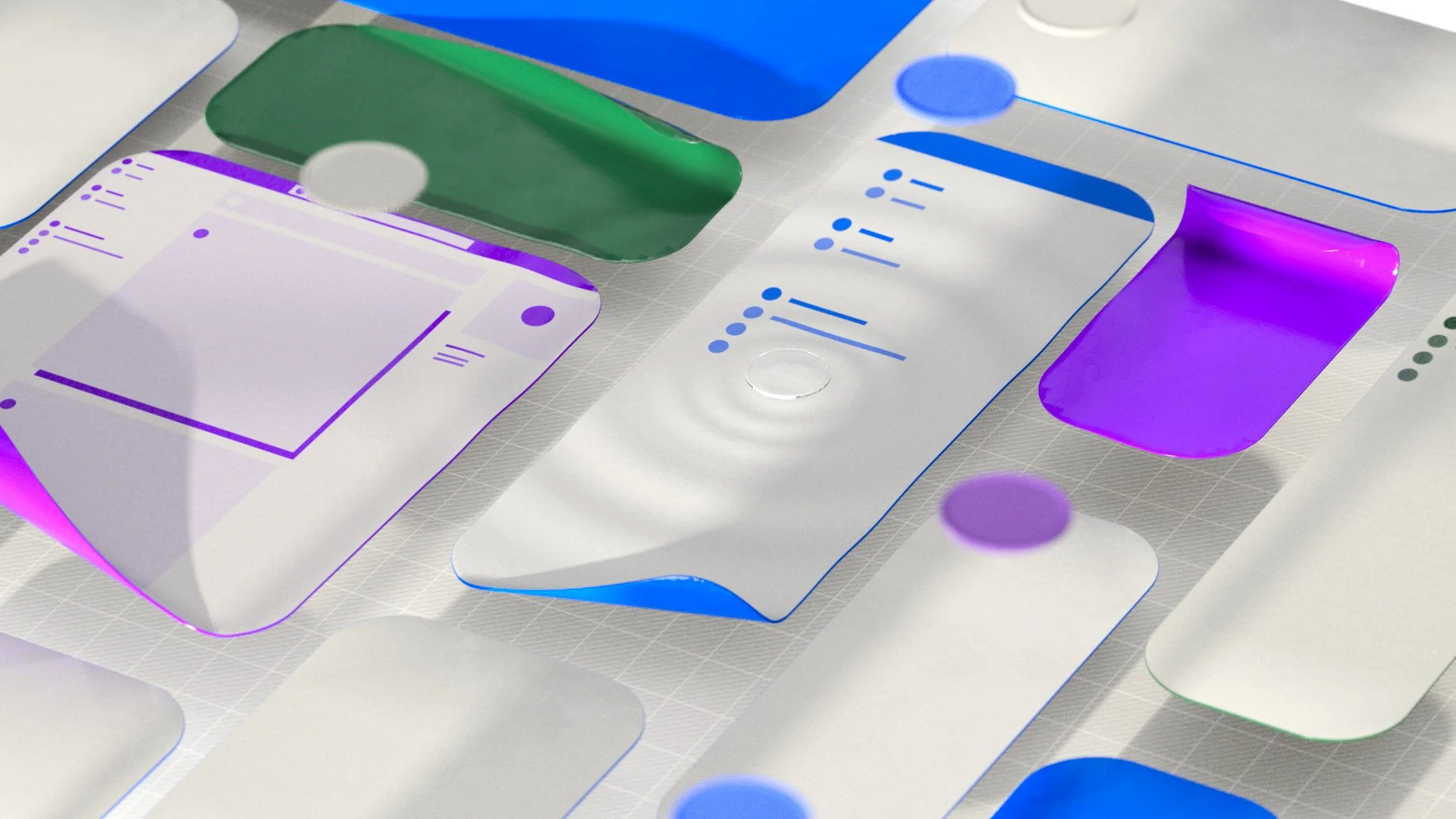
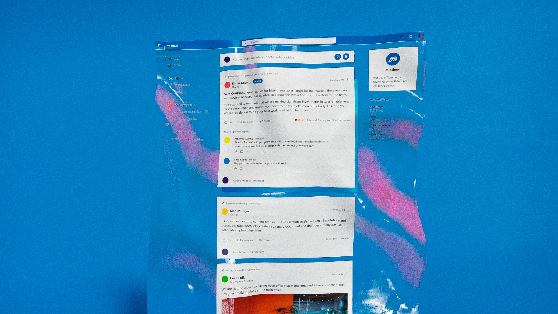
This UX film celebrates the update of Microsoft Yammer’s experience with the latest Fluent UI controls and components. For this piece, we wanted the visuals to embody the way in which the app works, fostering active conversations for across large organizations, and given this would be created entirely in CG, we had some challenges to overcome in conveying human presence.
We ultimately chose to use continuous sheets of paper featuring user content as a metaphor for those conversations. The paper material and sound design contributed the film feeling warm and inviting, adding a much-needed human quality to it. Each element carried subtle hints of the apps branding, which helped create a close connection between the app’s recognizable icon and its UI.
As in many of our other UX films, here we created a memorable branded intro that works as a catalyst for all of the energy we experience for the remainder of the story.


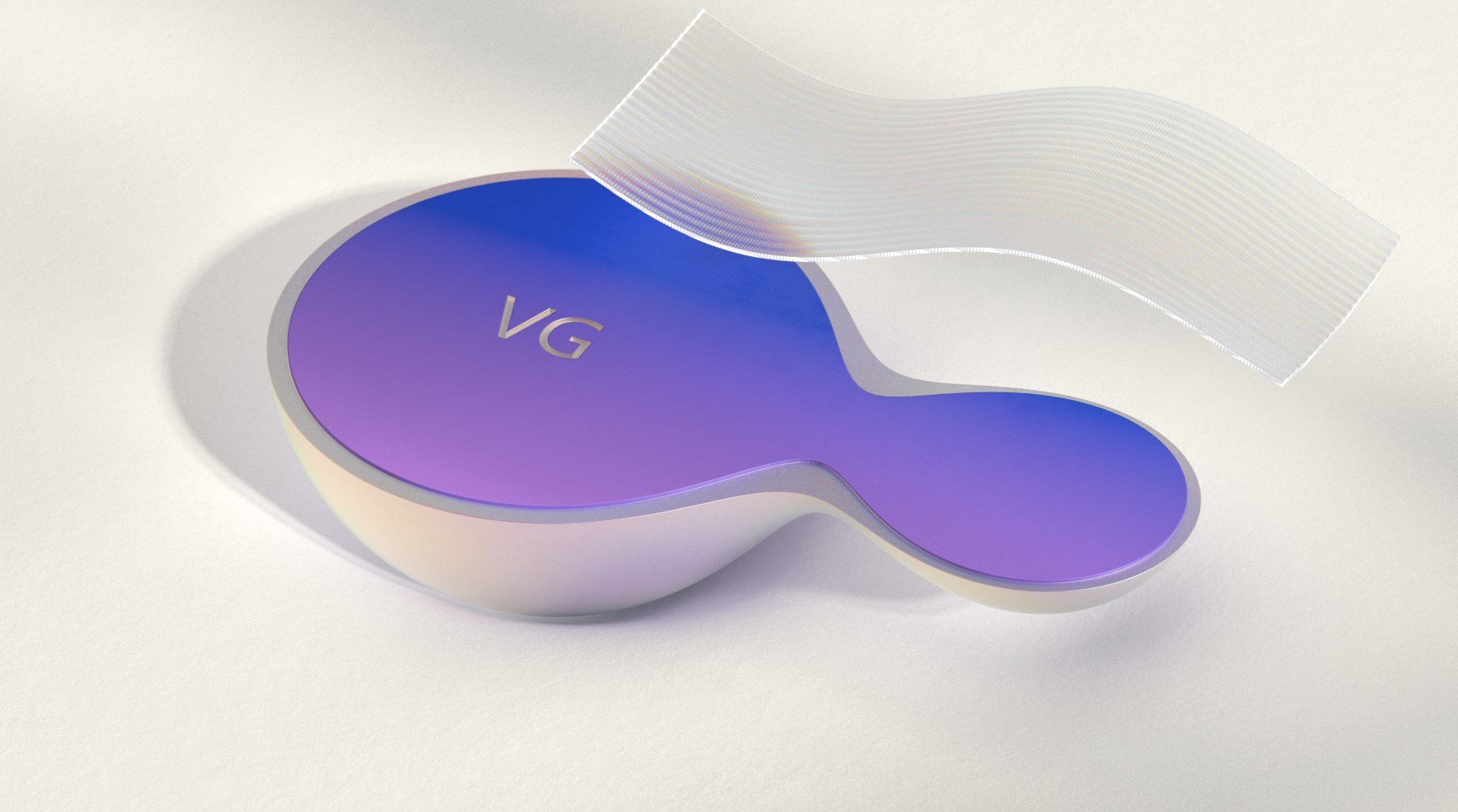


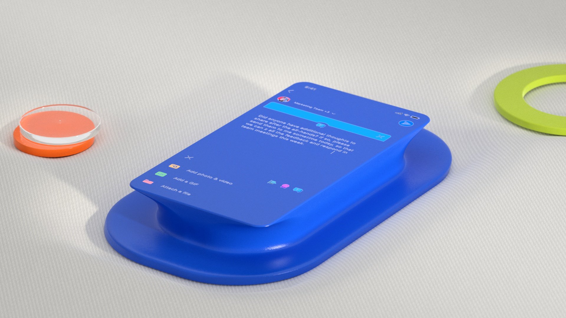


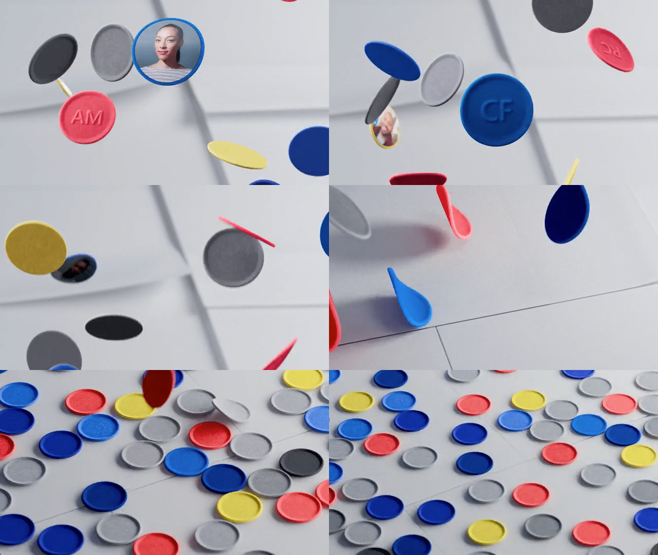
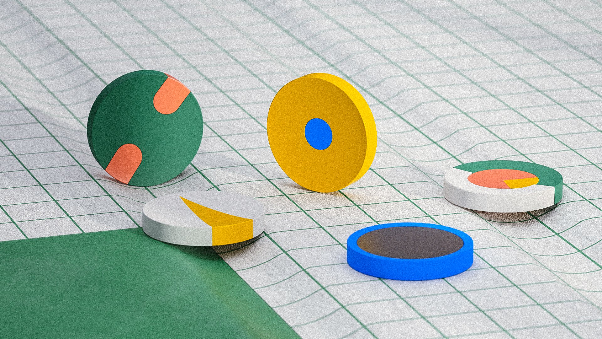
Given we did not show real people using the product, we needed to develop a metaphor for people coming together and conversing. As seen below, we explored many visuals, but ultimately landed on this circular representation of each user’s avatars, along with an emboss of their initials.




Thank you!
Thank you to all my collaborators at Studio Tendril, especially Alexandre Torres and Vitaly Grossmann, as well as Zelig Sound for music and their superb sound design.
Thanks also to my partners in product and marketing at Microsoft for trusting my vision during this process.
