Horizon Design System
It’s not every day that you get to launch a new design system, and even rarer is the chance to do so in your first few months at a new job. Within the first few weeks of joining ServiceNow, I was lucky that this became one of my core contributions.
ServiceNow’s Horizon Design System is a centralized resource for components, design patterns and UX expertise, intended to empower its customers, partners, and its own internal teams to design exceptional experiences on our platform. We can also argue that it goes beyond simply creating, documenting, and publishing these UX elements. It is also a way of working. Afterall, that is the most certain way for an effort like this to succeed: living and breathing a collaborative, open and transparent practice of building products.
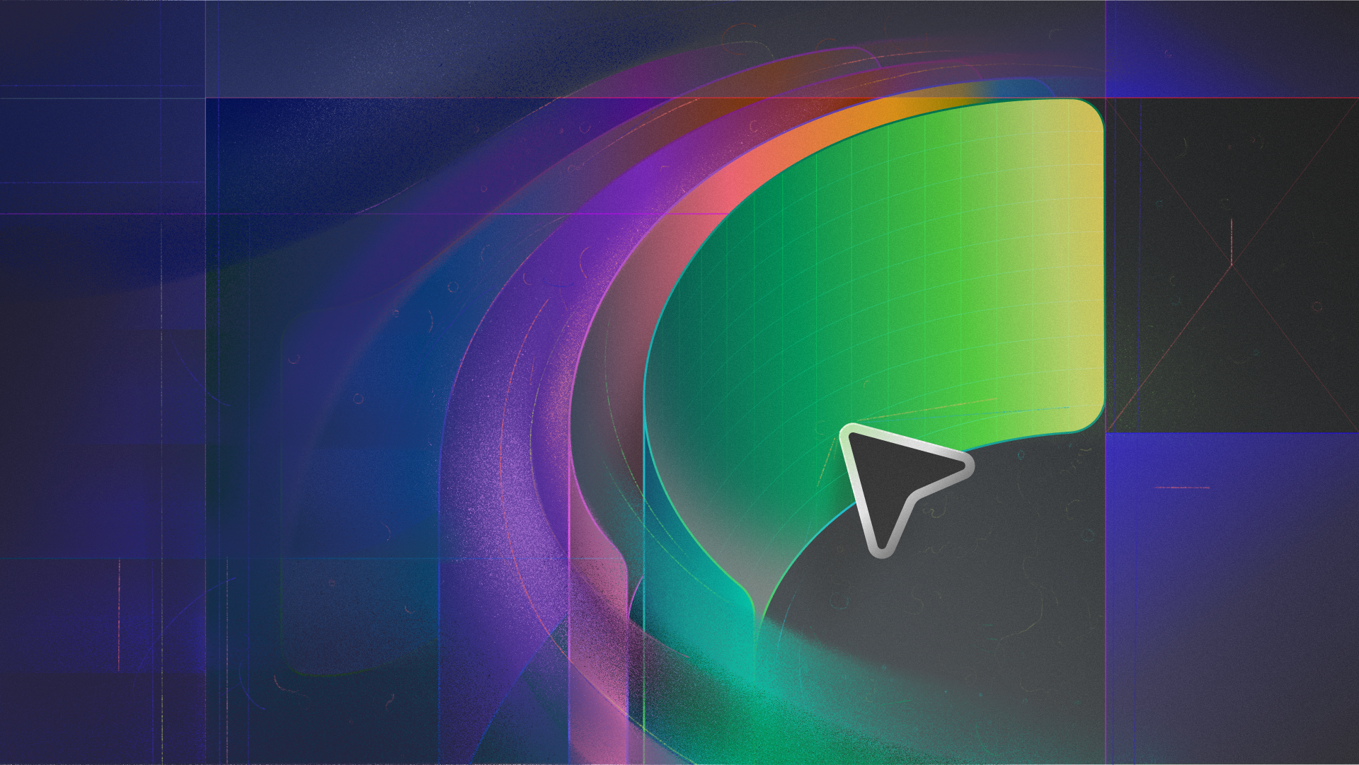
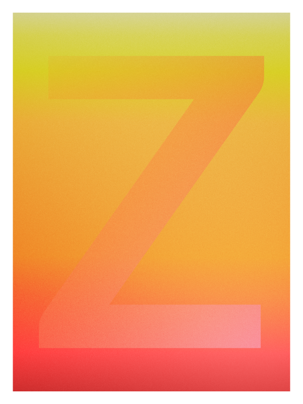
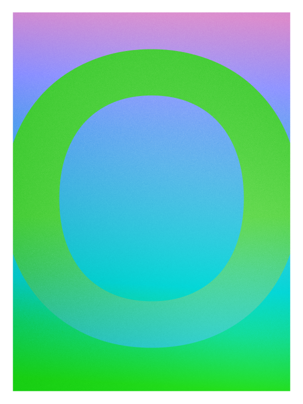
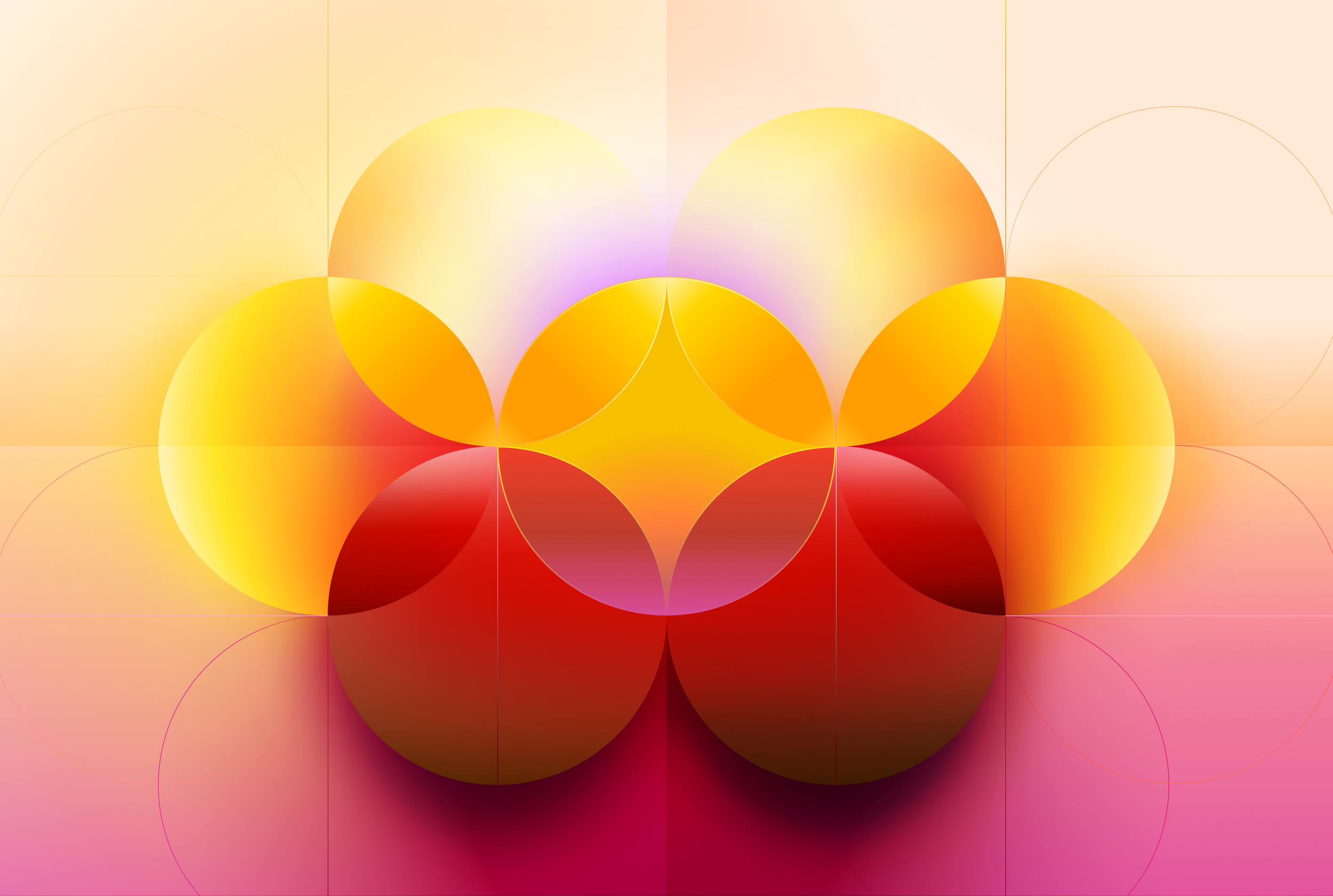
What I’ve gathered on this page, are some of the visuals my team and I created for the launch of Horizon.
To see my original post with a more extensive credit list, please visit LinkedIn. If you want to learn more about what Horizon means for ServiceNow, have a listen to my colleague Meredith Van Lier talk about our efforts at The Design Systems Podcast. But most importantly, please visit the Horizon site to see the all the content for yourself.


How might…
a rigorous adoption of our design system help us build a more modern experience?
our system help us achieve a consistent visual language without constraining innovation?
it enable our suite of experiences to show up more united, as One Platform?
our system’s principles help elevate craft in our products?
it make our brand more relevant?
the aesthetics of our products be both timeless and personal?
our principles help us go further in our commitment to accessibility?


During the definition phase of Horizon, I got to spend some time with my colleagues working on a set of principles that we have used as inspiration. These have acted as a north star to guide our decision-making and keep us aligned on what matters most. We wanted them to represent how we build our products and what sets us apart.
Frictionless Flow
Effortless Engagement Everywhere
Our design champions intuitive use and fluid navigation, making every interaction a seamless journey for our users.
We prioritize user efficiency and comfort, ensuring that our latest innovations feel natural and are accessible to all.
Our experiences are reliable, informing and guiding our users with clarity.
Harmonious Synphony
Unity Through Diversity
The natural connections across our platform experiences underscores the value of consistency, ensuring users navigate effortlessly across our products.
This unity amplifies usability and strengthens our ecosystem, allowing it to intelligently anticipate and adapt to the diverse needs of our users, fostering a sense of trust in every interaction.
Emotionally Resonant
Vibrant Design Impact
Our experiences are far more than aesthetically pleasing; they are positively memorable. We facilitate opportunities for ServiceNow and our customers’ brands to be expressive and vibrant when it matters most.
We craft our designs with the intensity and precision required for a product to be deeply loved.
These illustrations were created by my team: Monique Lindsay, Jeremy Van Cleef, Francisco Govea, Ryan Blackman, and Katherine Chen.


Early concepts I developed as a possible illustration direction.