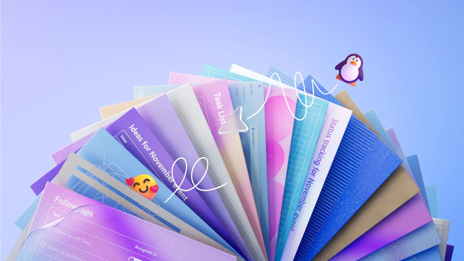
Microsoft Loop
During my experience as Director of Design for Office, I had the opportunity to oversee the team responsible for Loop. The journey the team went through was exciting and I could see the day when the app would eventually debut.
For this reason, more than any other, when the time came to create a UX film for its launch, I was thrilled that our partners in marketing invited me to collaborate with them in directing this story.
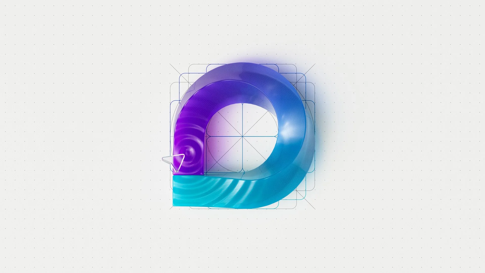
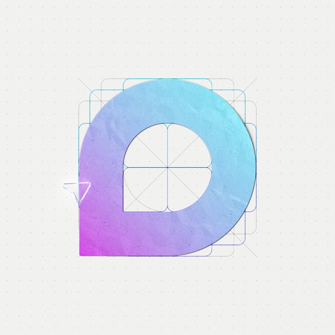
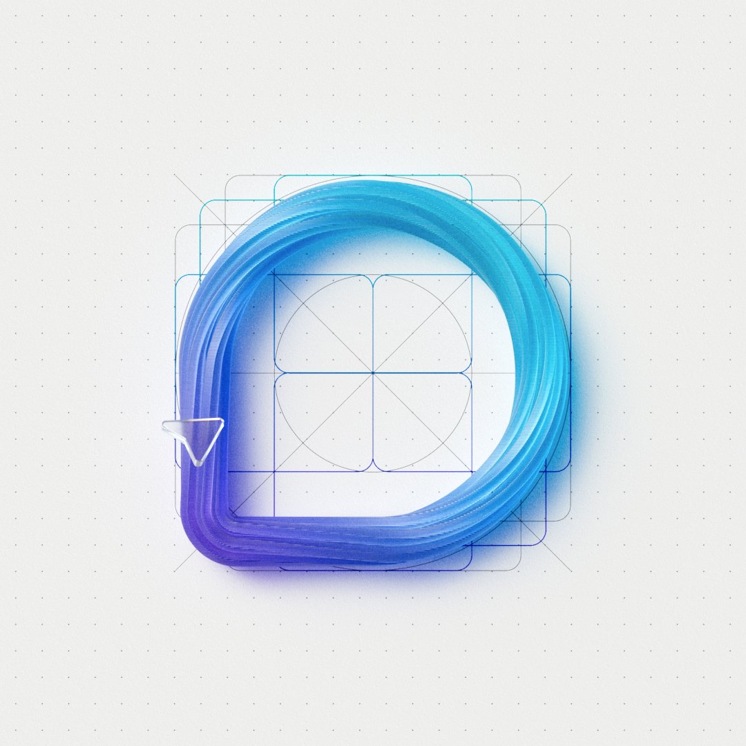
The Microsoft loop icon is simple and bold. At a glance, it seems to stand apart from the other Microsoft 365 experience icons, and yet its design is entirely based on the grid we developed for the system of app icons. This simple grid allows each app to find a unique and ownable form and yet land in close alignment with the suite.
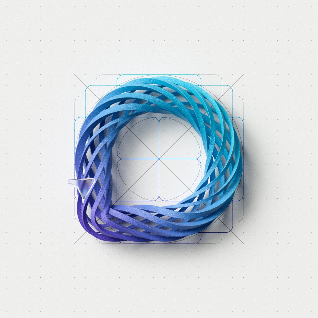
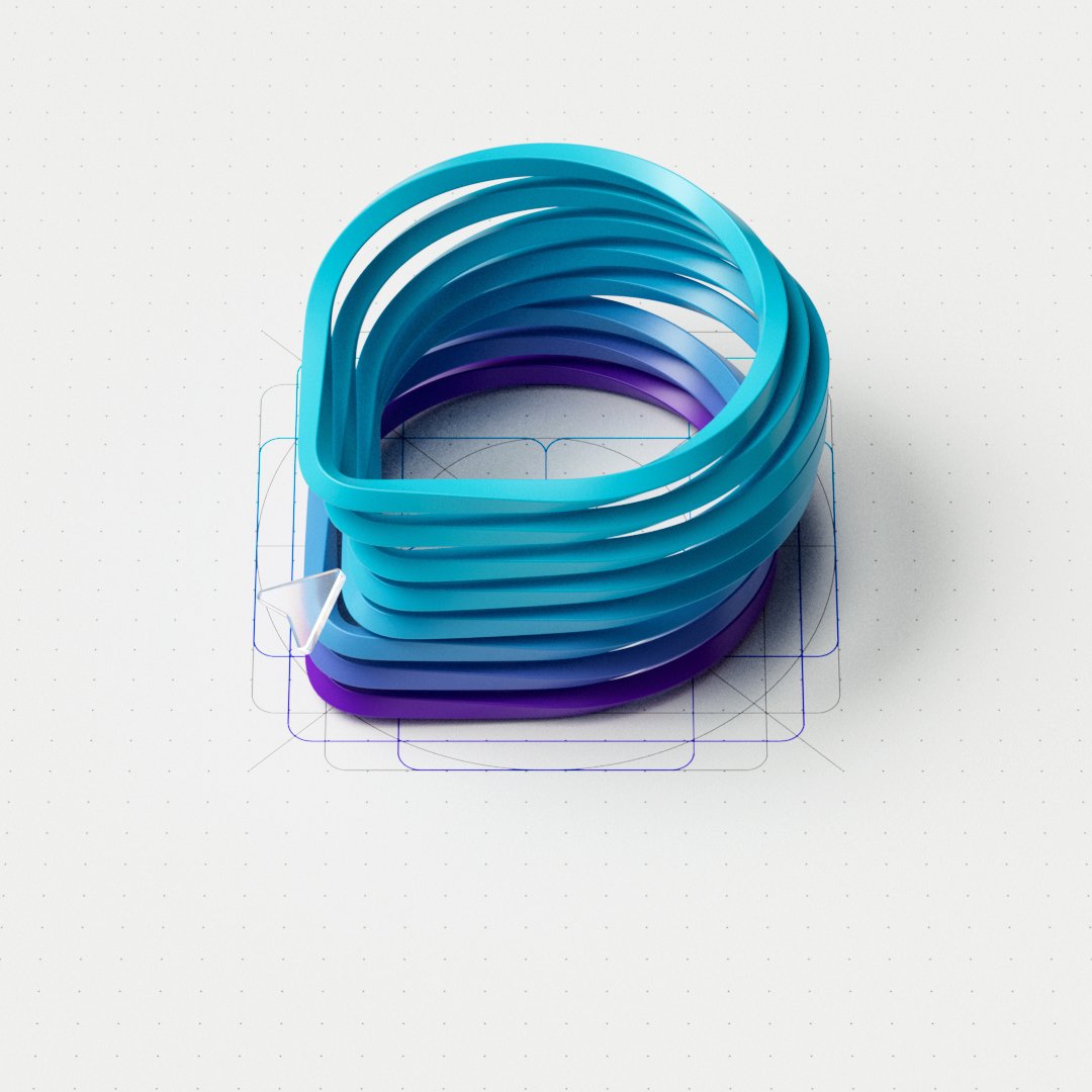
Below is a variety of ways we explored to depict the app icon in this film. We looked for opportunities to play with its name, inserting one, or many loops in this shape and finding ways to leverage that tension as a catalyst for the energy we would see unfold throughout the story.
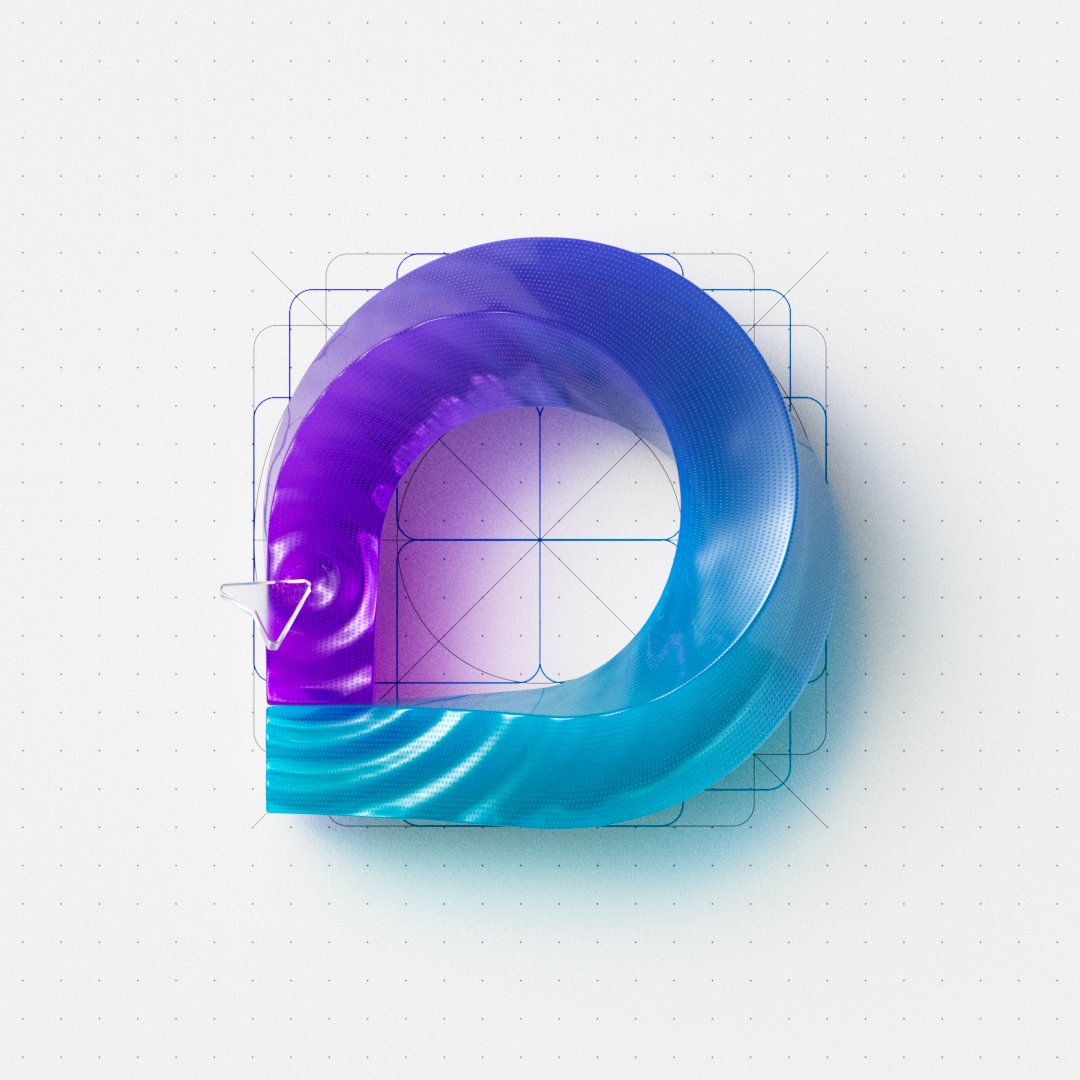
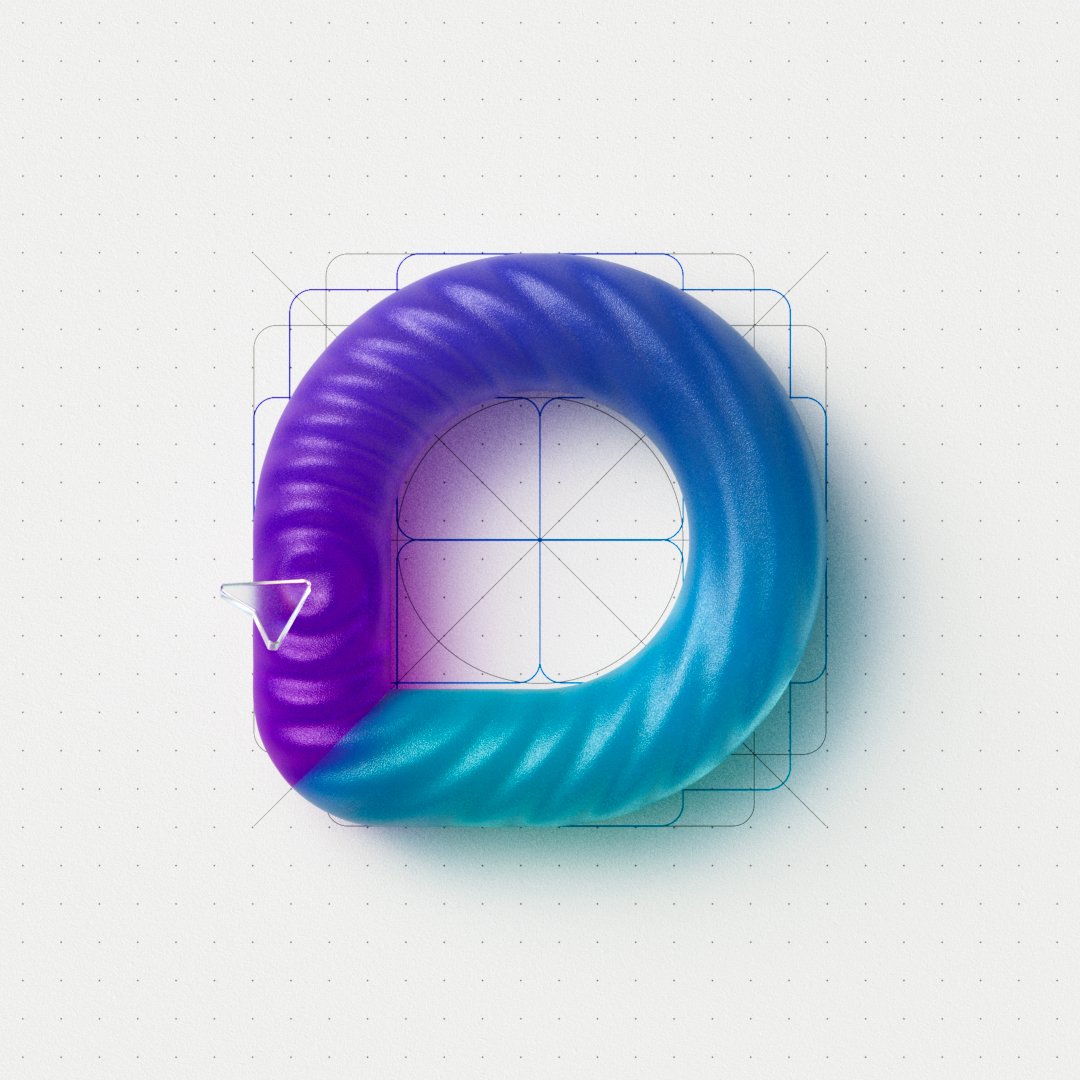
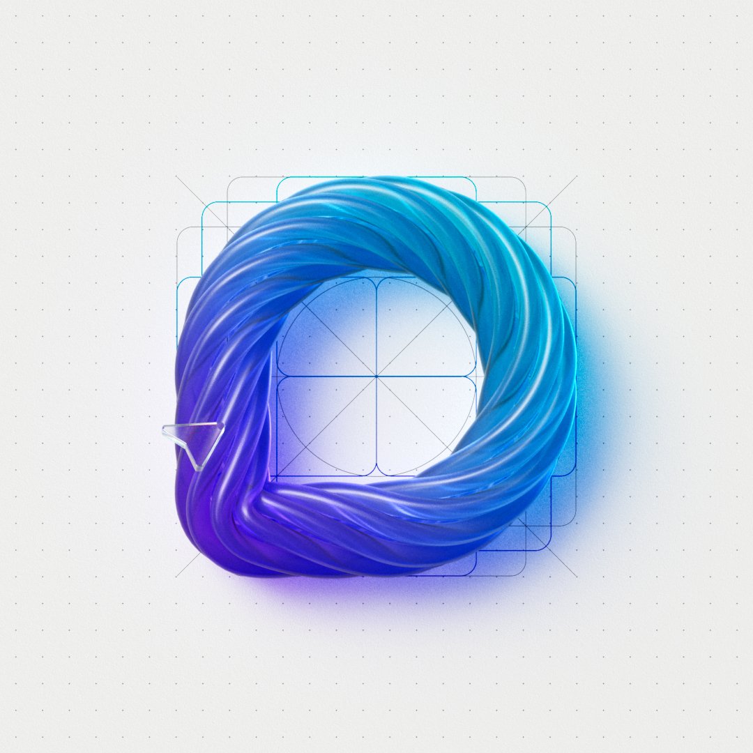
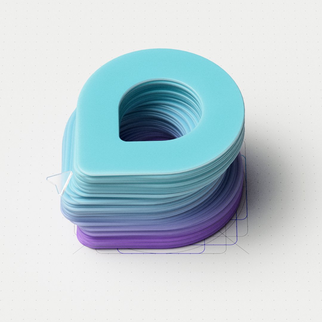
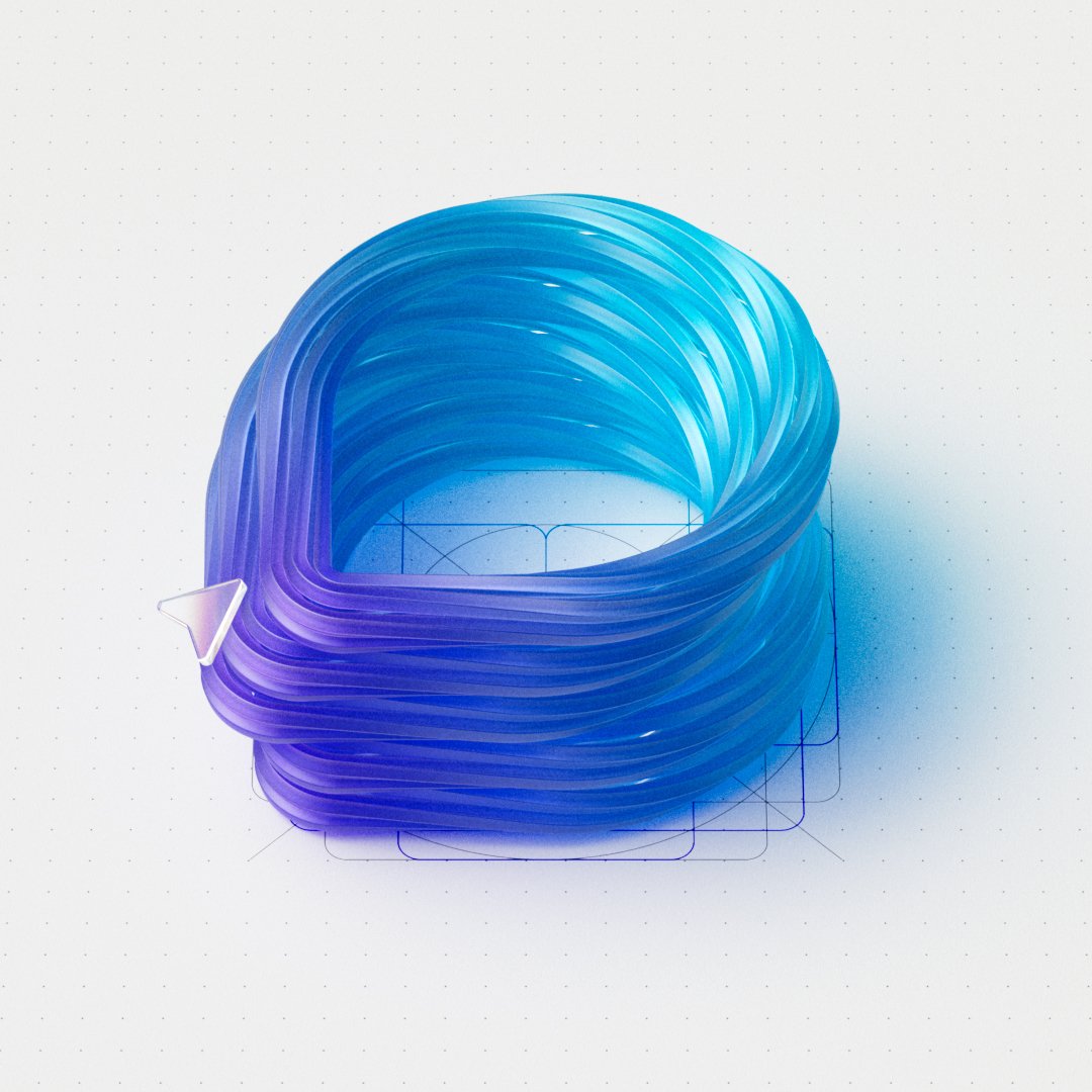
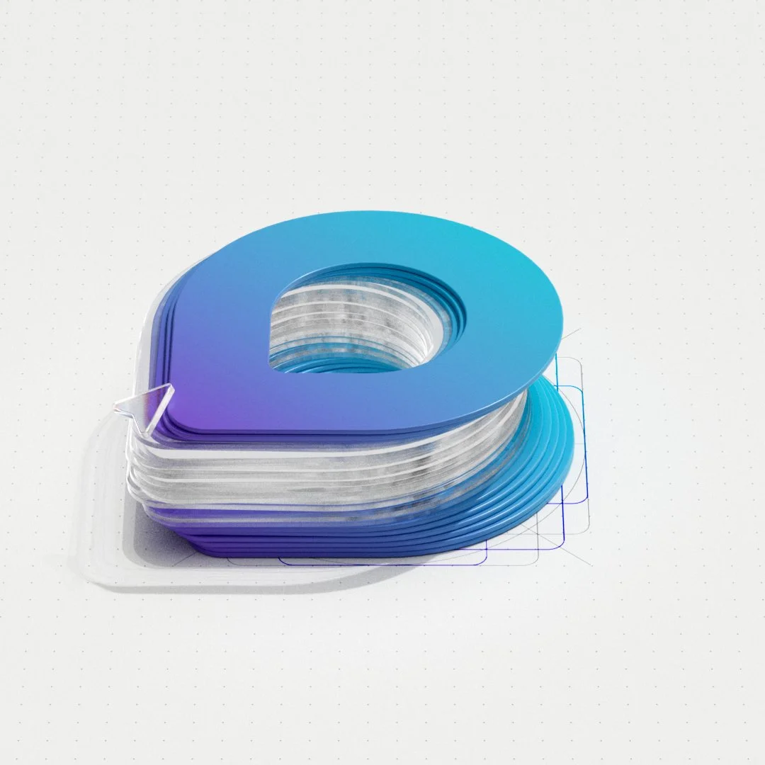
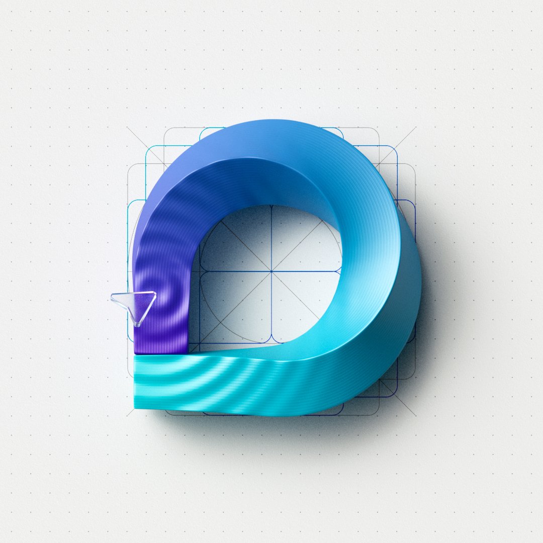
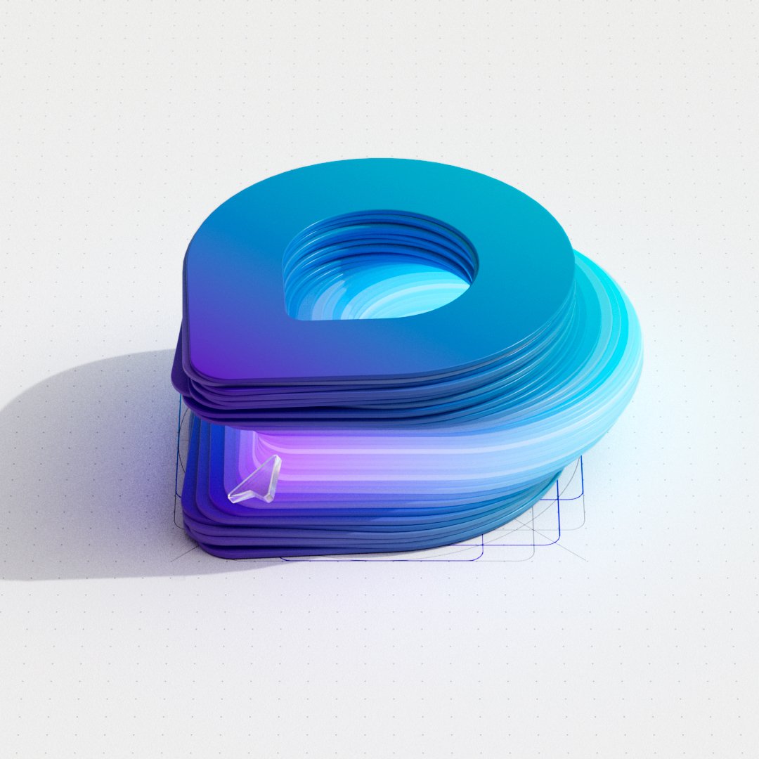
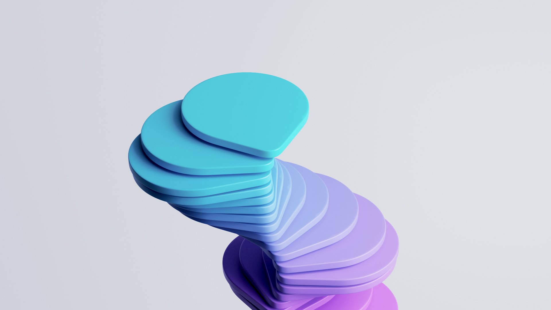
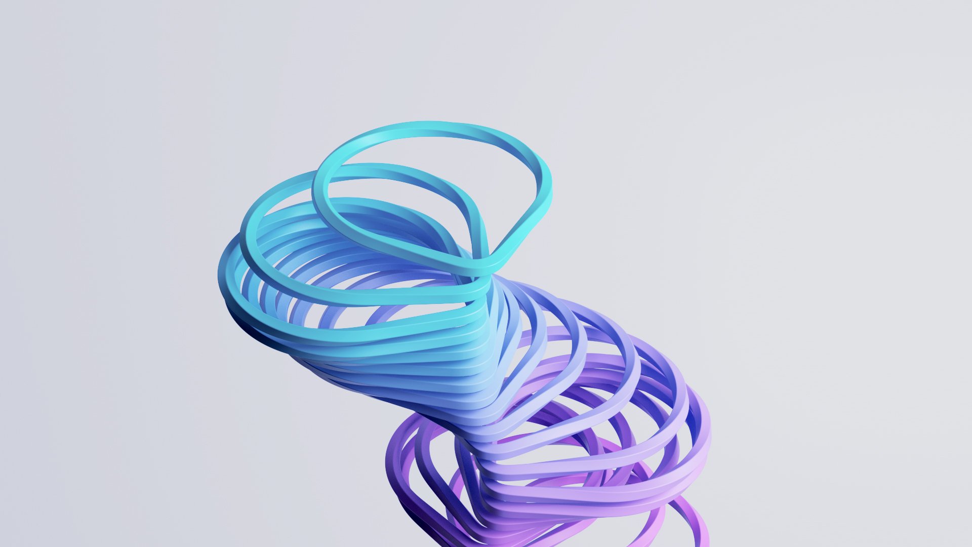

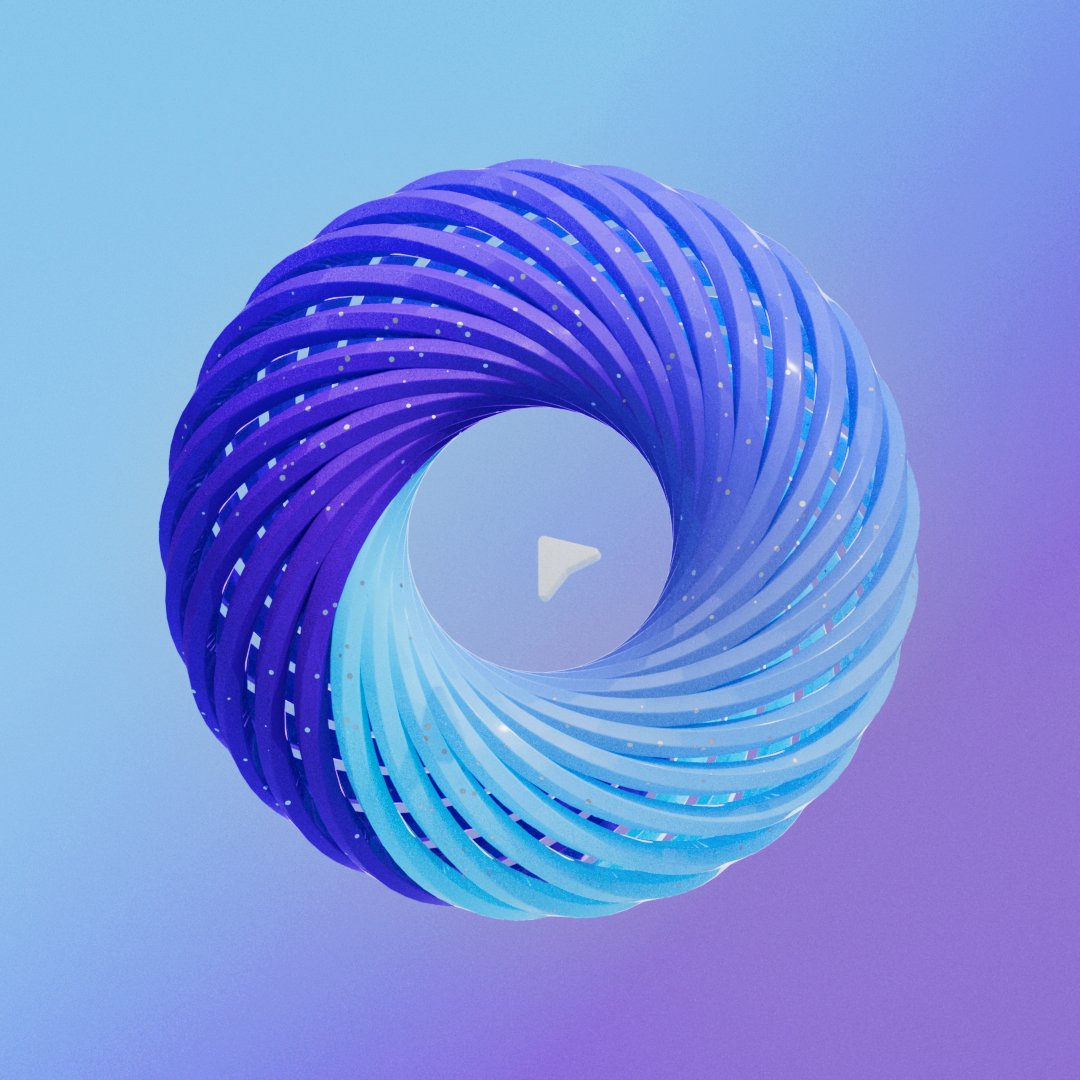
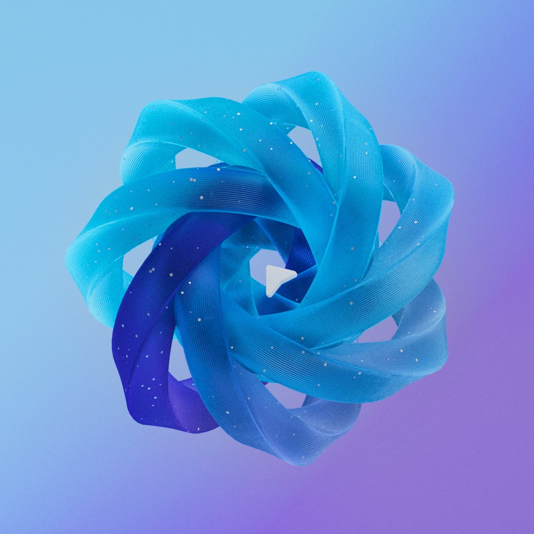
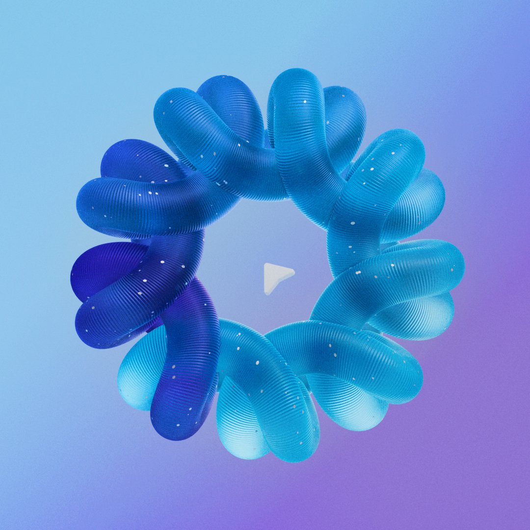
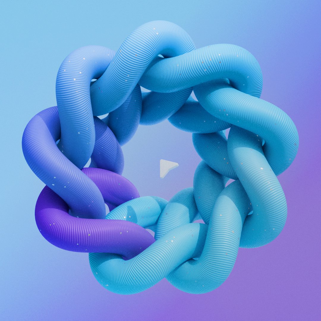

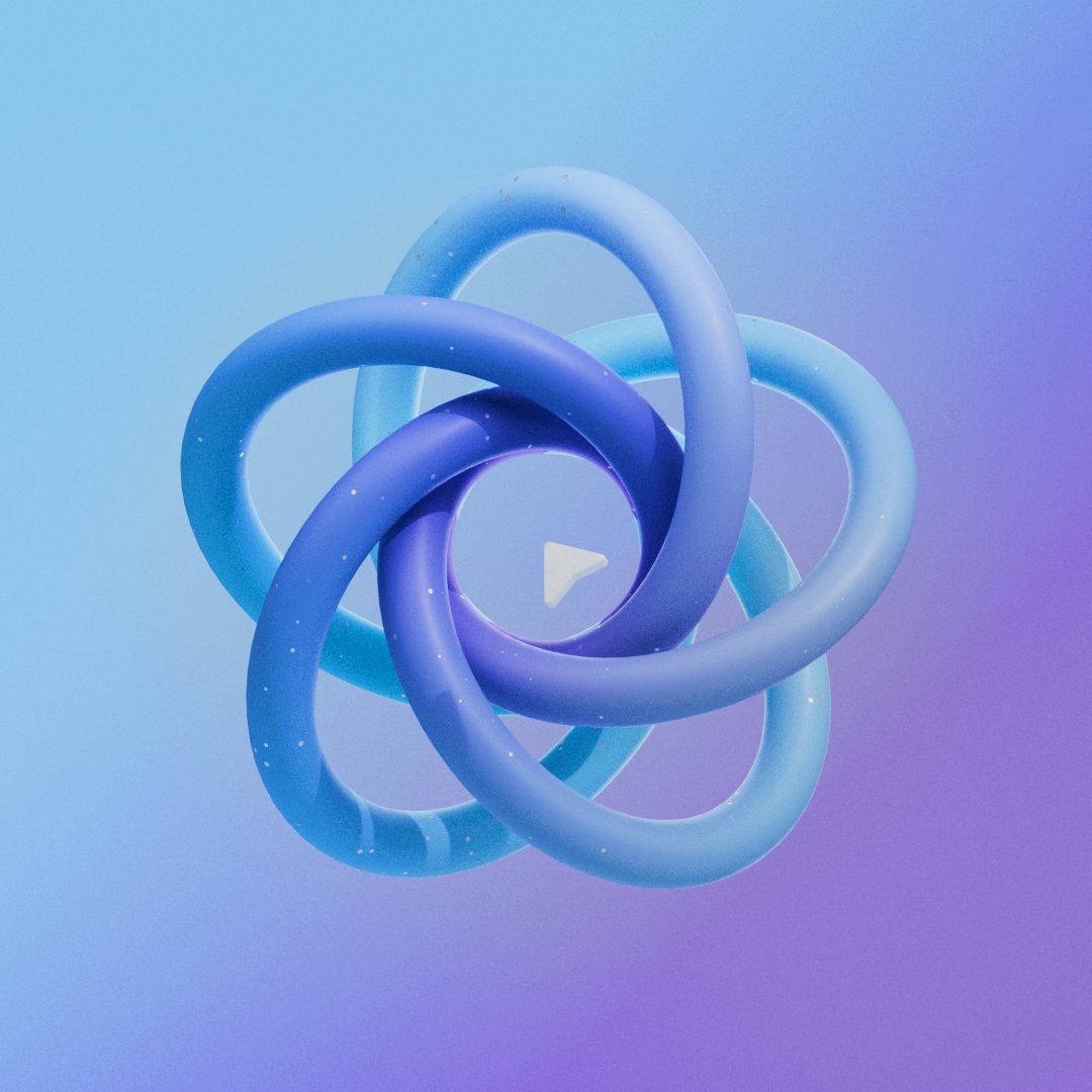
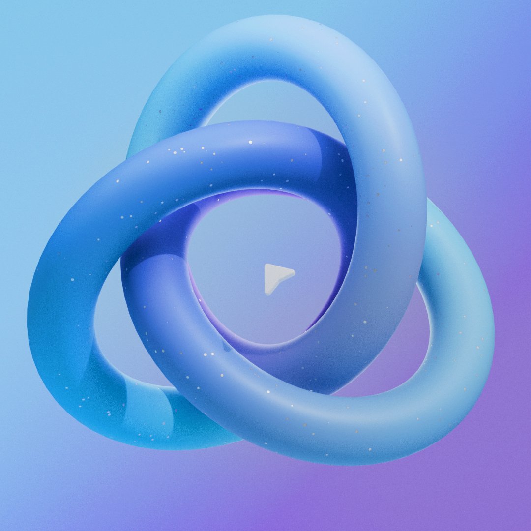
Loops intent is to expand the ways in which people can collaborate in real-time and asynchronously, creating a bridge between different applications so people can contribute from wherever they want.
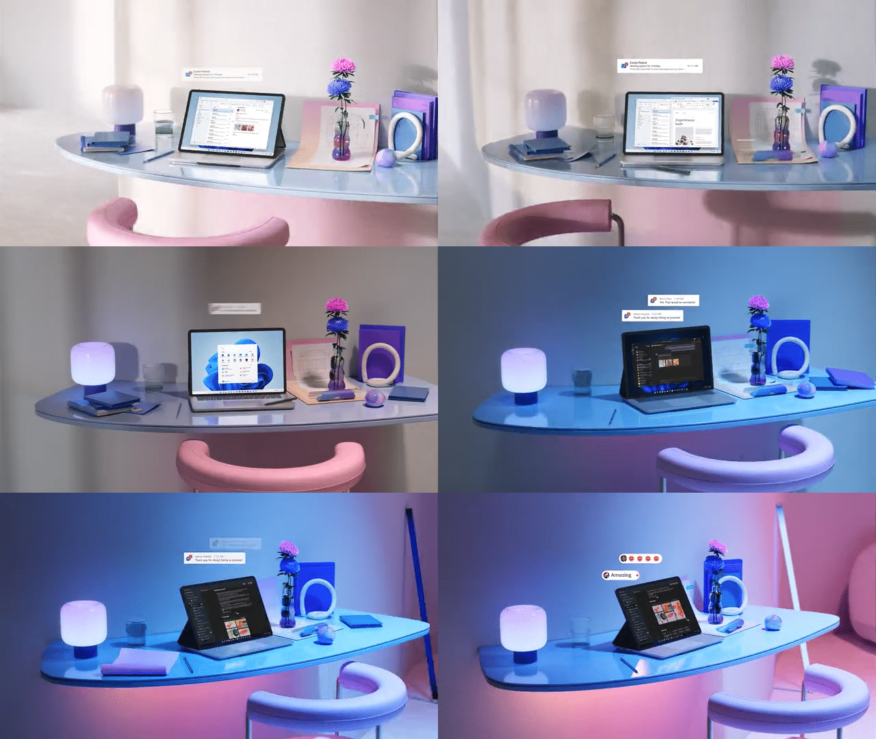
We created this simulated time-lapse to help illustrate the journey of a Microsoft Loop user throughout the day.

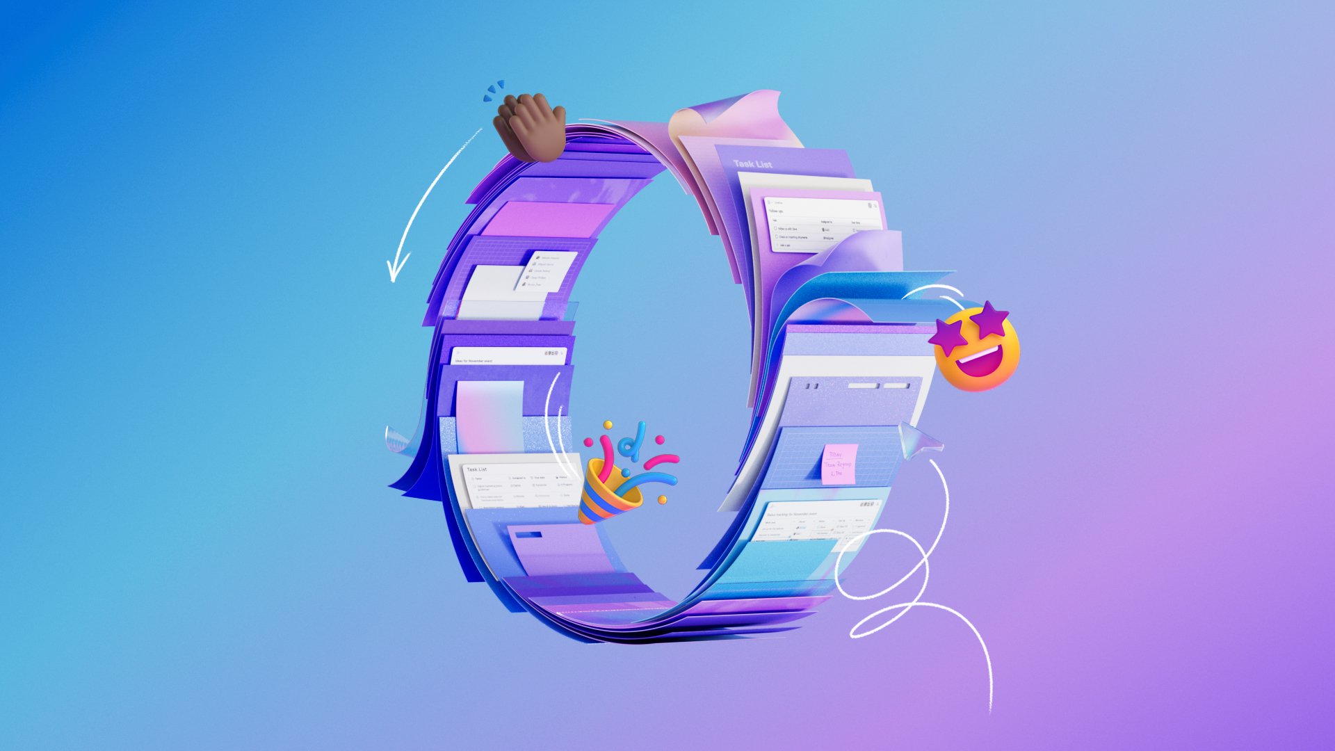
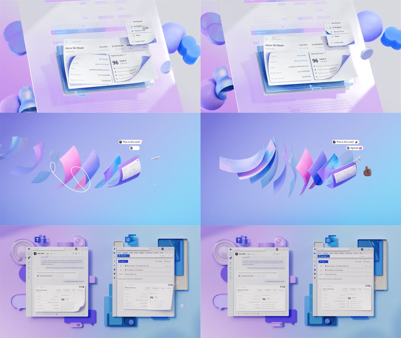
Loop’s ability to traverse application boundaries was illustrated in super fluid animations and transitions, along with playful hand drawn lines that aimed at depicting the experience’s ease of use.

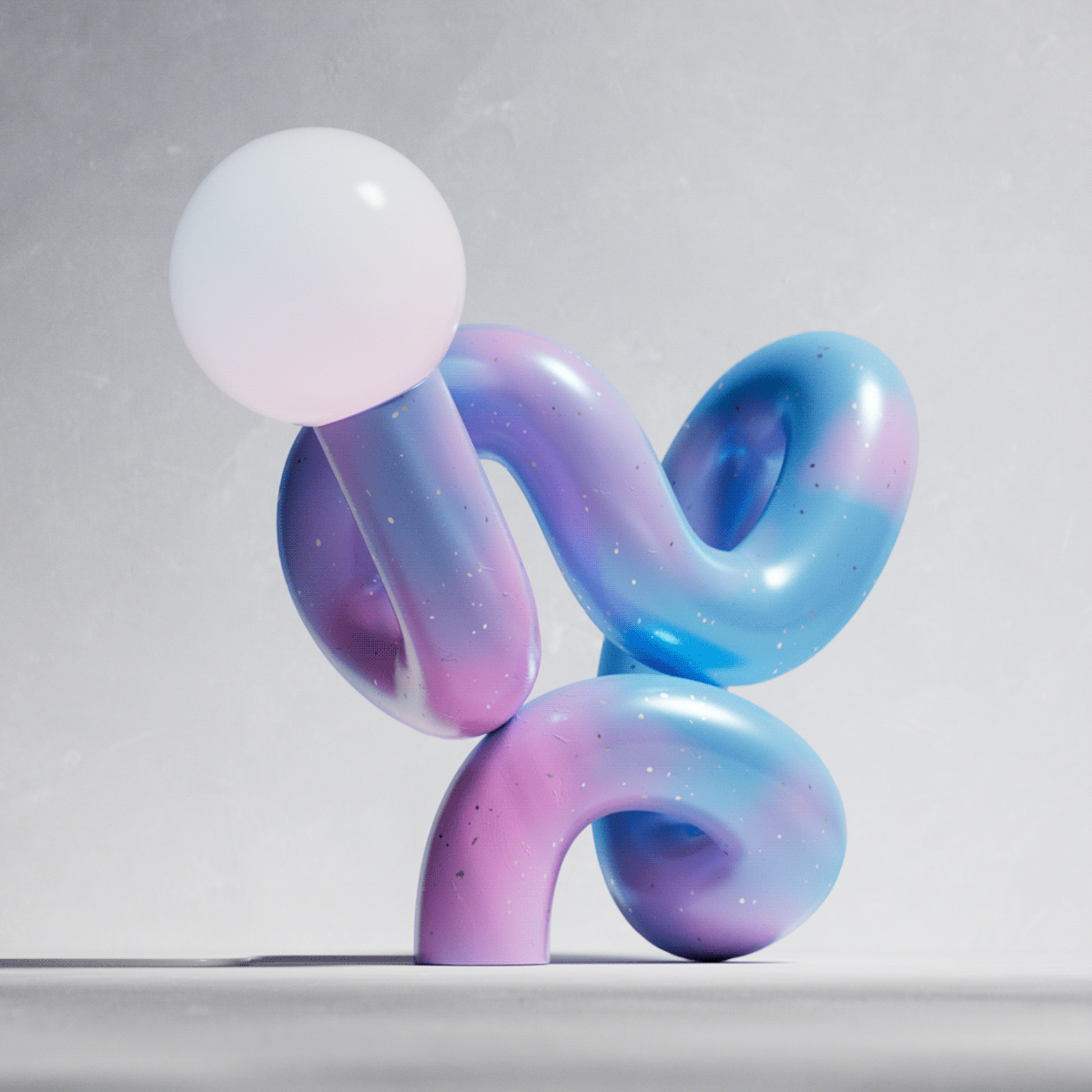
An abstract typographic interpretation of the product’s name leveraging its own icon.
Sound Design
Great sound design has the power to transport viewers and make graphics come alive. I also believe it can make a brand more tangible, real, relatable and this is even more critical for digital products. Below are two clips highlighting the close integration between these sound design details and animation.
Thank you!
Thank you to the team at NotReal in both Spain and Argentina for taking on this challenge! The success of the launch was amplified by your attention to detail and relentless dedication to your craft.
Major kudos also to Matthew Wilcock and the amazing team at Zelig Sound for continuing to help us define a unique sonic signature for Microsoft Design.
Thanks also to all of my partners at Microsoft, the many product leaders and individual contributors behind Loop, as well as our partners in marketing for your trust in my direction for this piece.


