YourPhone App
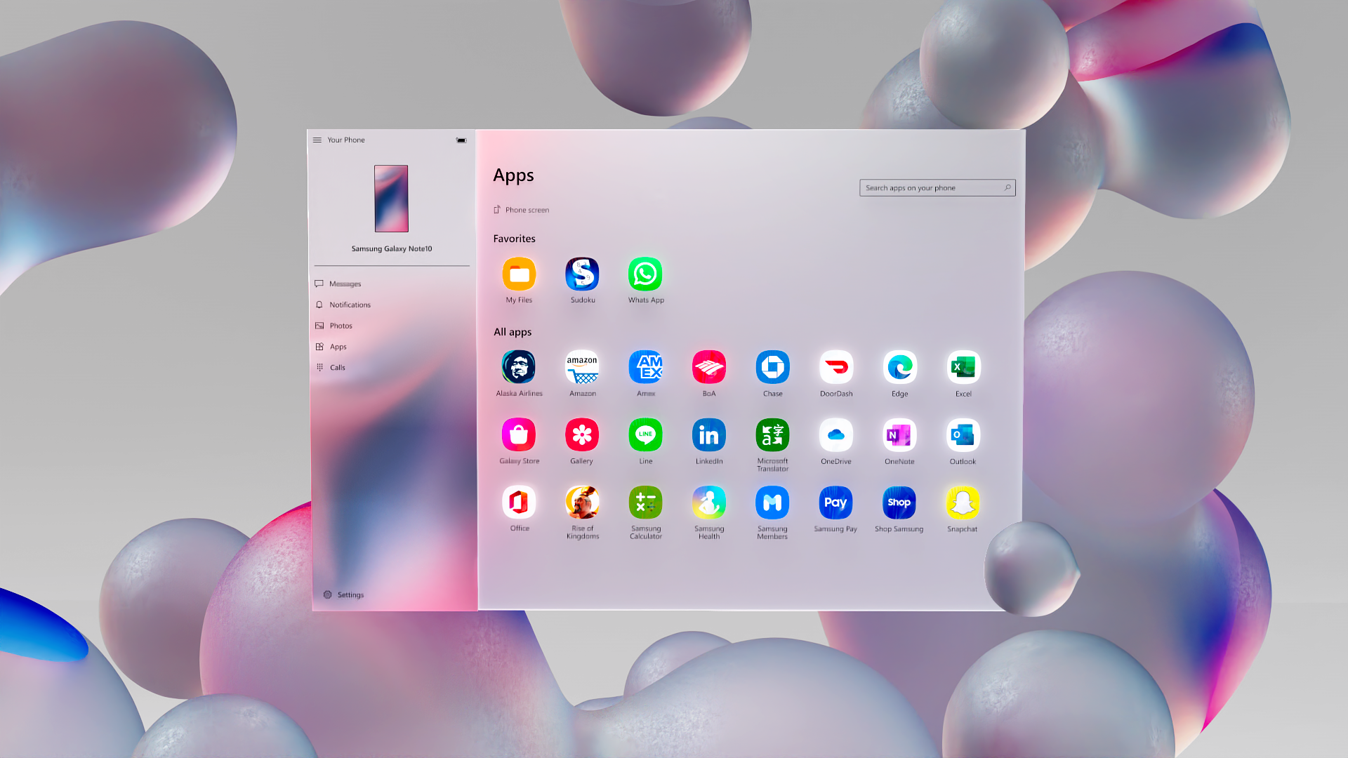
Microsoft’s YourPhone app connects the apps on your Android phone with your Windows device. This UX film illustrates this concept by flowing in and out of pure product truth and a series of dreamy sequences that amplify the app’s branding and the user experience.
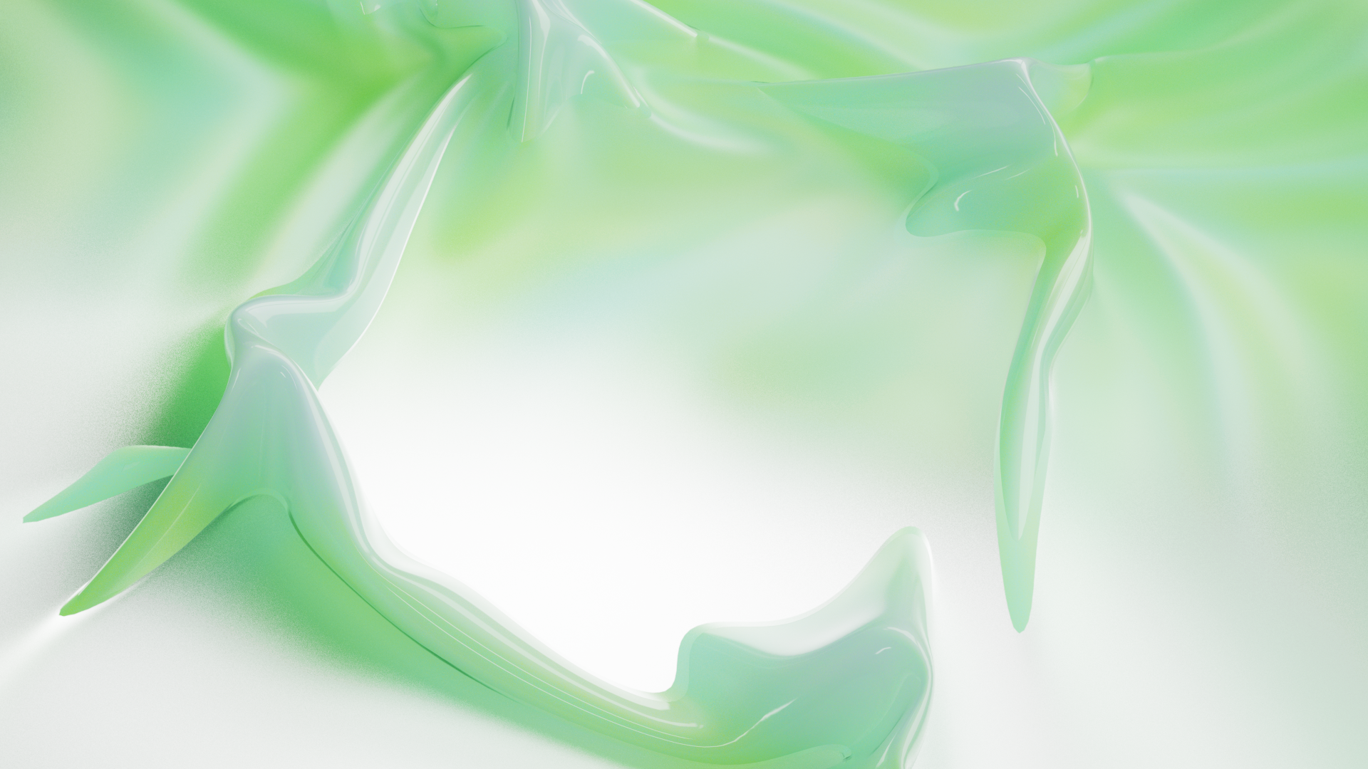
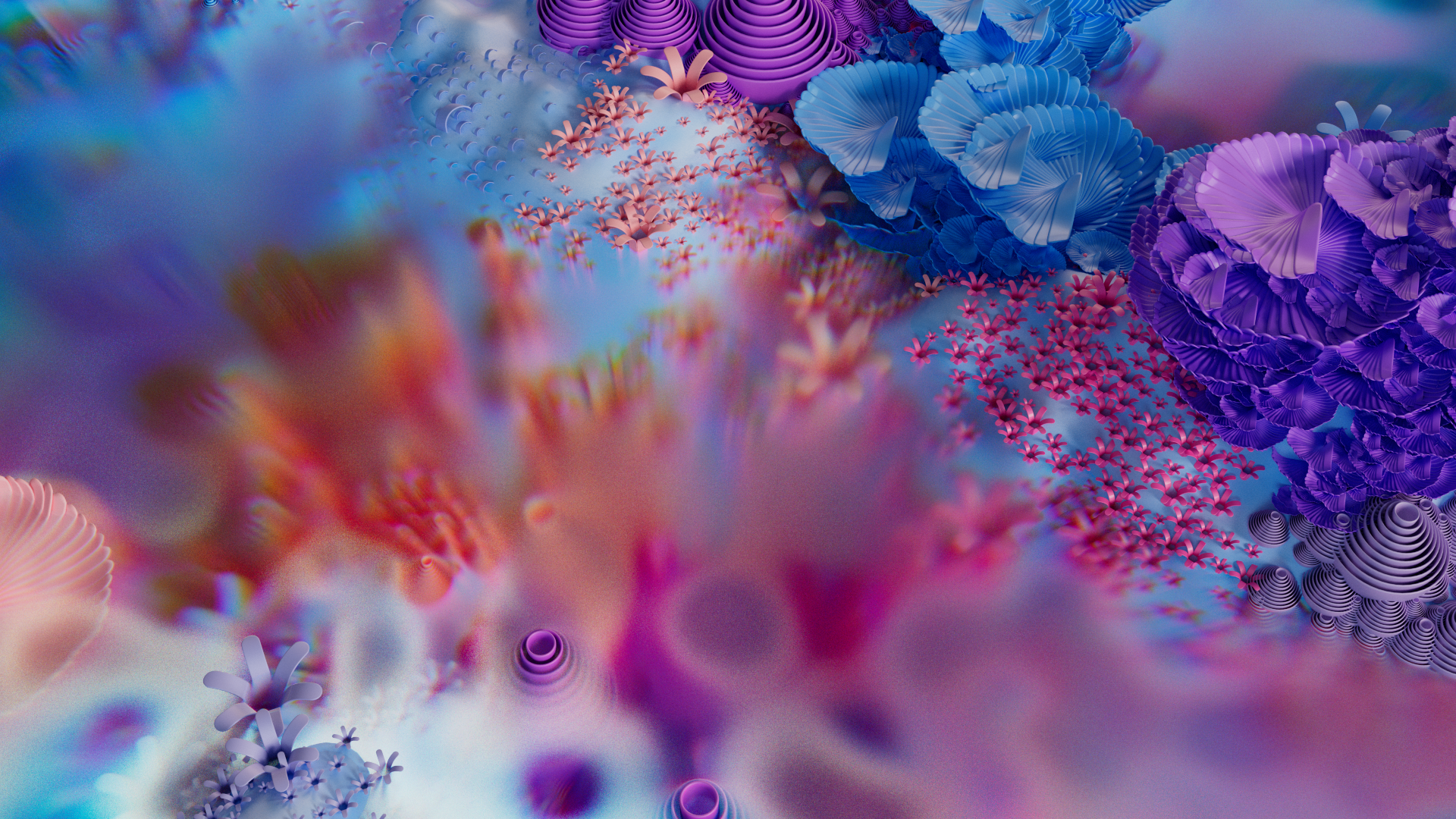
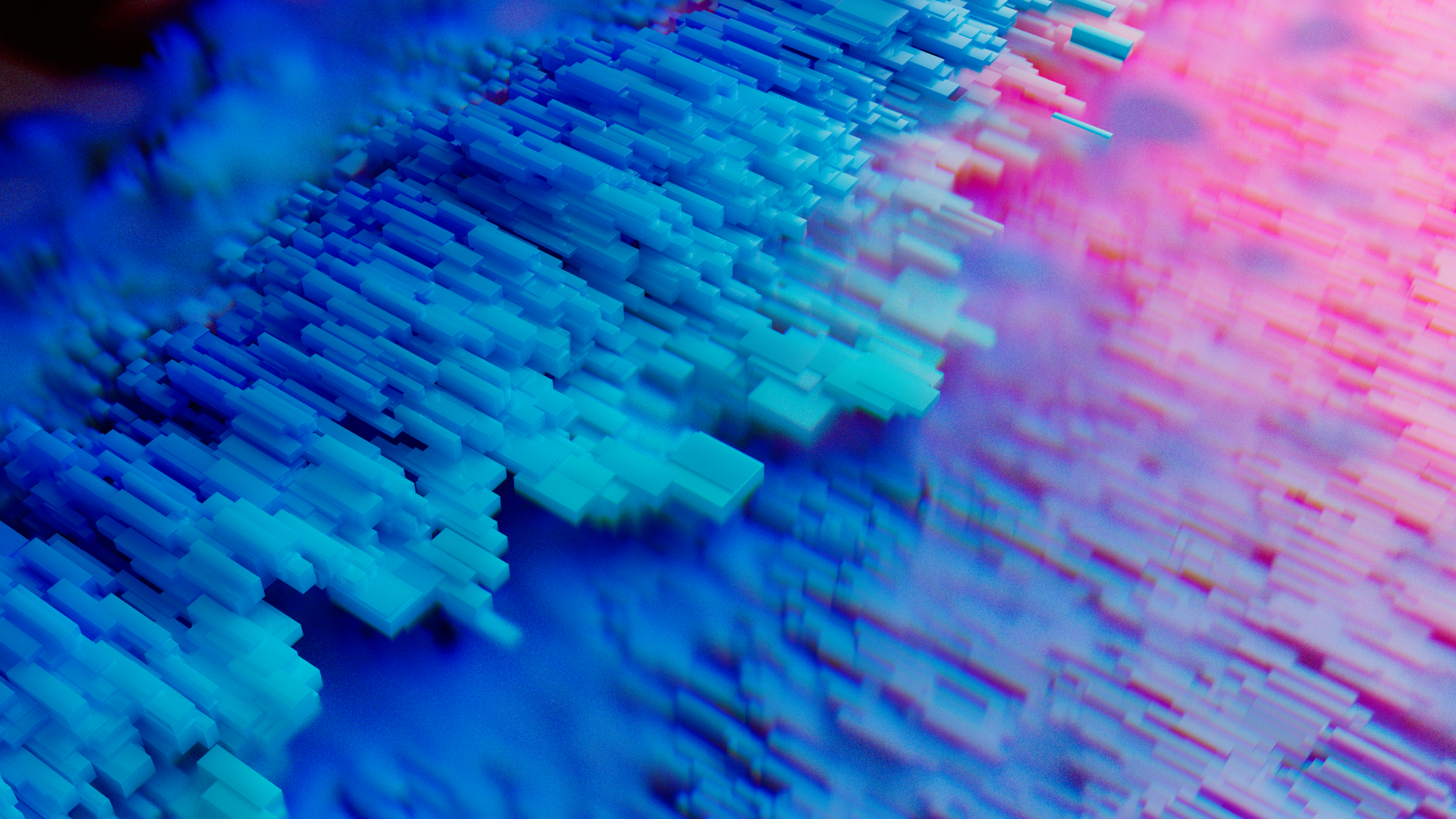
Our creative process took us through a series of visual explorations aimed at capturing the fluid nature of the app, which makes the connection between a phone and a PC incredibly simple.
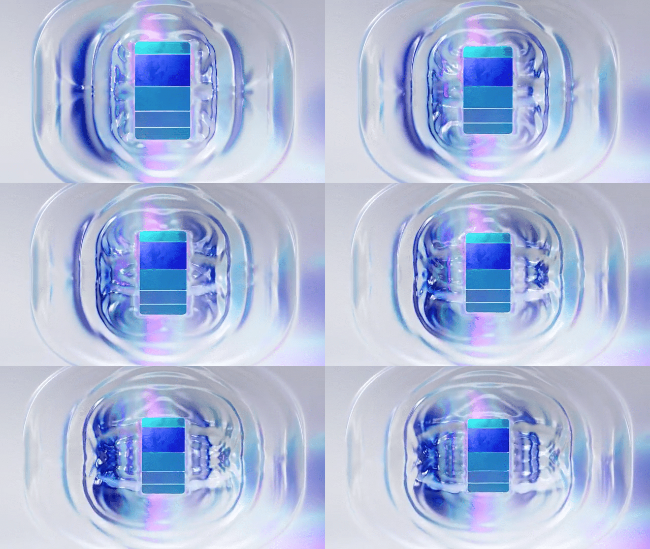
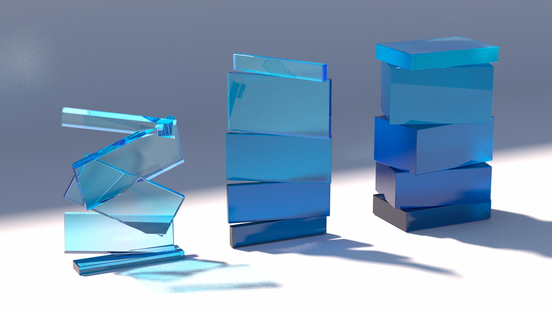
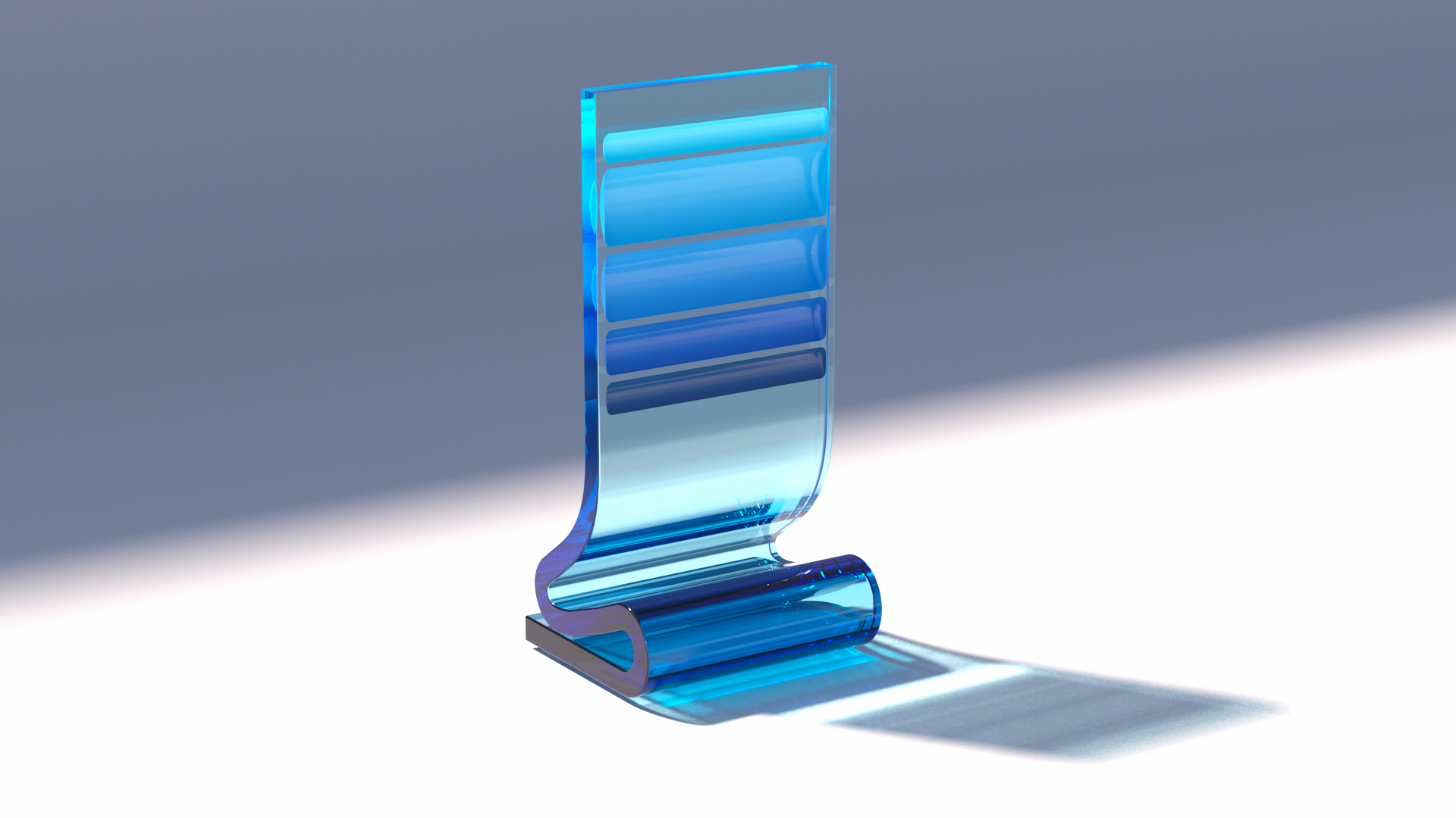
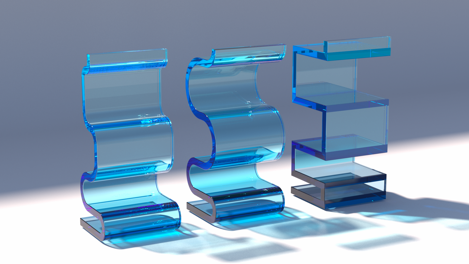
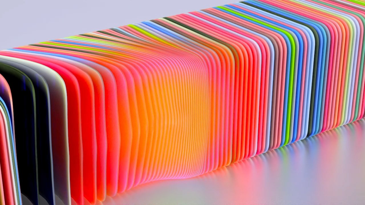
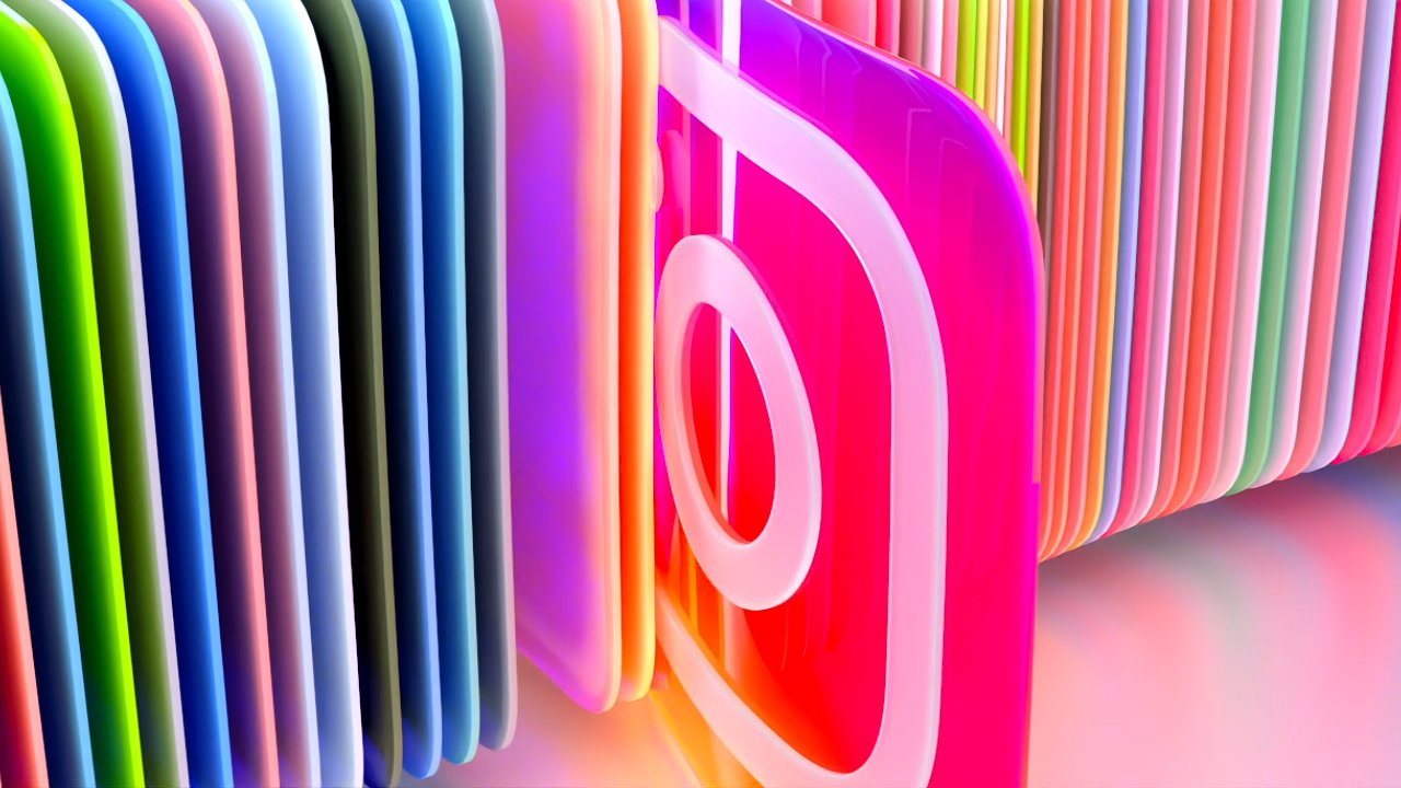
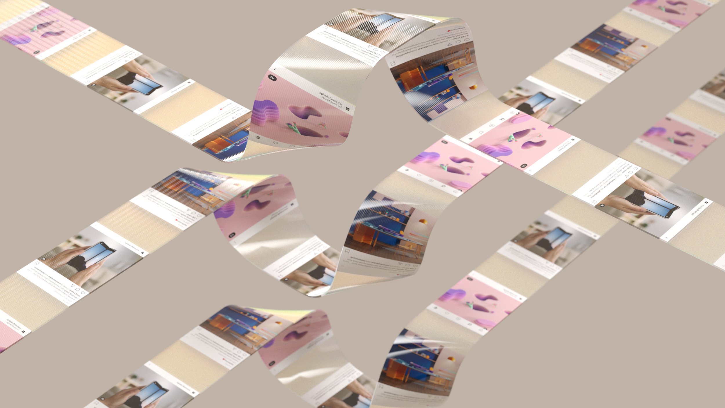
As these images show, the R&D ranged from material and lighting quality, to fluid simulations and patterns that all conveyed the concept of “fluidity” in a way or another.
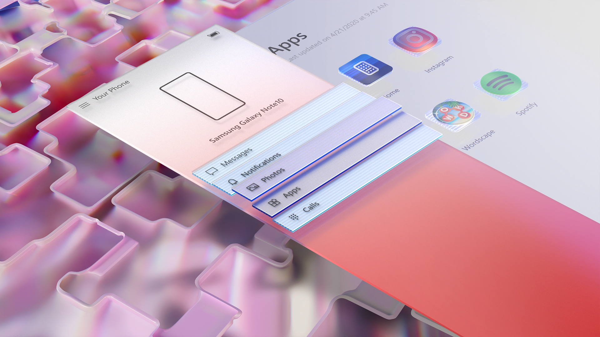
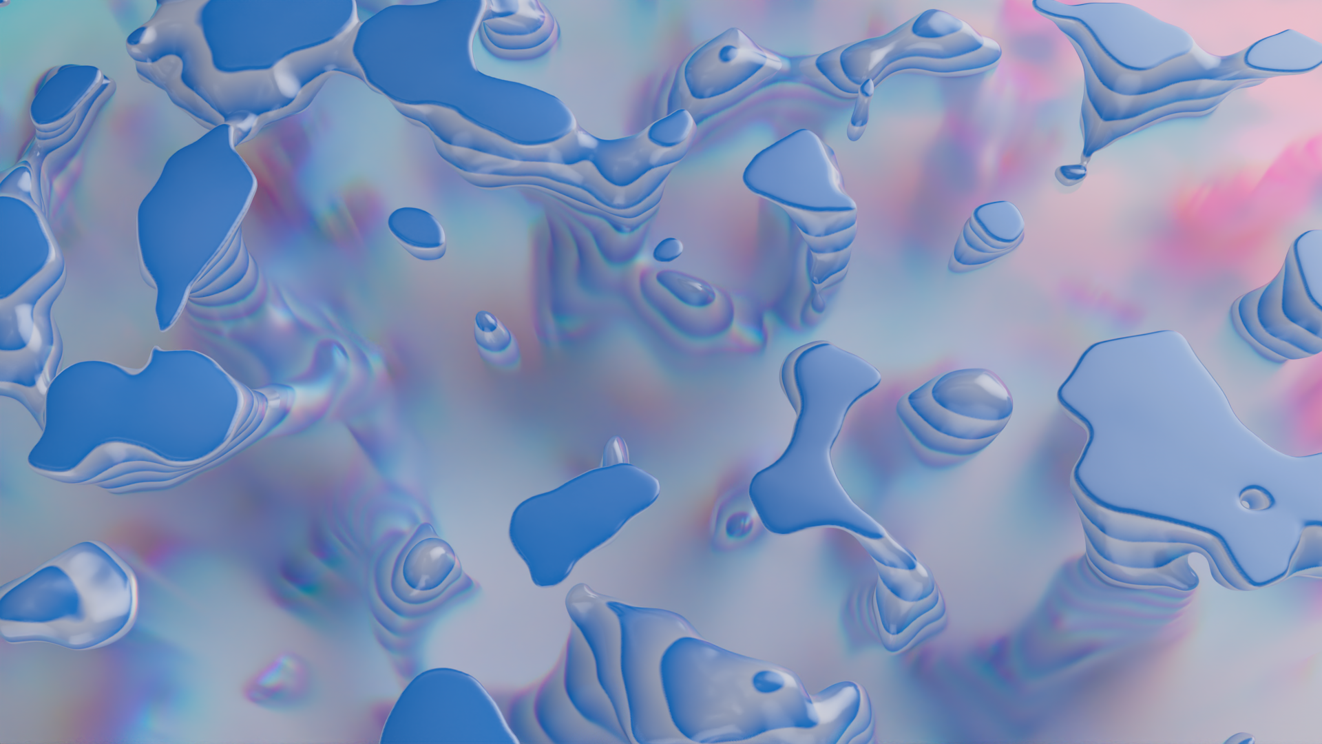
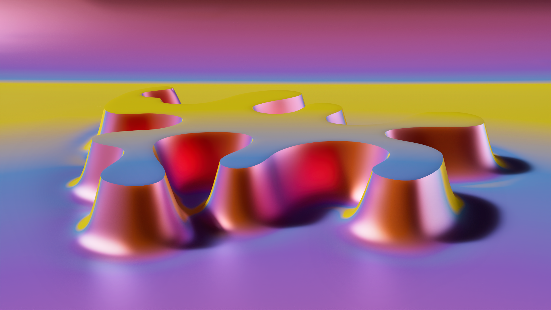
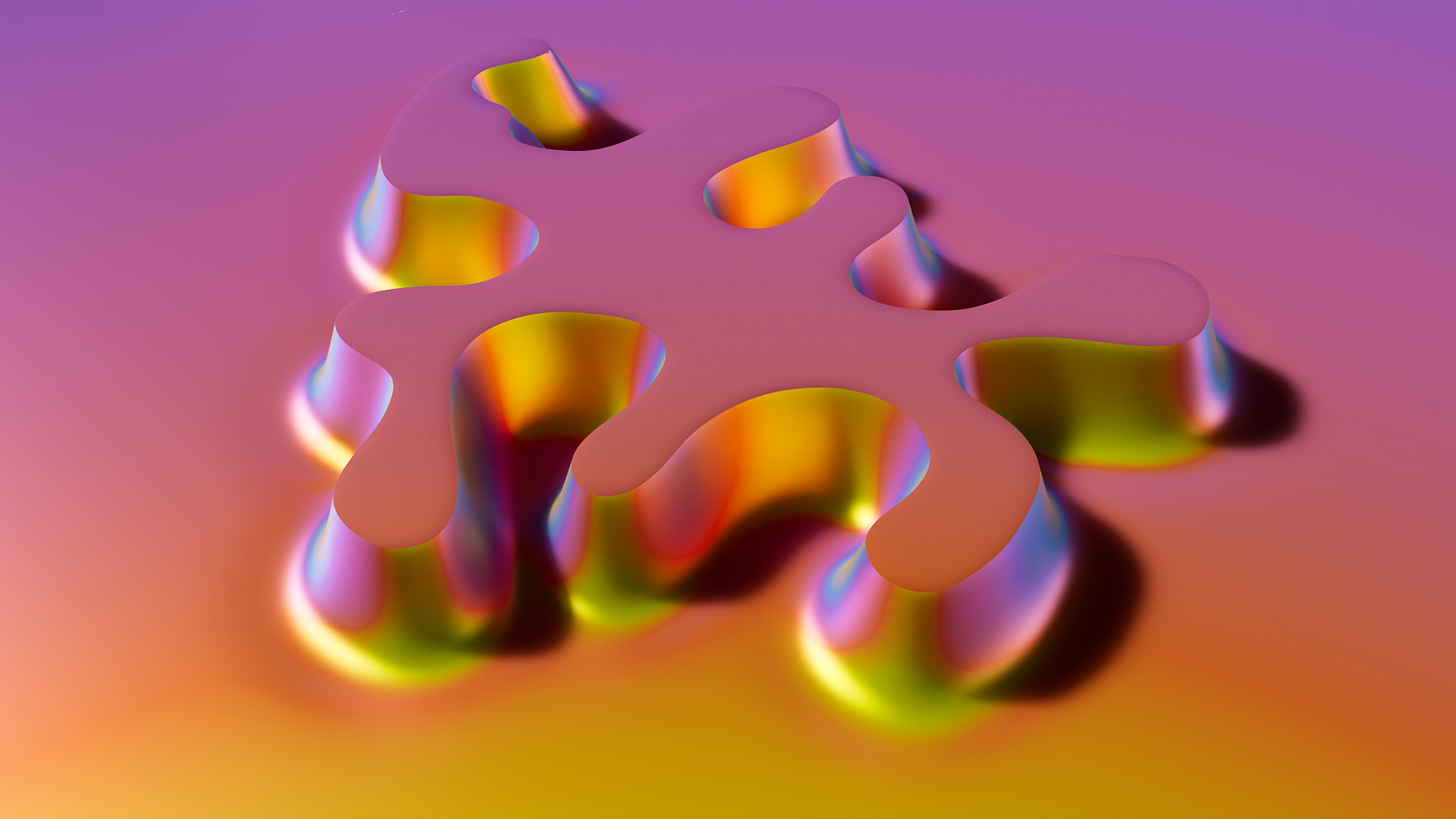
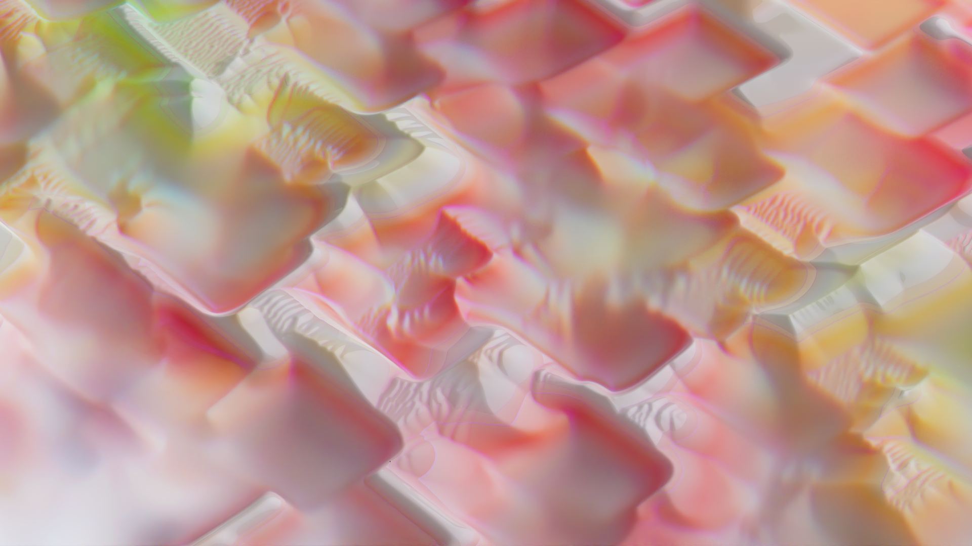
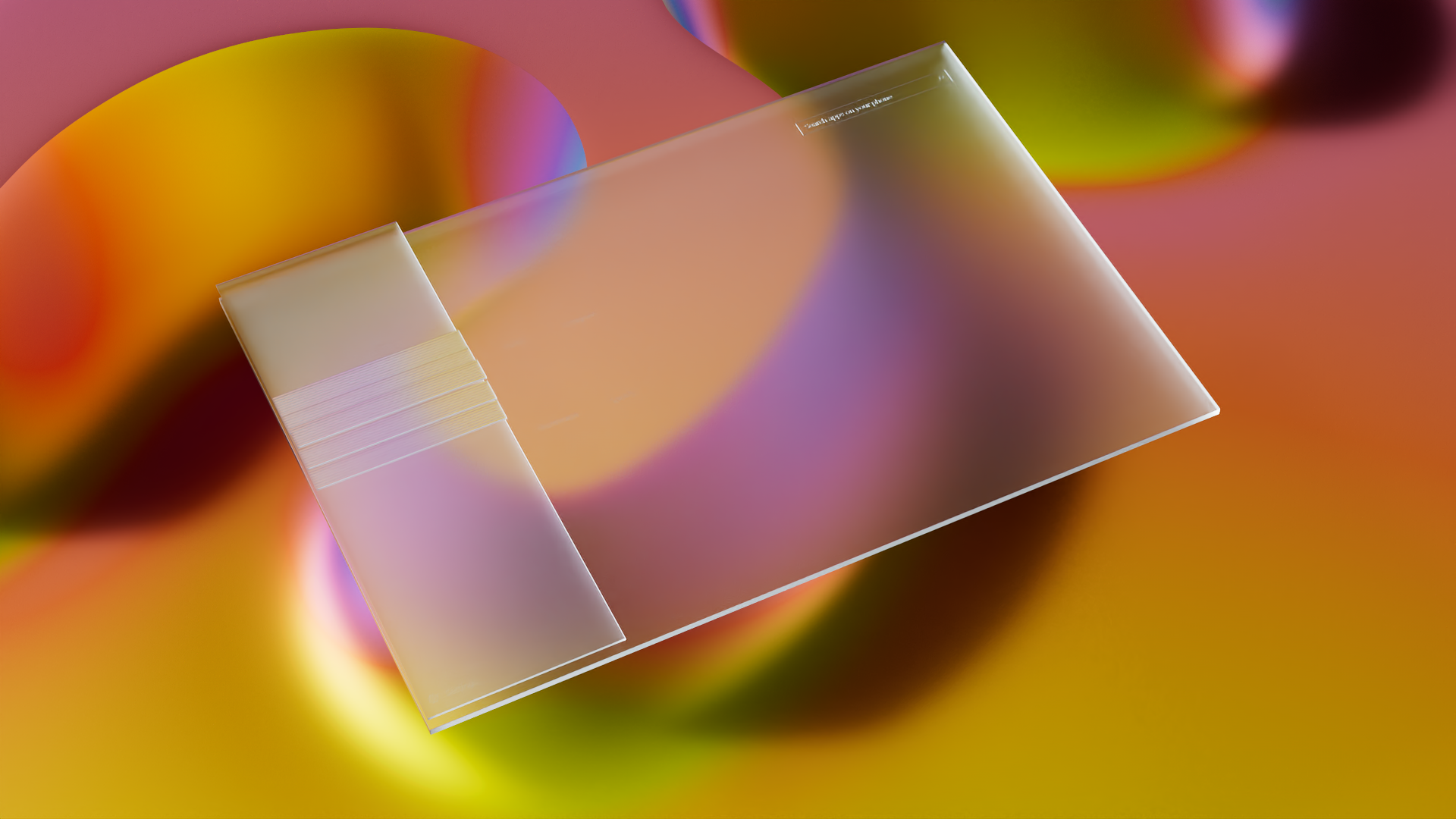
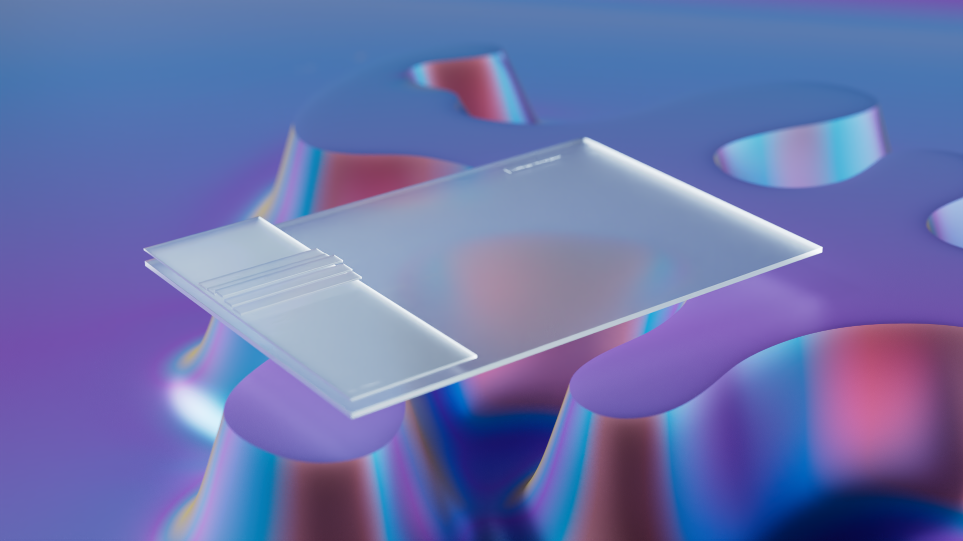
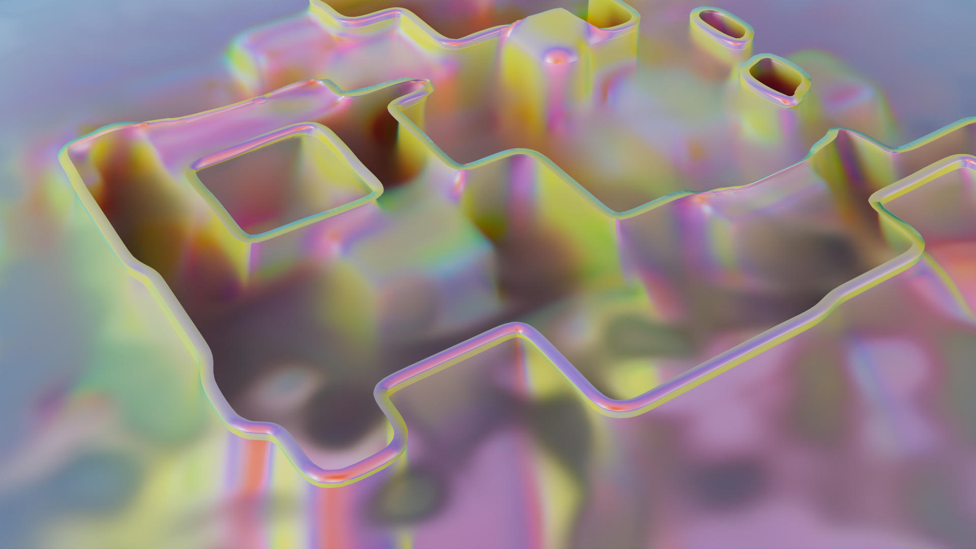
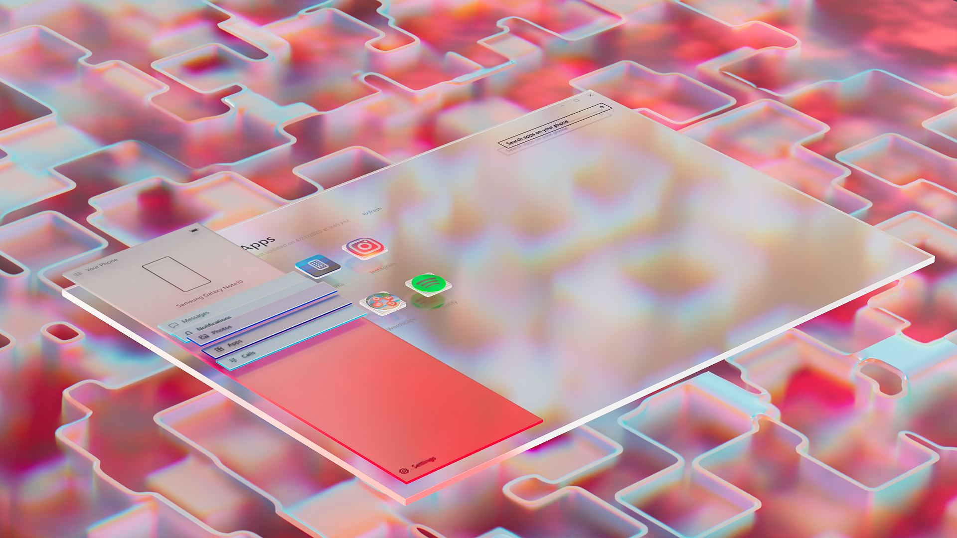
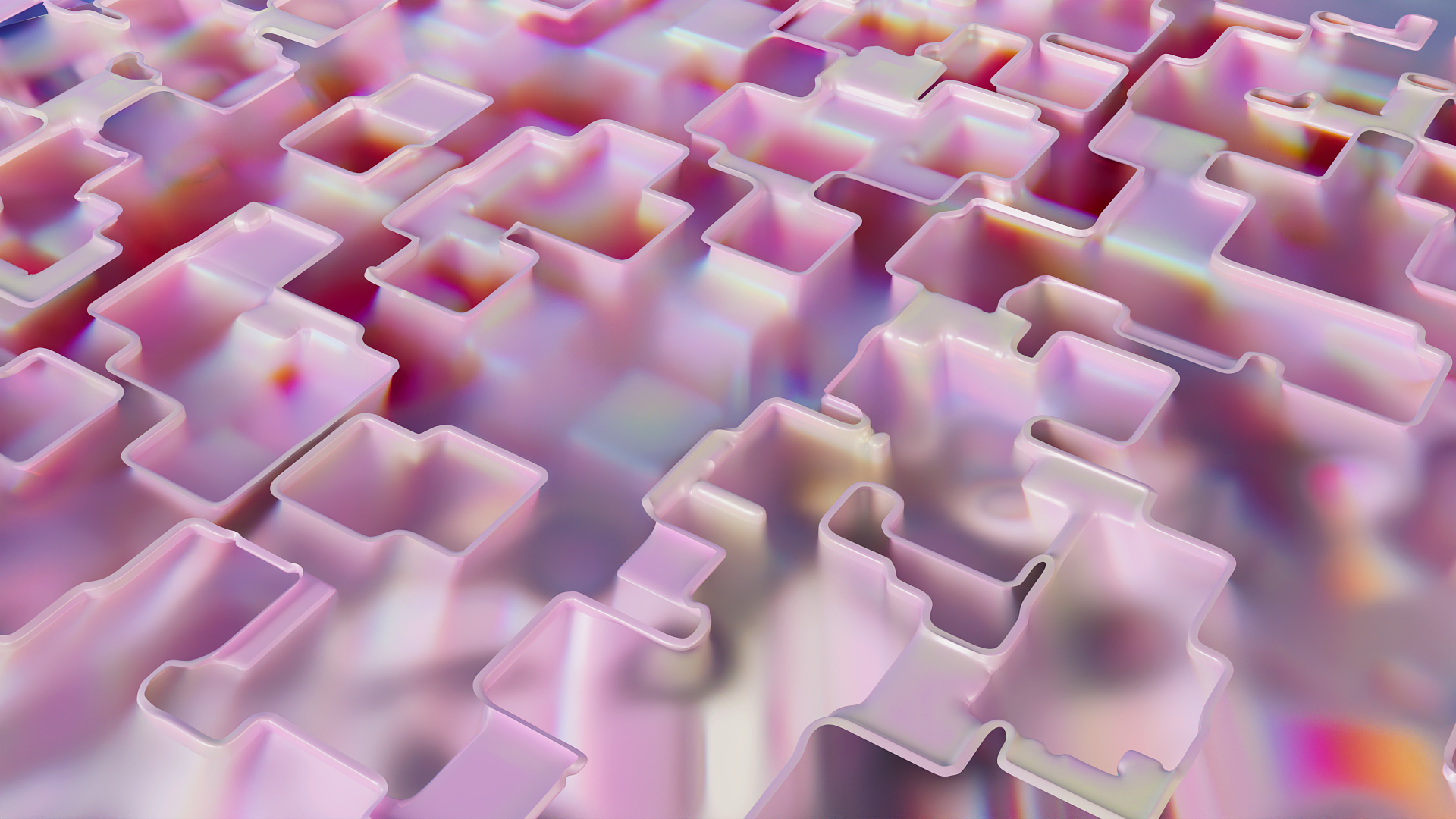
Ultimately we settled on this particular visual showing the interaction between the app’s icon and a thin clear membrane representing the threshold between the phone and the computer. You seen this membrane effect throughout the video.
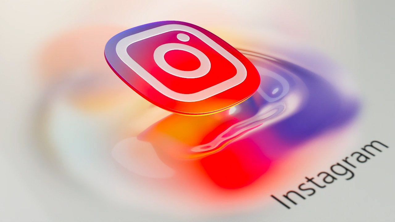
Below are different iterations of the icon aesthetics and its attempt to convey a flexible flow of apps in and out of the phone.
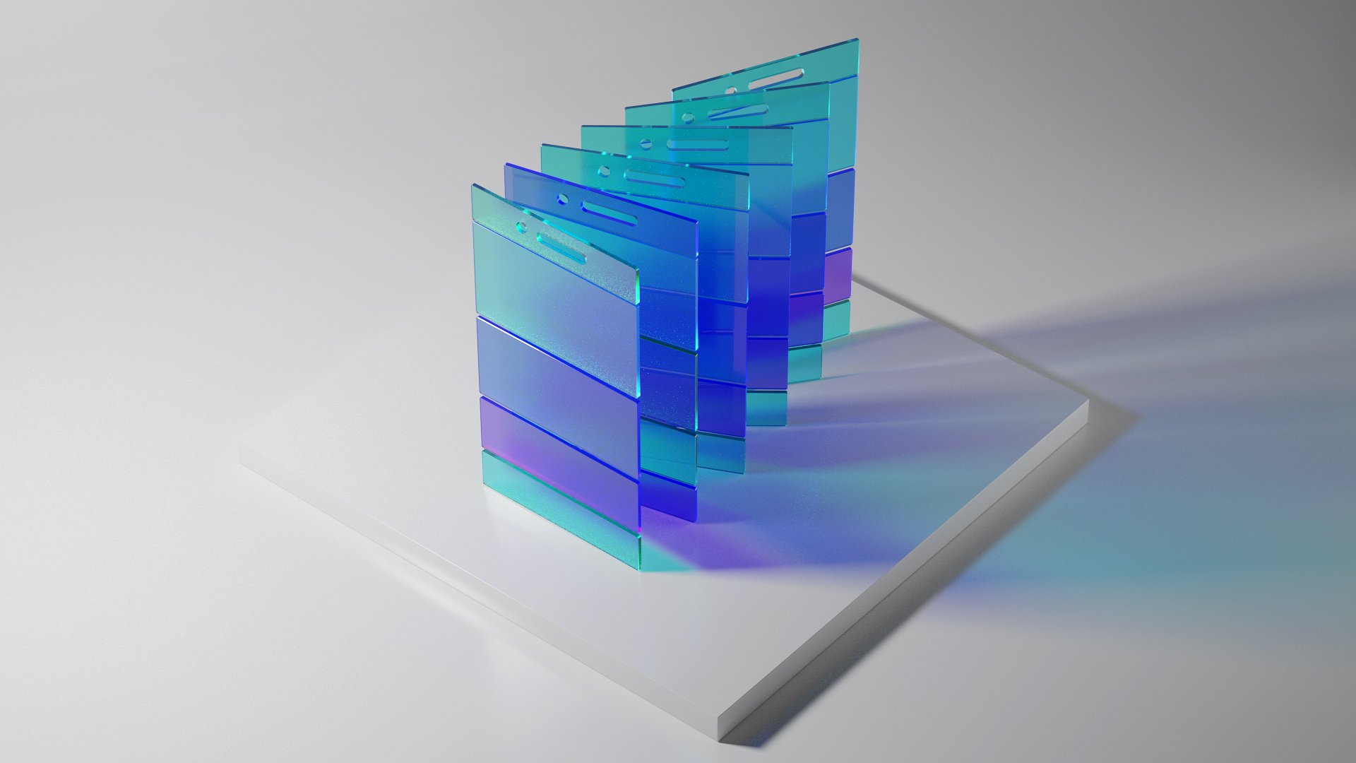
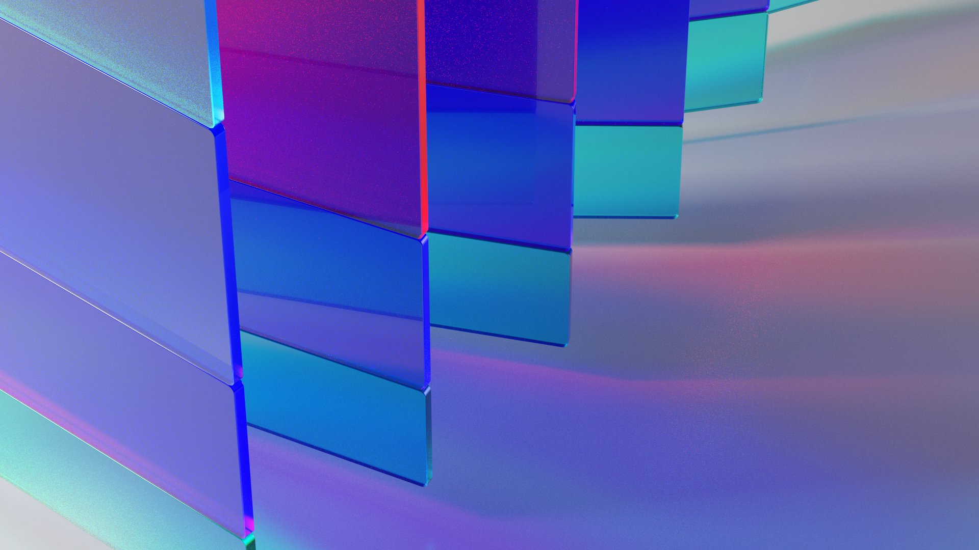
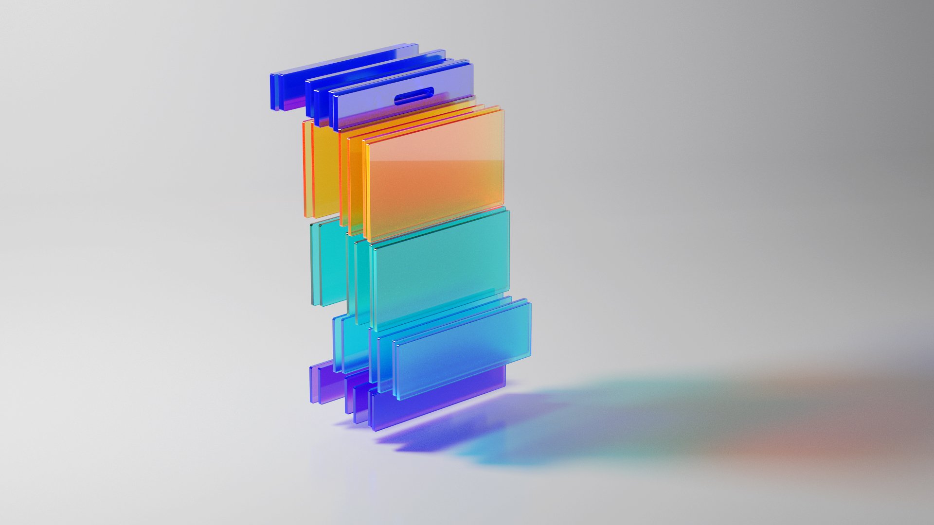
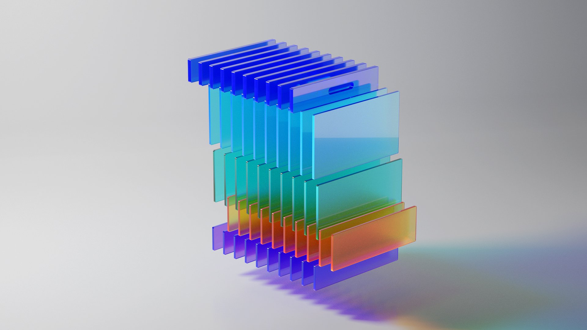
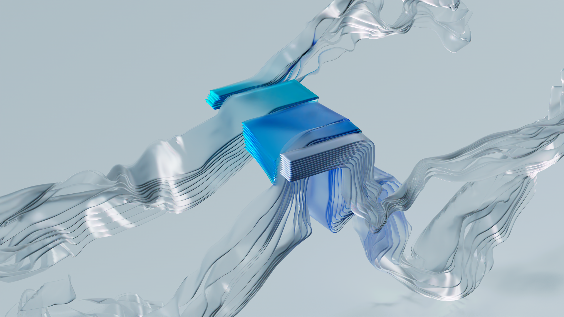
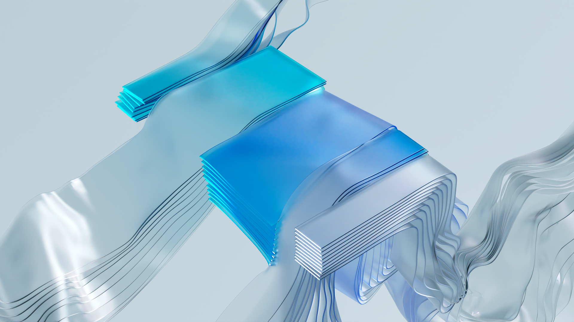
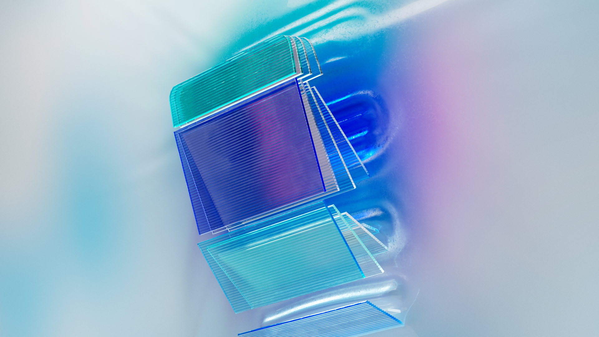
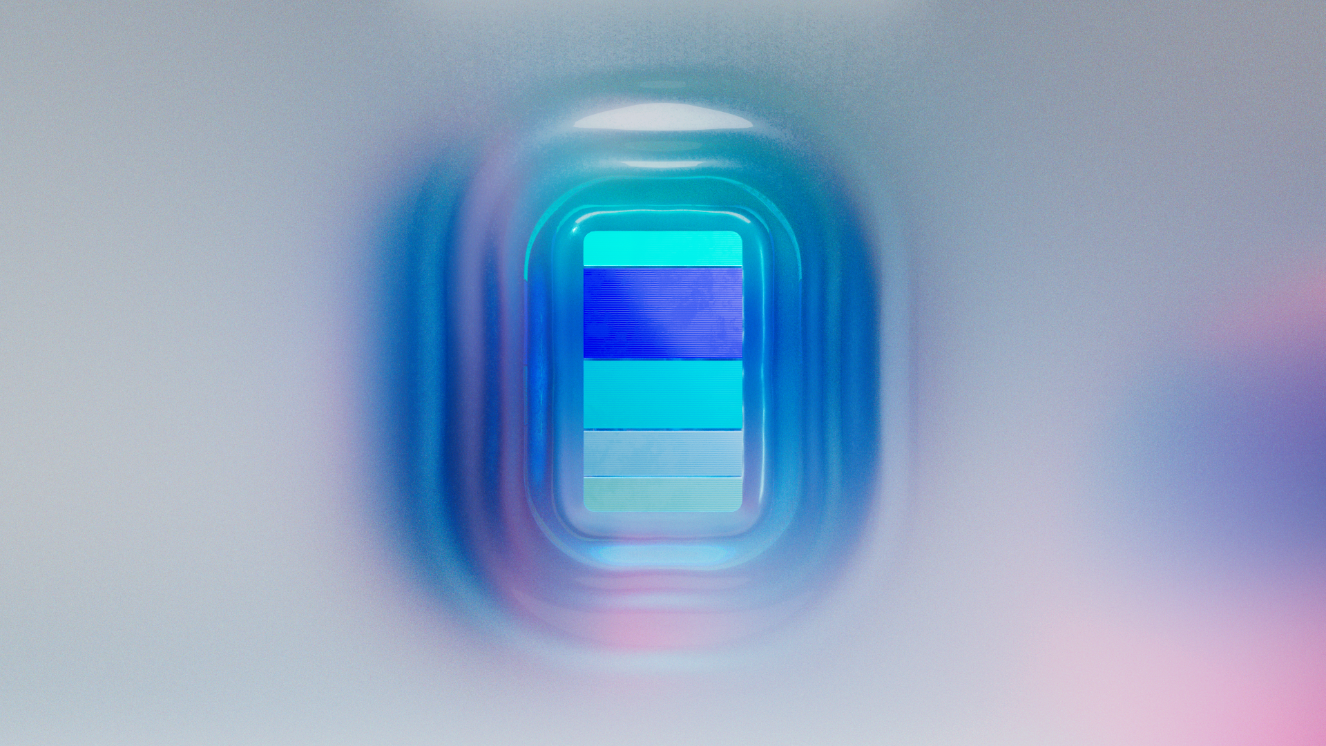
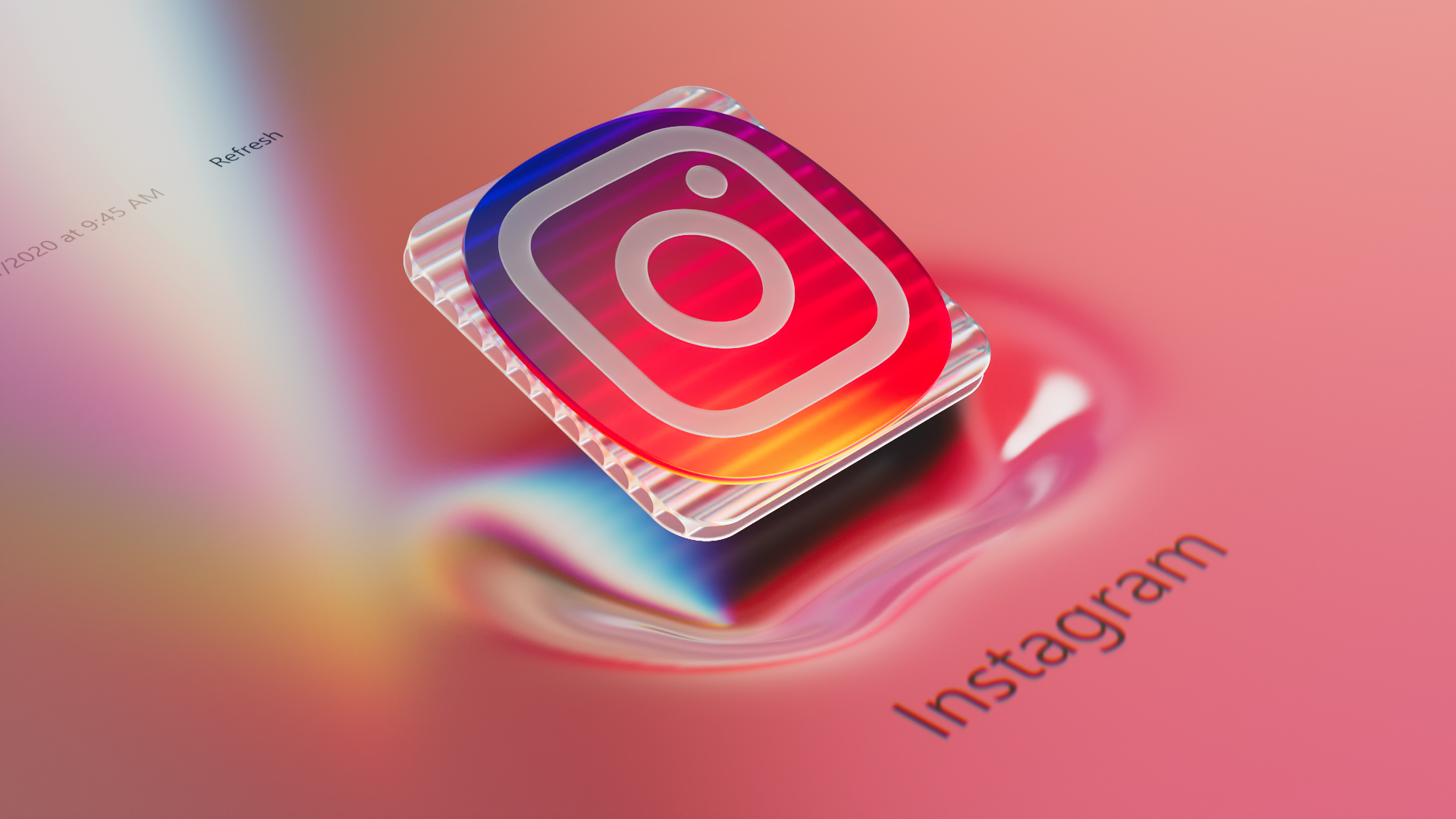
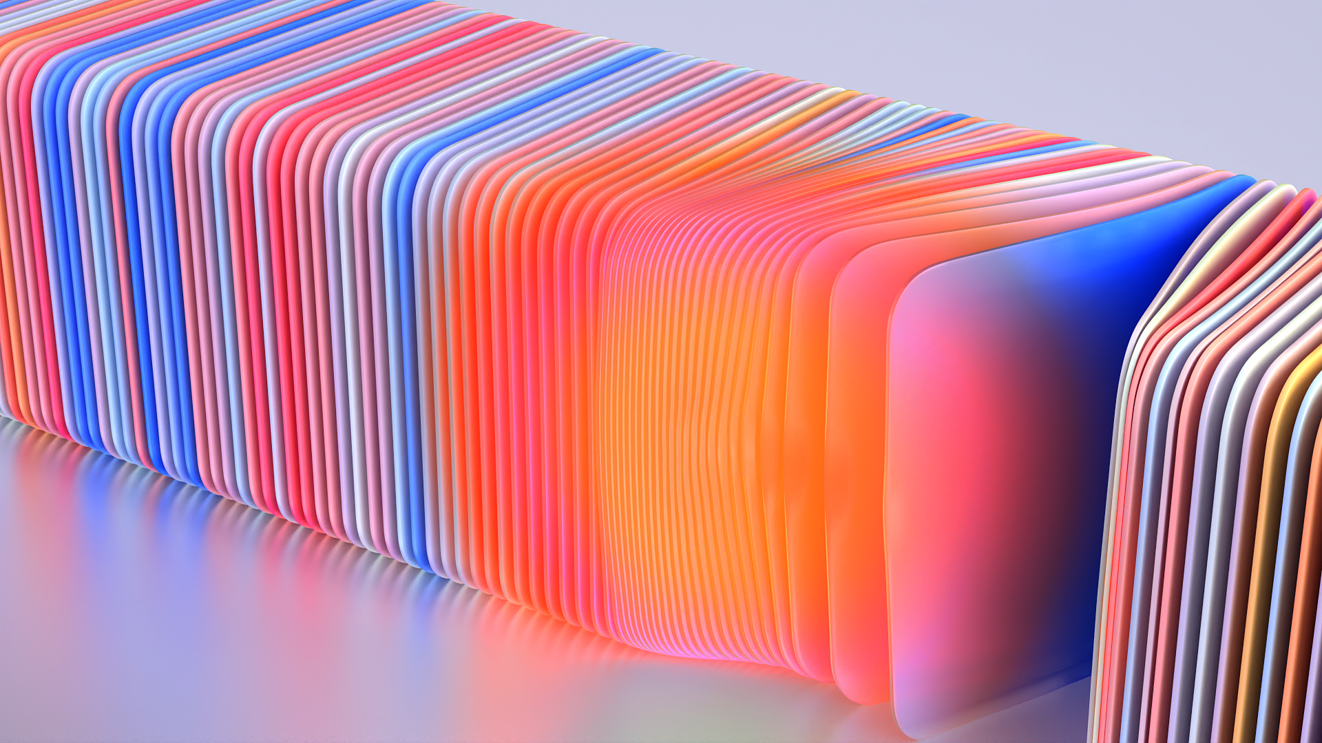
A render of YourPhone app in an abstract space representative of Windows.
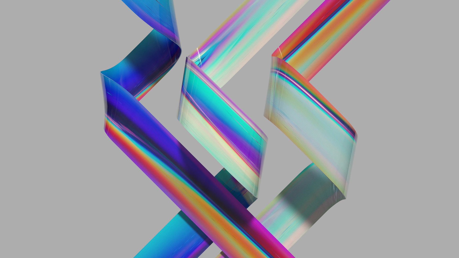
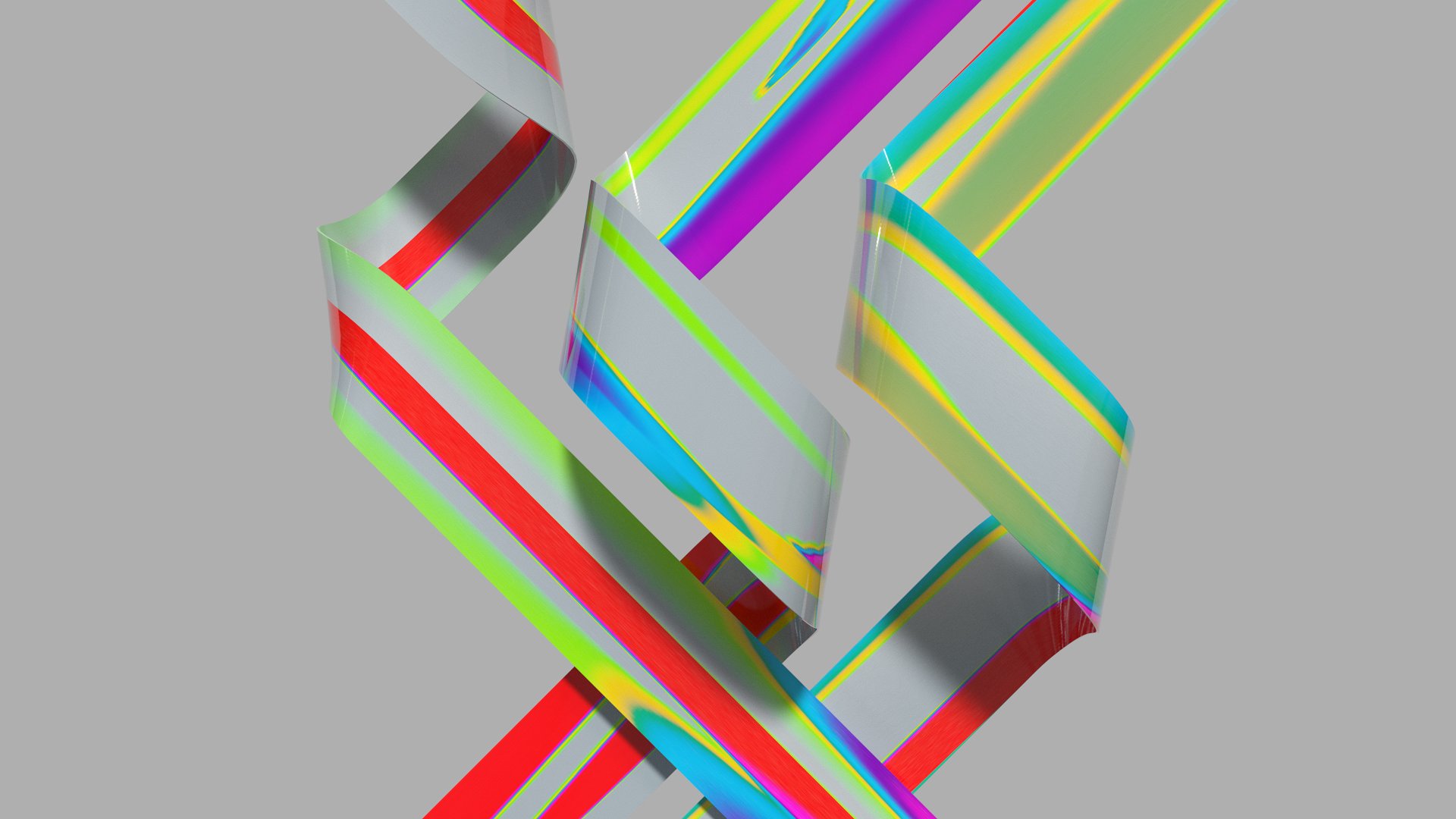
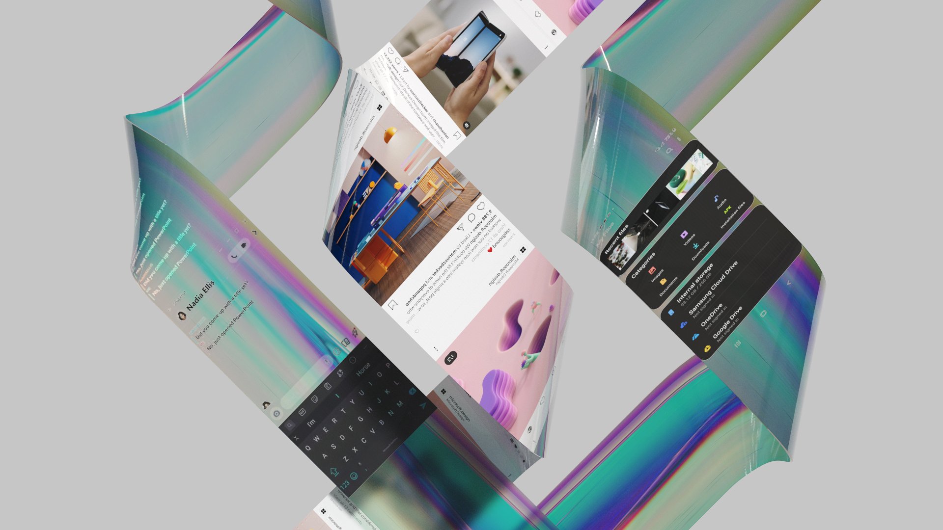
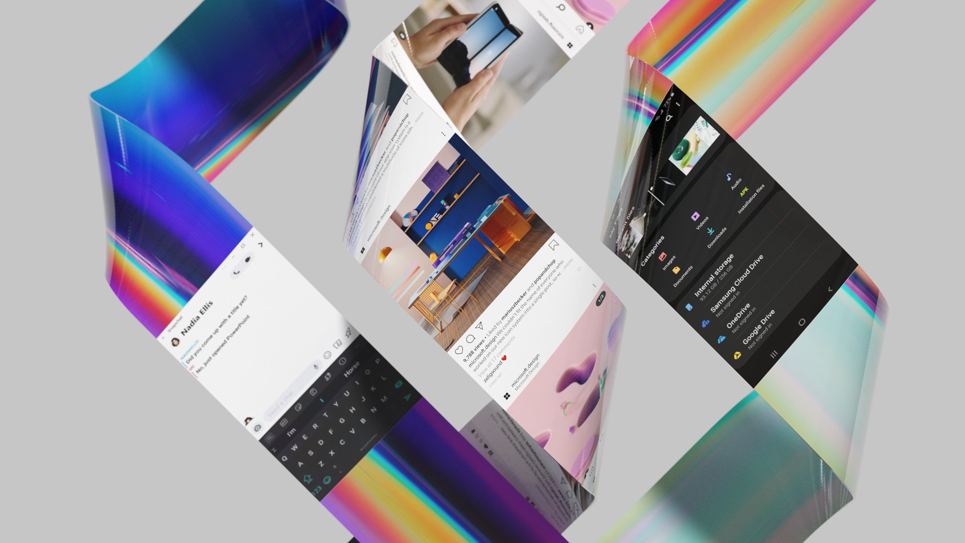
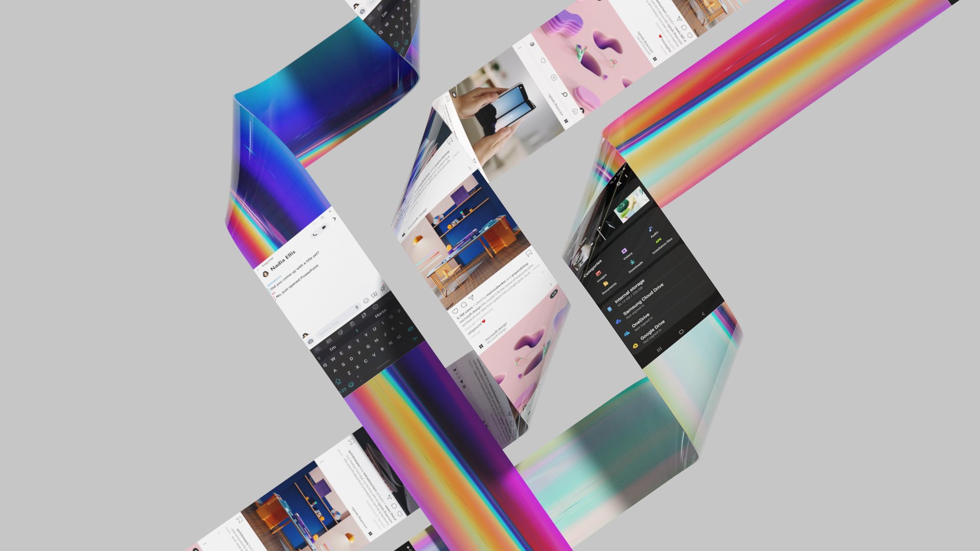
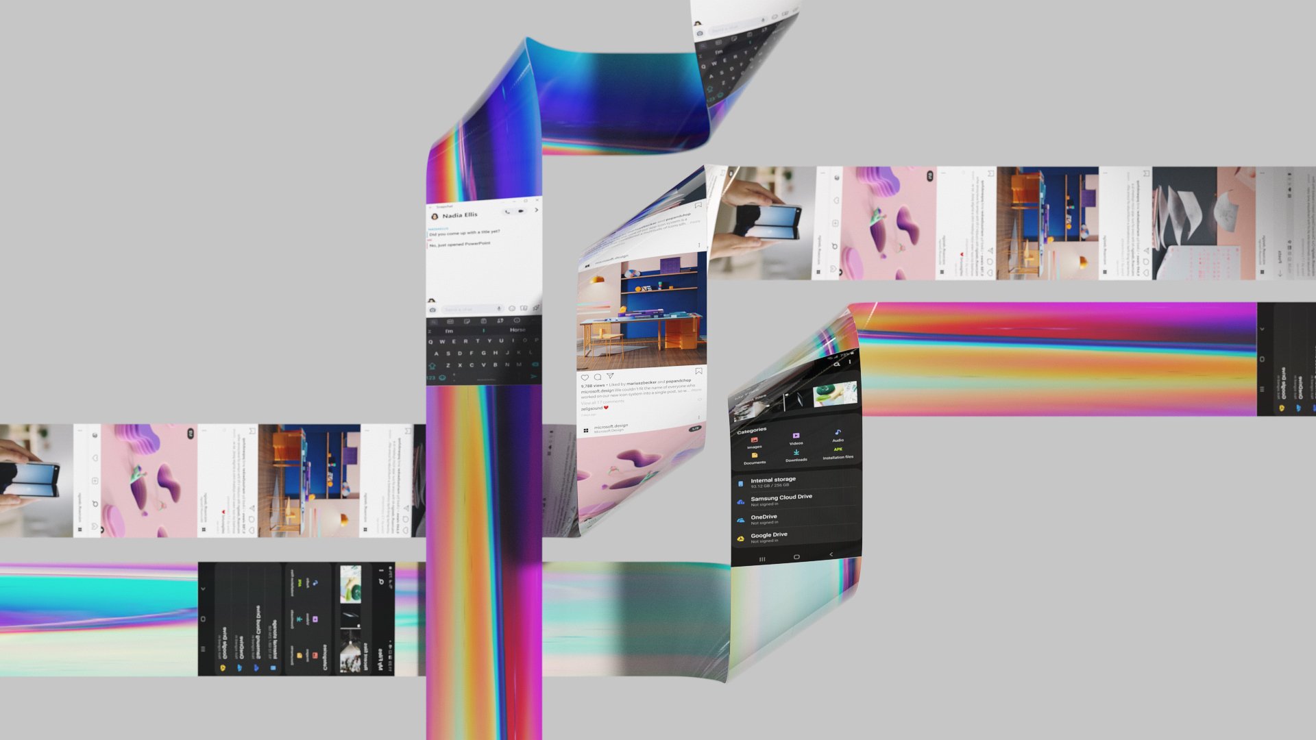
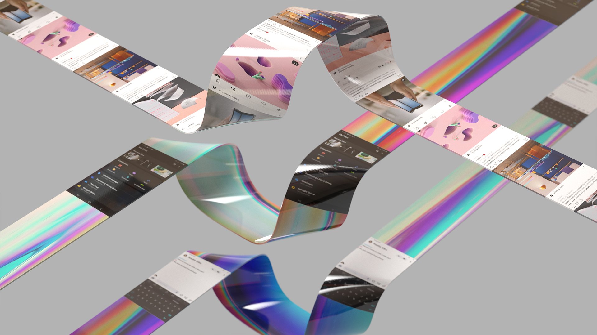
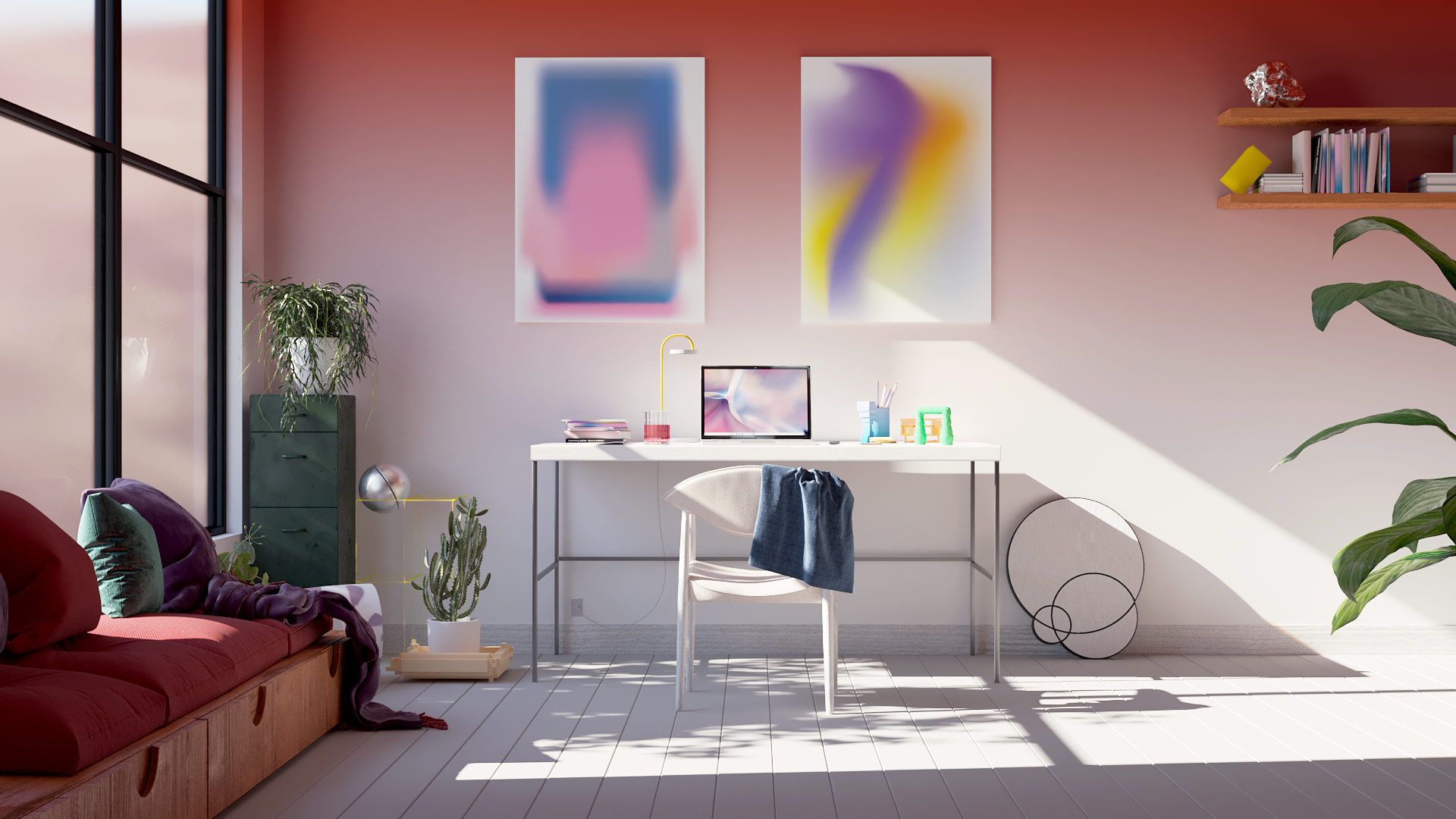
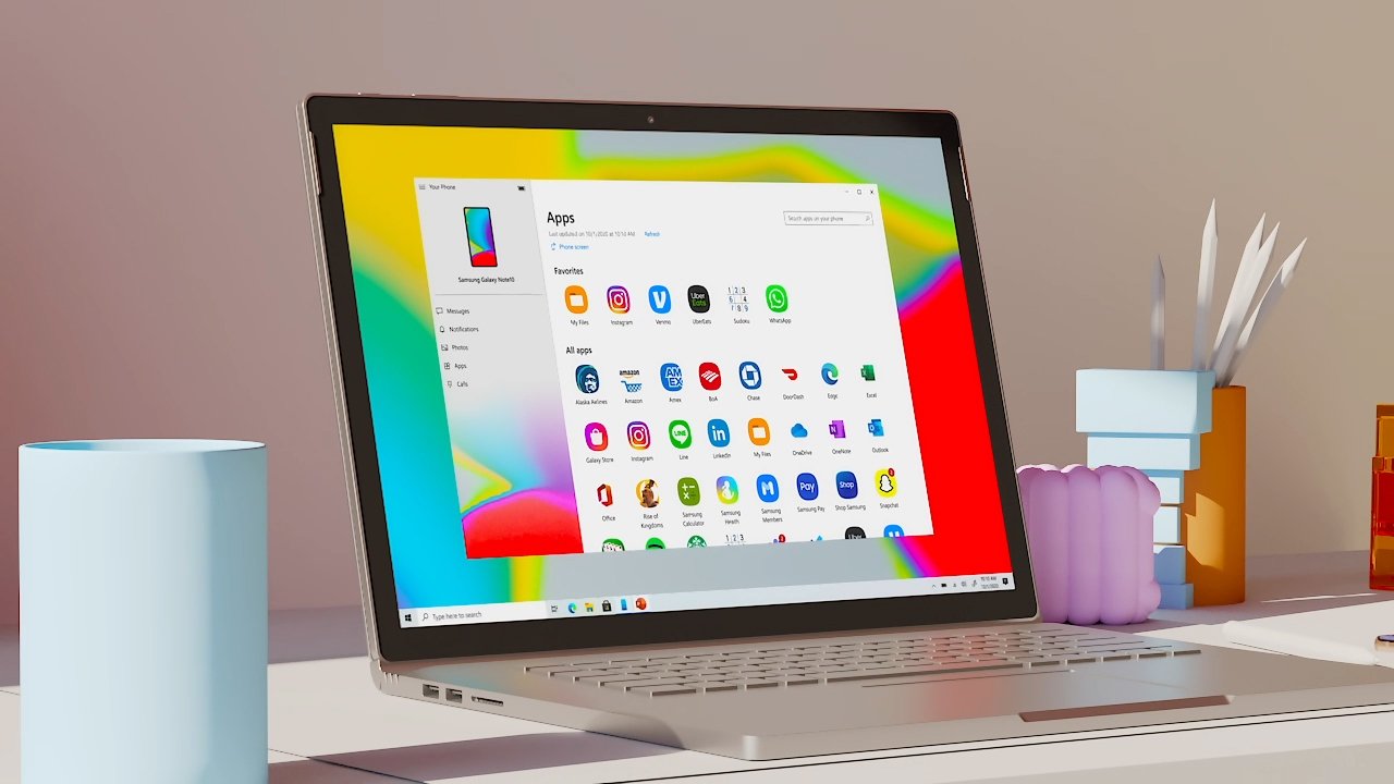
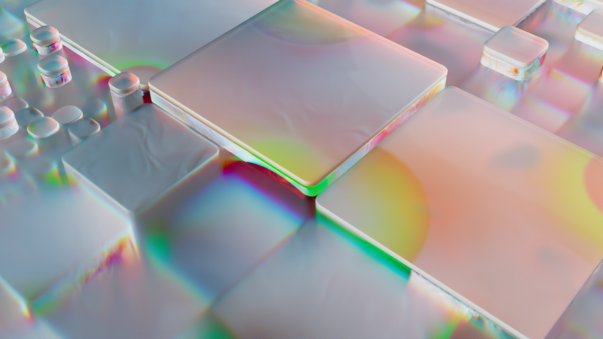
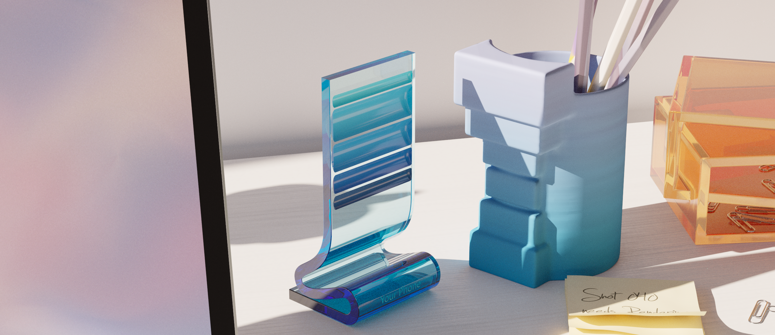
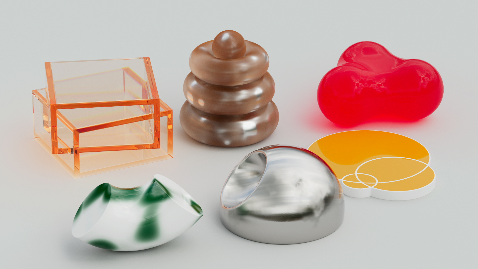
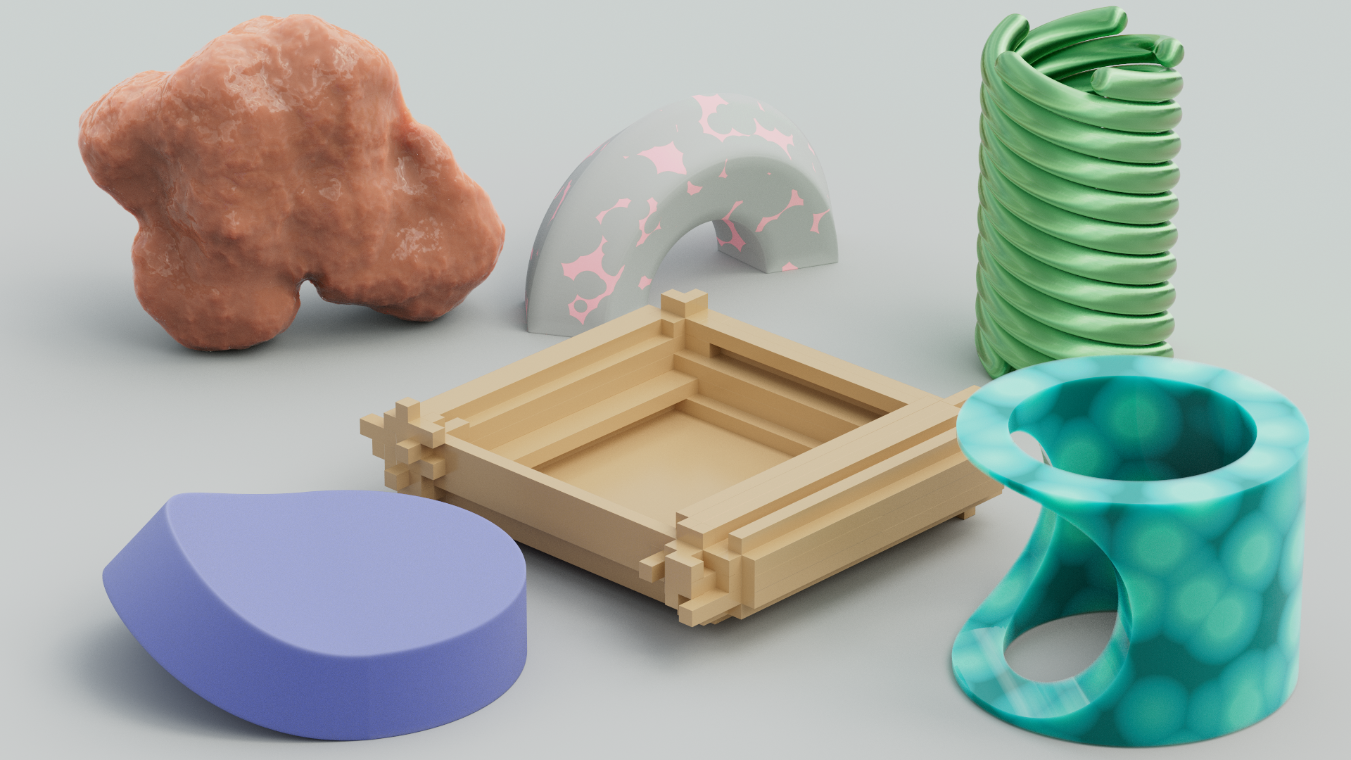
As in all other UX films I’ve directed for Microsoft, the design of the environment and it’s objects played an important role in setting the tone for the story and creating a strong bond between the product, the interactions and the brand itself. These are some of the look development shots.
Thank You!
Thanks to my product and marketing partners at Microsoft for trusting my direction in this film. The result is quite unusually wild and one I’m really proud of.
A massive thank you to my partners in the creation of this film: XK Studio and Zelig Sound. Your beautiful designs, animations and sounds made this simple story magical.

