Illustration Archive
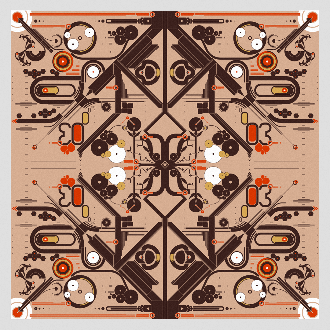
Before I learned about design and its application, I spent endless hours illustrating and painting. Then, as I began to work more from with a PC, I quickly adopted Adobe Illustrator as my primary tool. This page is a compilation of some of the projects I created between 1999 and 2012 for both print and web mediums.
In 2000 I created an interactive project called “Flatness Amongst Others”, which was hosted on what was my personal website then: hungryfordesign.com (the URL is no longer mine).
It was dedicated to hosting various collaborations with other artists in the form of interactive concepts and illustrated experiments. The site was part of a collective effort called “May First Reboot” where hundreds of digital artists and web designers committed to refreshing their pages simultaneously on May 1st, 2000. I was lucky to win that year’s prize for best website that year.
Above is a static preview of the actual site, which was quite unusual back then. This approach was yet very fitting for its time where web interactions were being pushed to new heights when web standards hadn’t yet been finetuned and acted as a way to challenge some of the sameness that was experienced on the corporate web projects in those years.
Before the site was officially launched, it featured the splash screen seen on the right, which in its original format also had music and some minimal animation. A reminder that in those days the web was much less structured, without the large platforms we all use today, hence being more receptive to experimentation.
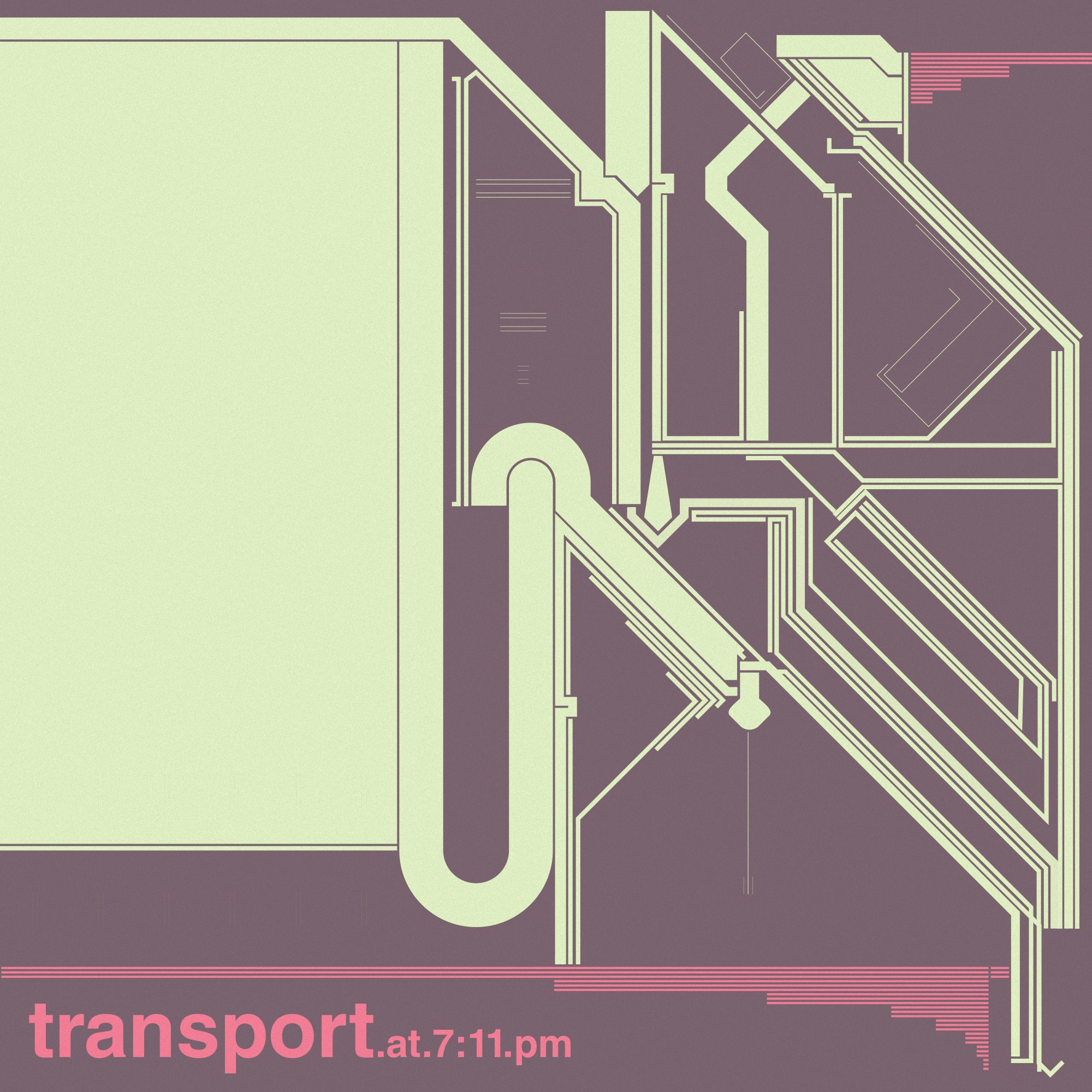
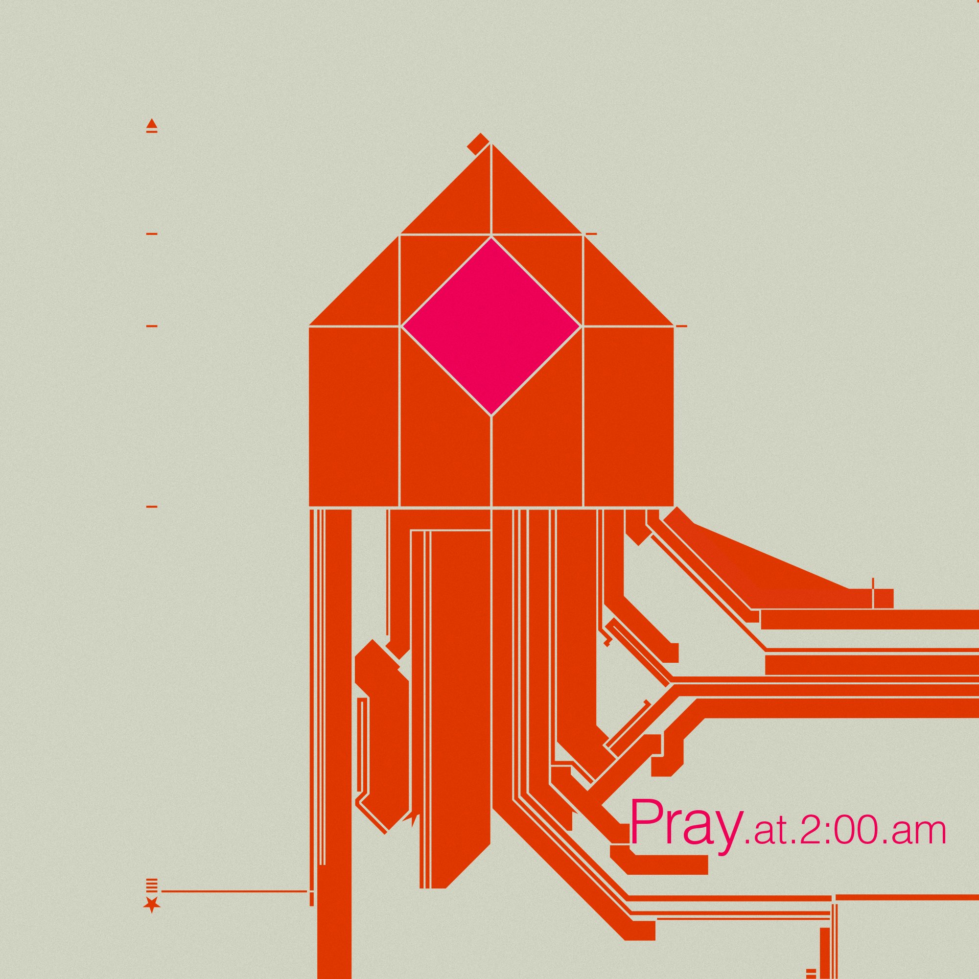
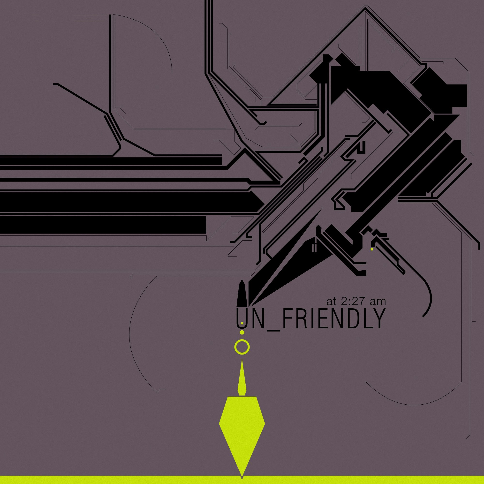
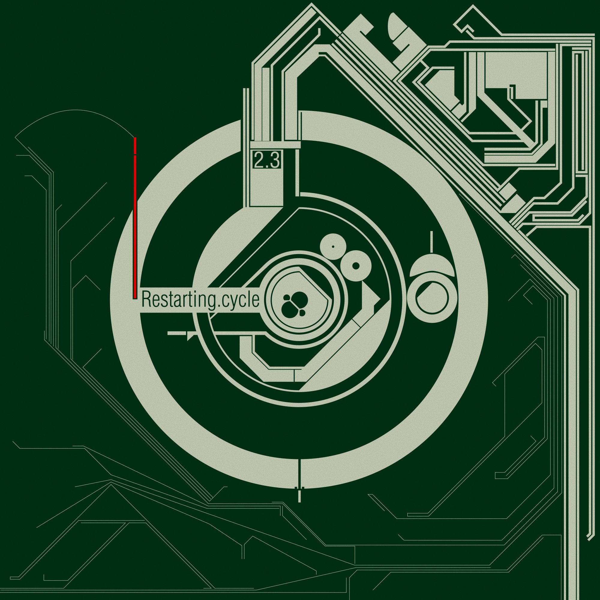
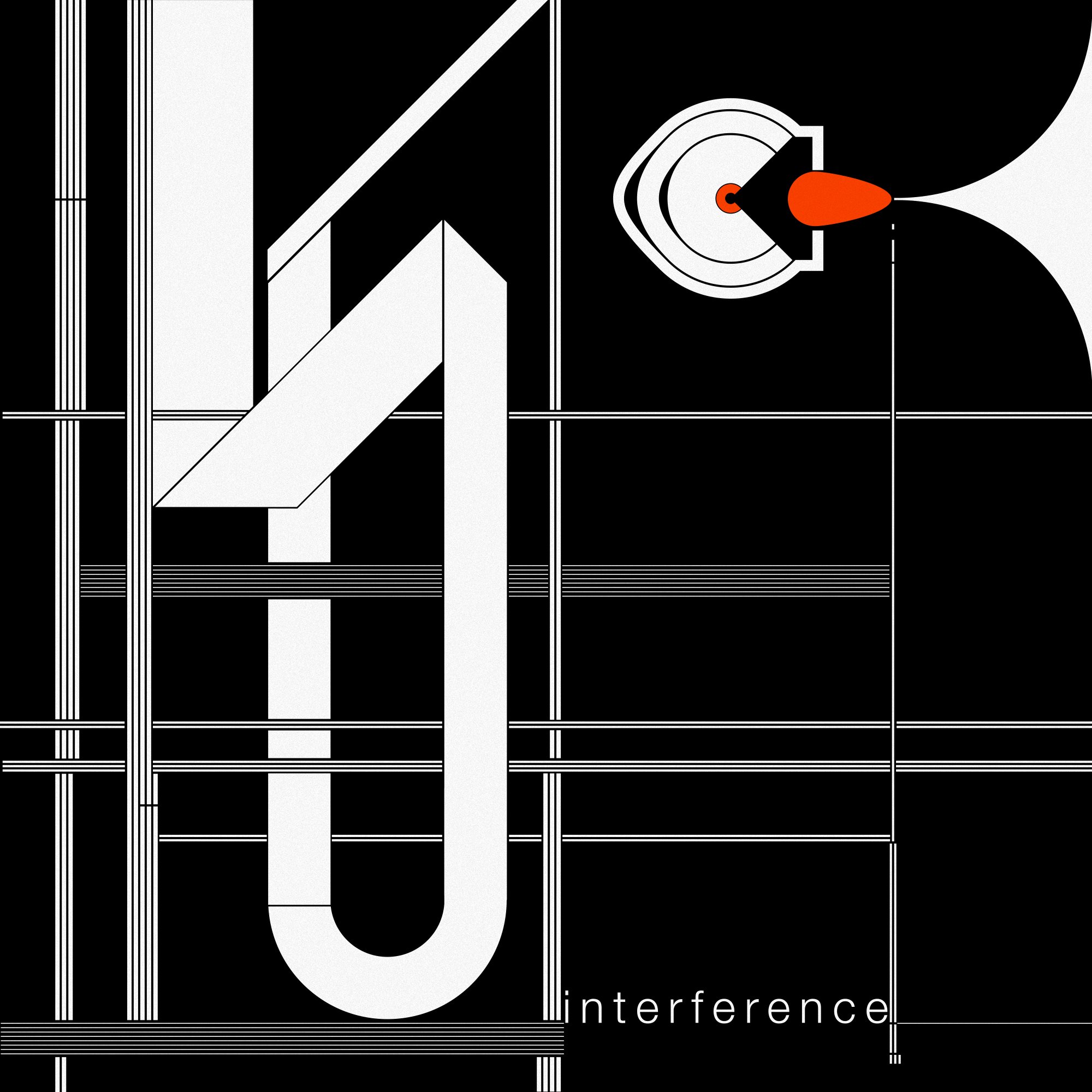
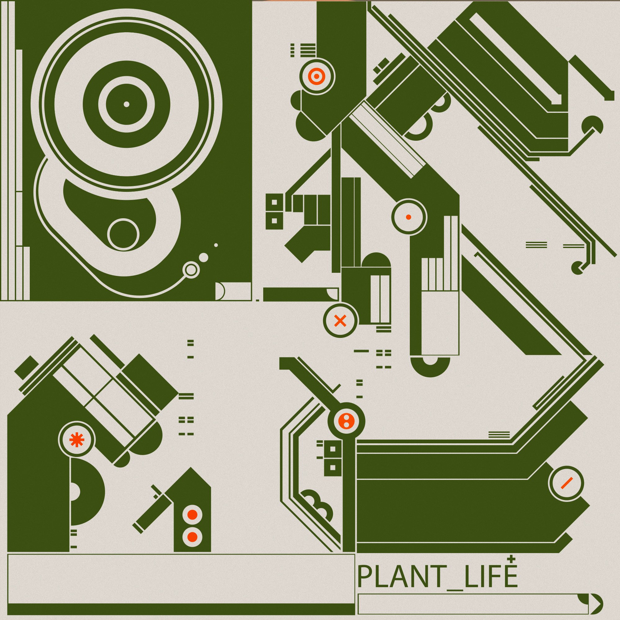
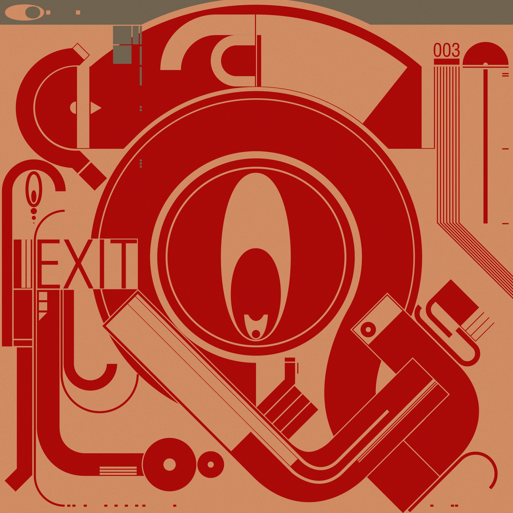
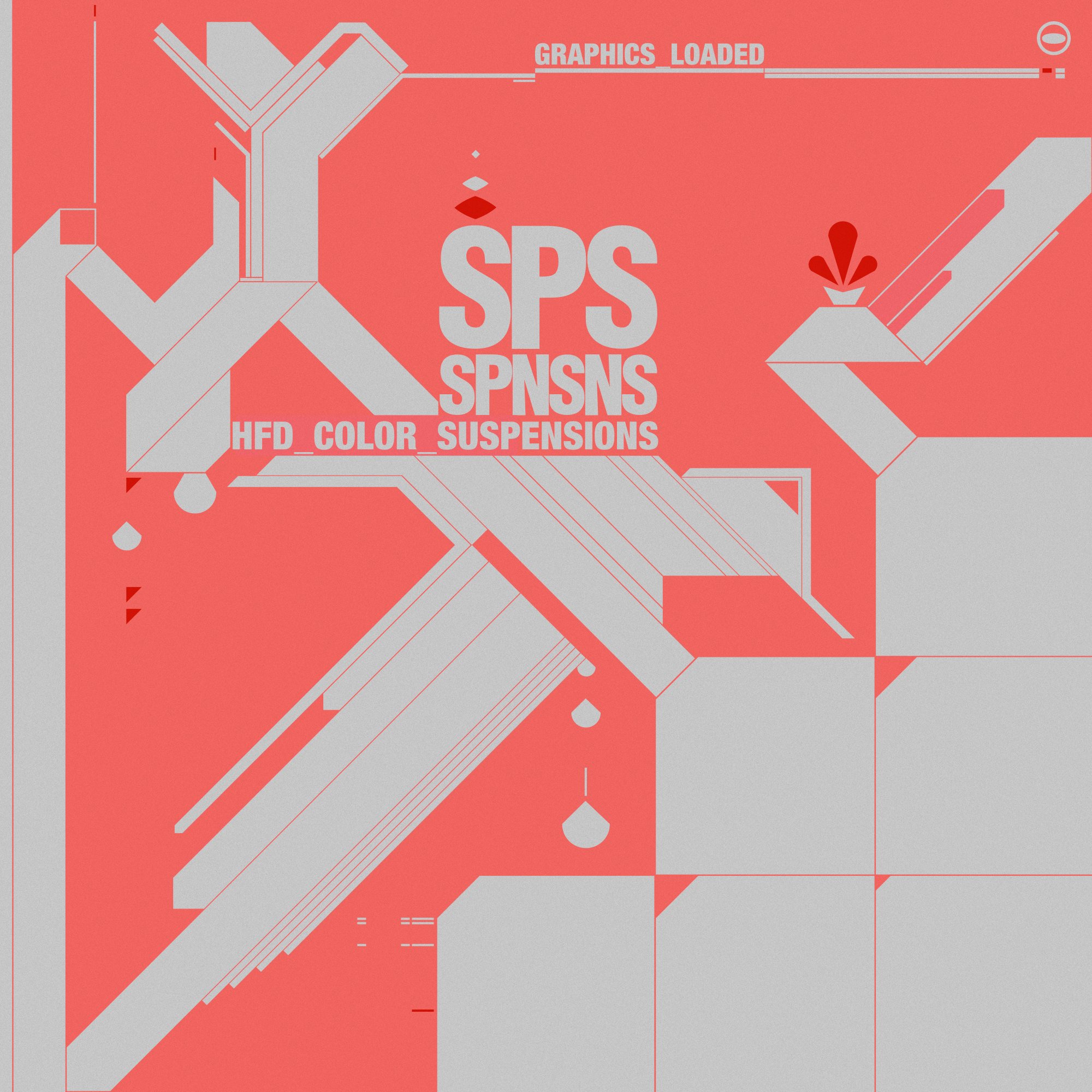
As part of the site, I created this series of illustrations named “Color Suspensions”. They were all created spontaneously without much planning and were intended to capture a particular mood or feeling at any given time. The exact words and time were later re-considered and inspired by the image itself.
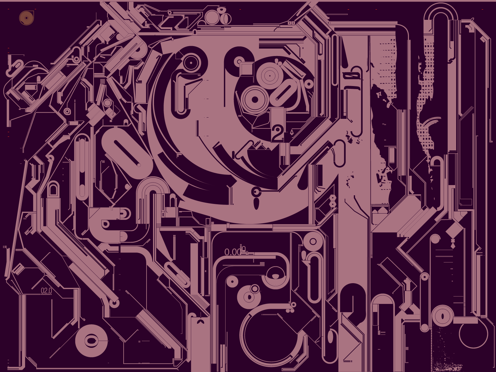
It is clear to me that at the time, I was heavily influenced by my surroundings in NYC, as well as by Russian constructivism, and modern Japanese graphic design.
I let these influences come to life in spontaneously via these reductive tritone images that were in ways evocative of my experiences in the city.
As patterns

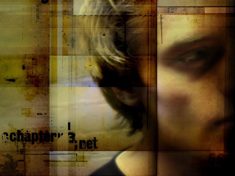

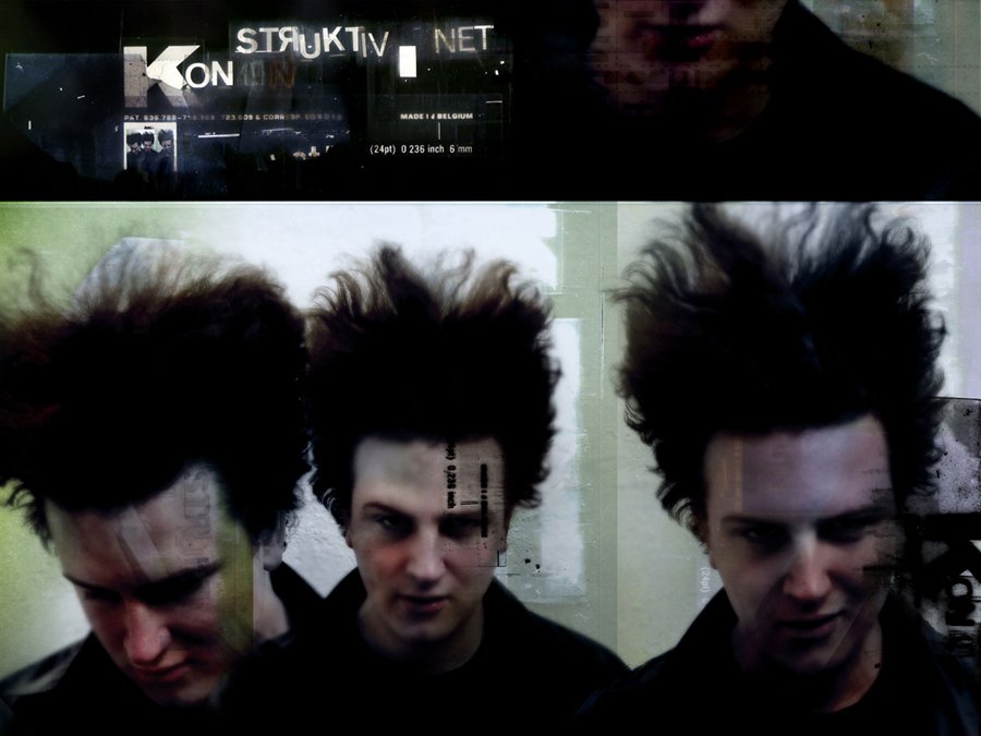
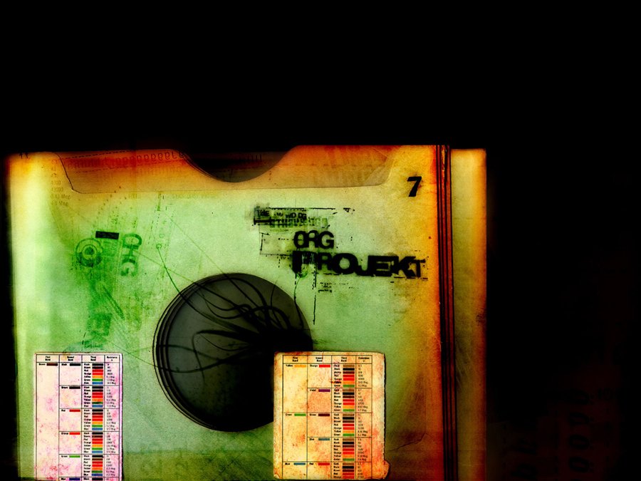
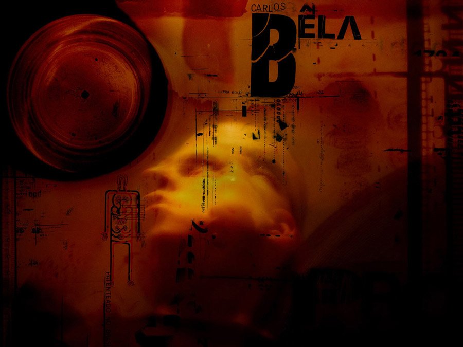


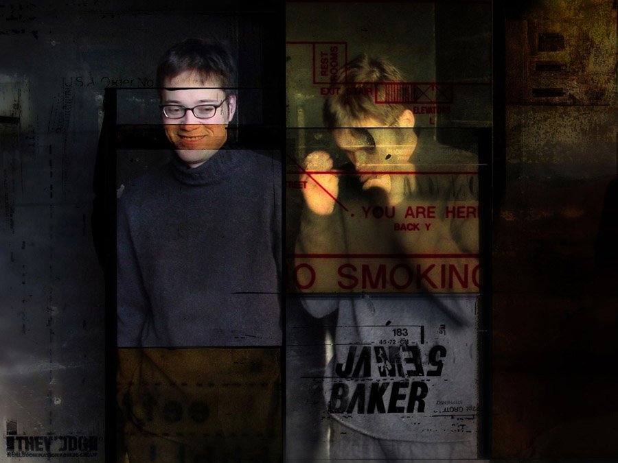
In 2001, I was inspired by the idea of fusing custom typographic designs with intricate illustrations. I found this additive creation process to be mediative, and it helped me solidify my personal aesthetic in the following years.
Often the idea letterforms came before the images, but often their production happened in parallel. Above is a poster created for Threadless called “Phallic Attachment”, and on the right another called “Chaotic Dialogue”, is a collaboration with a design shop called Derush (no longer in business).
Visit this page to see some of these bespoke fonts in more detail.
Above is my contribution to IDN’s Flips book Music vs Motion, and below were illustrated elements for a video I created for Nike Presto.
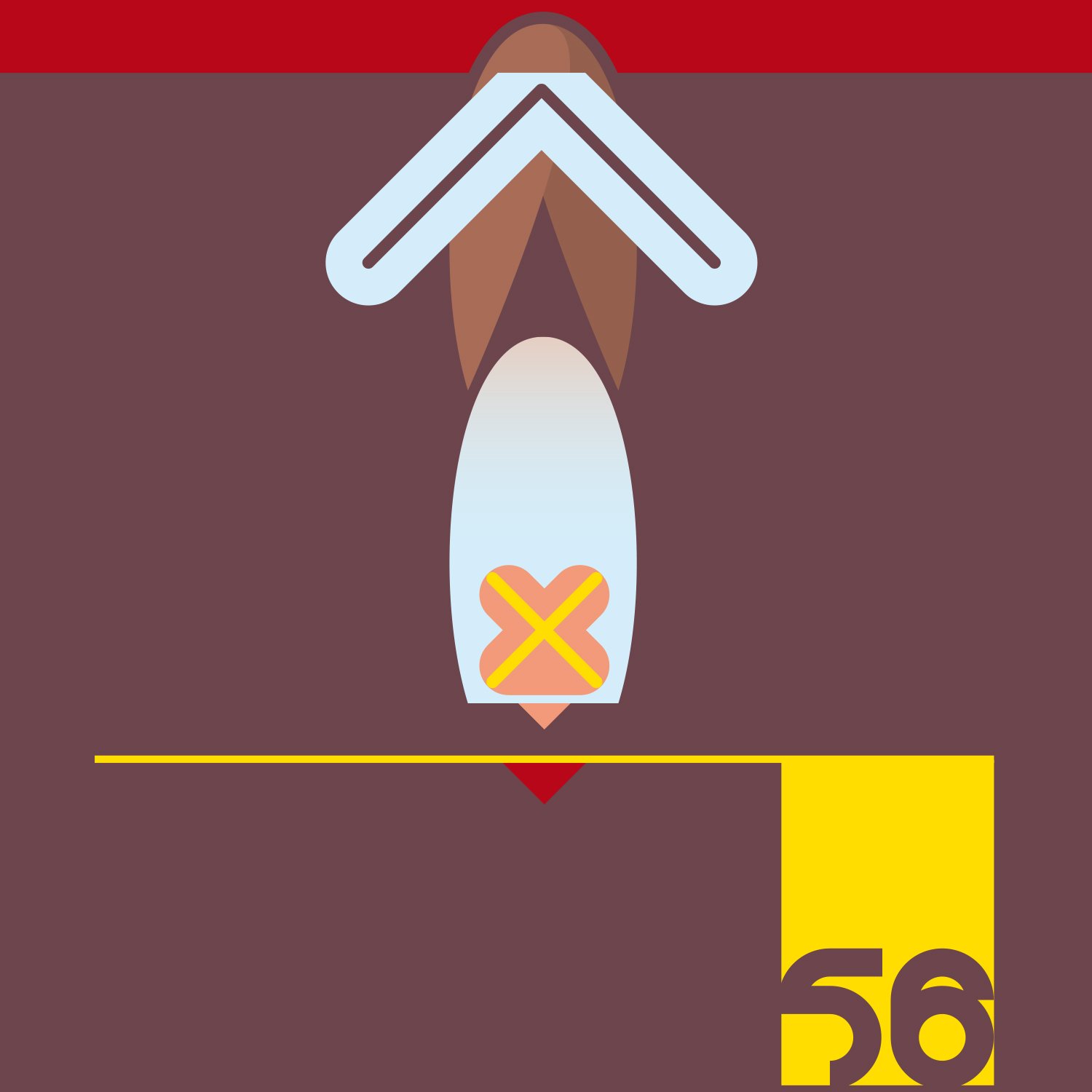
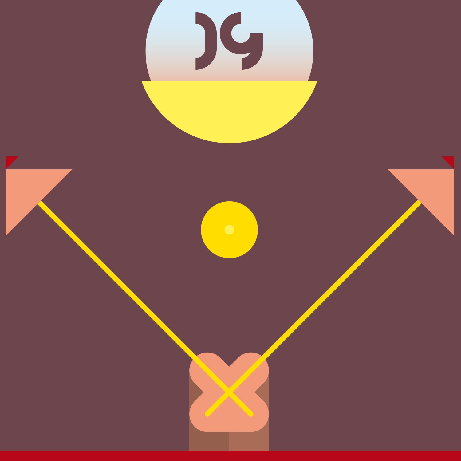
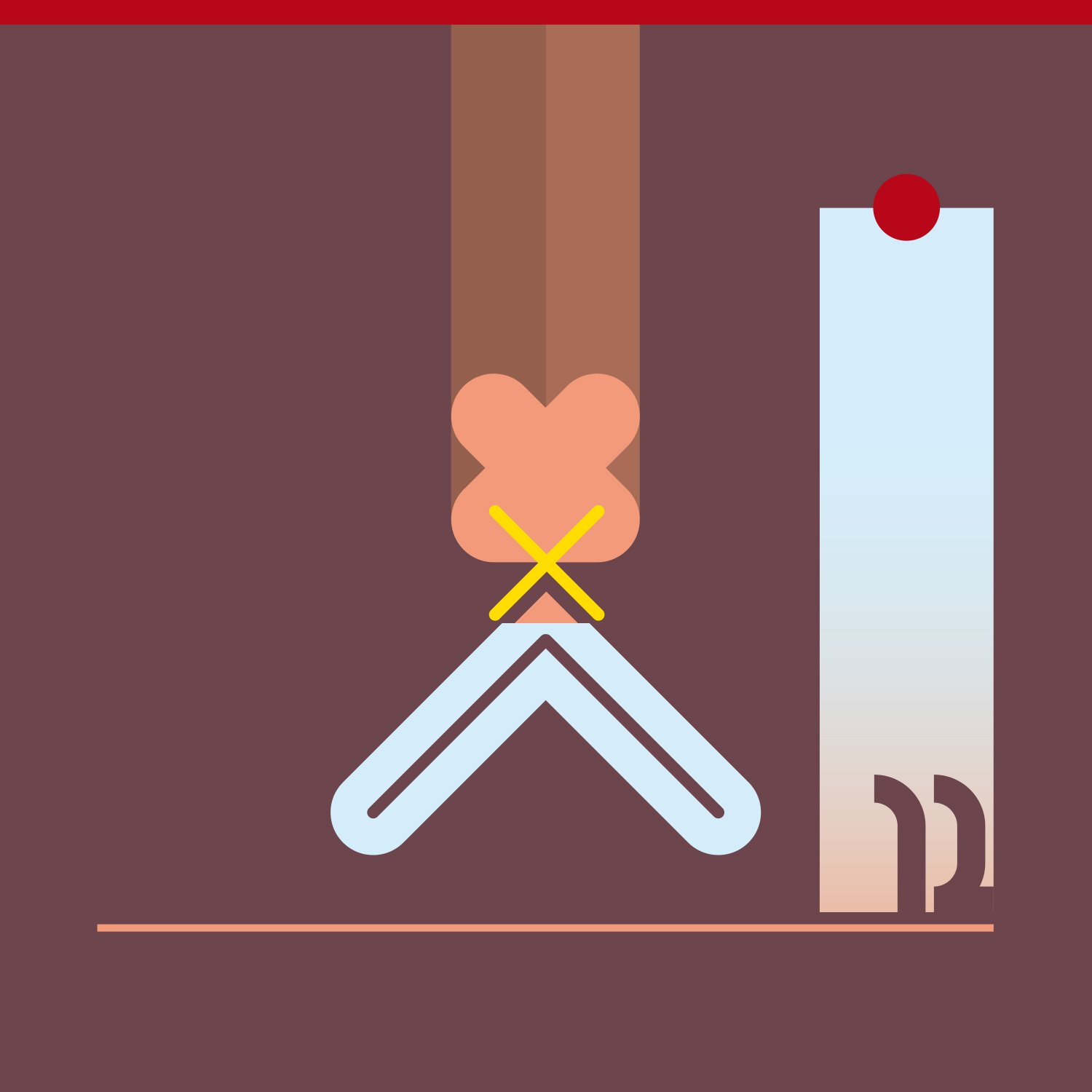
Poster for NYC-based magazine The Blow Up.
Cover and internal design for DVD of my motion design agency Nervo, 2008. The images below were commissioned by Atlanta-based company Artistic Image.
As motion design became my focus, I began to bring this aesthetic into those projects, which in turn pushed me to think differently about them as static artworks to begin with. All of a sudden, I was compelled to convey movement in every design I made, making them more interesting to create and interesting to look at.
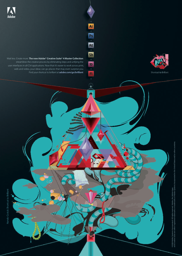
Below is an Artist Series project for Adobe, which I named “Build”. On the left is the process of creating the image in Illustrator and on the right is the final piece, which was animated entirely in Adobe After Effects.
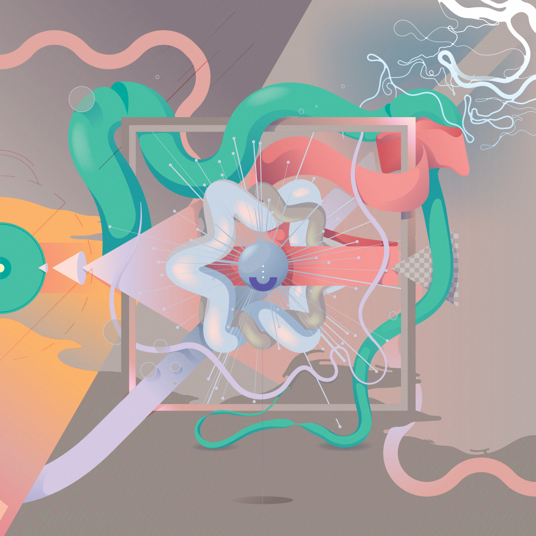
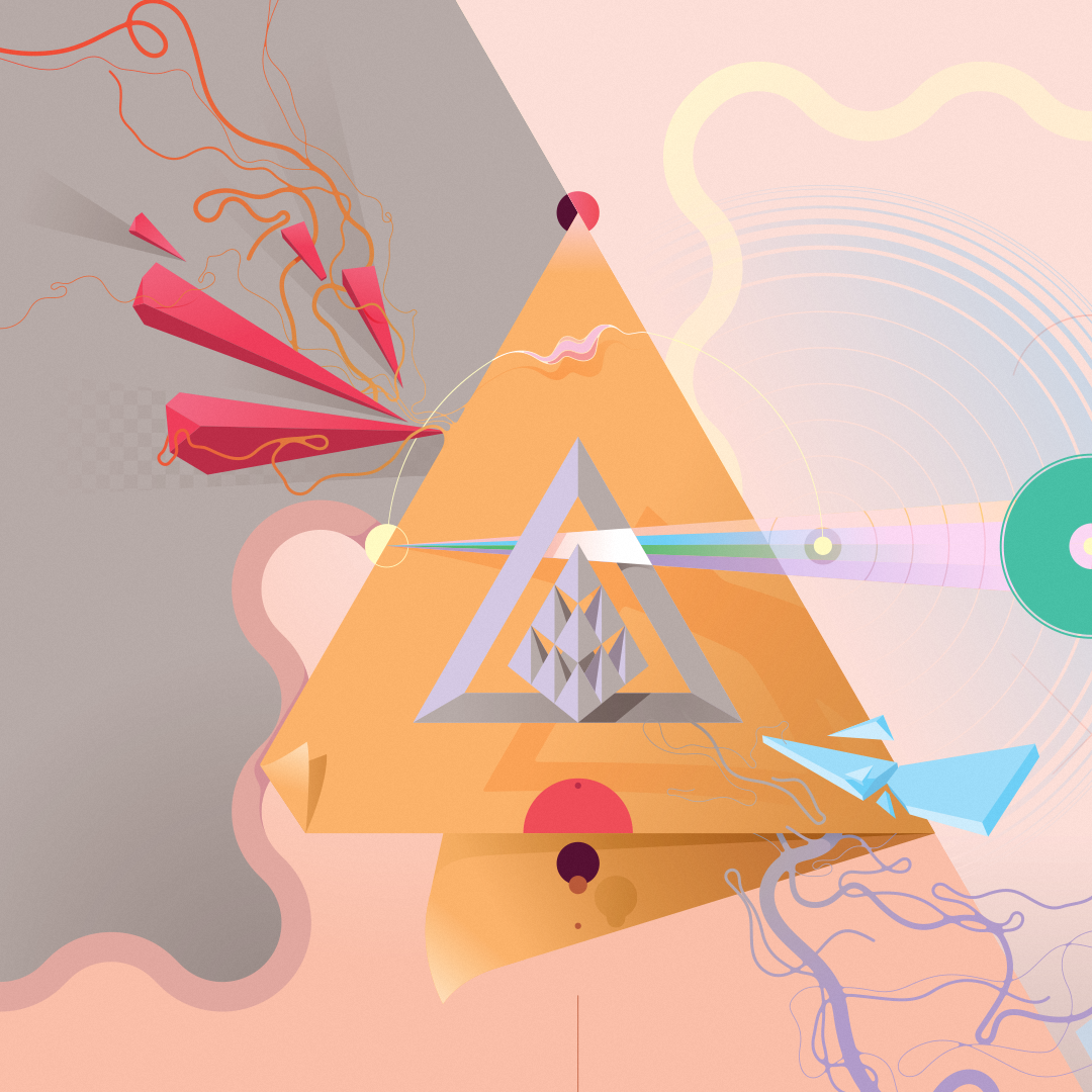
Poster for music artist Plastiq Phantom. Each section of this poster was reflective of one of the album’s songs, all of which came together into one complex composition.
Illustration for Absolut Vodka, depicting Absolut Mandrin flavor.
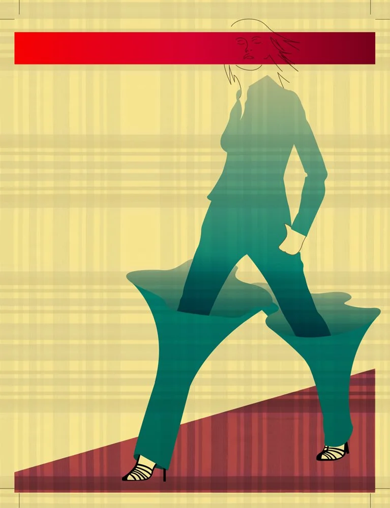
An illustration for Complex Magazine.
An illustration for the late design blog Design is Kinky.
An illustration for the late ad agency Modernista.
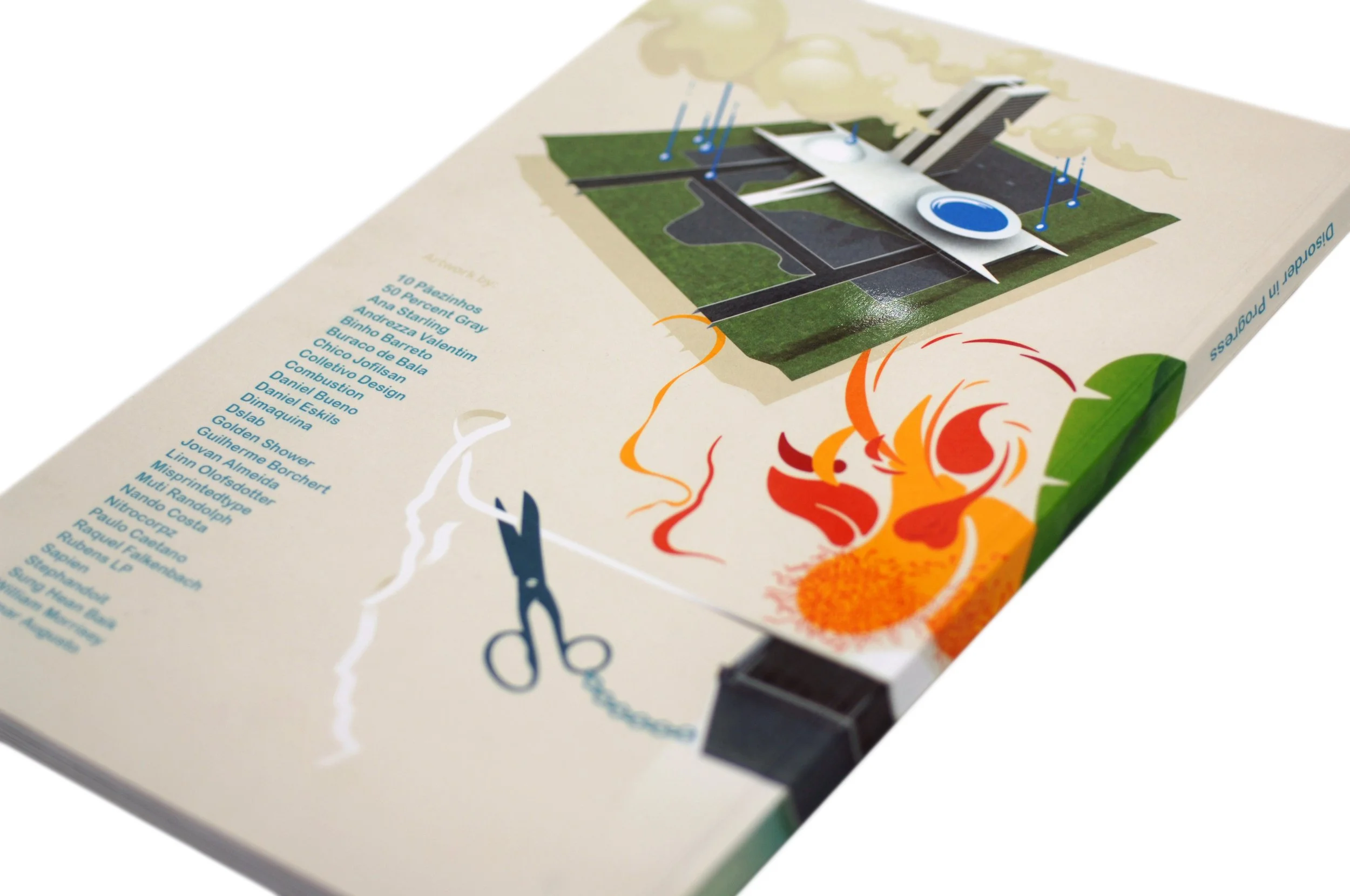
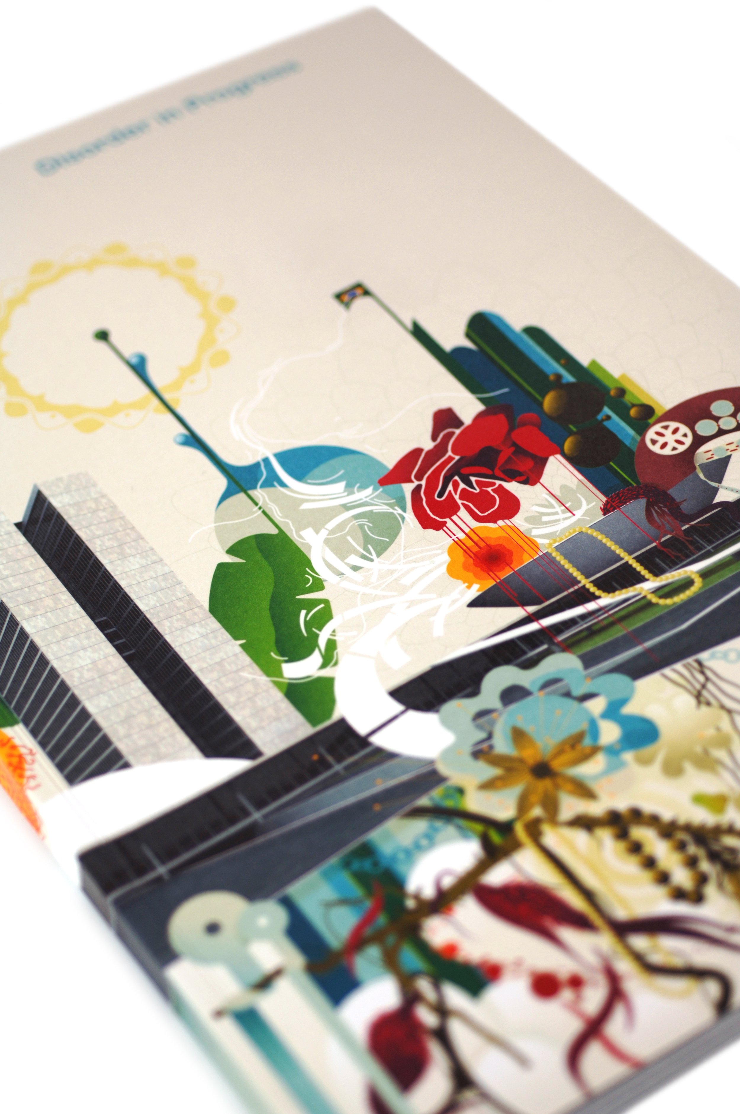
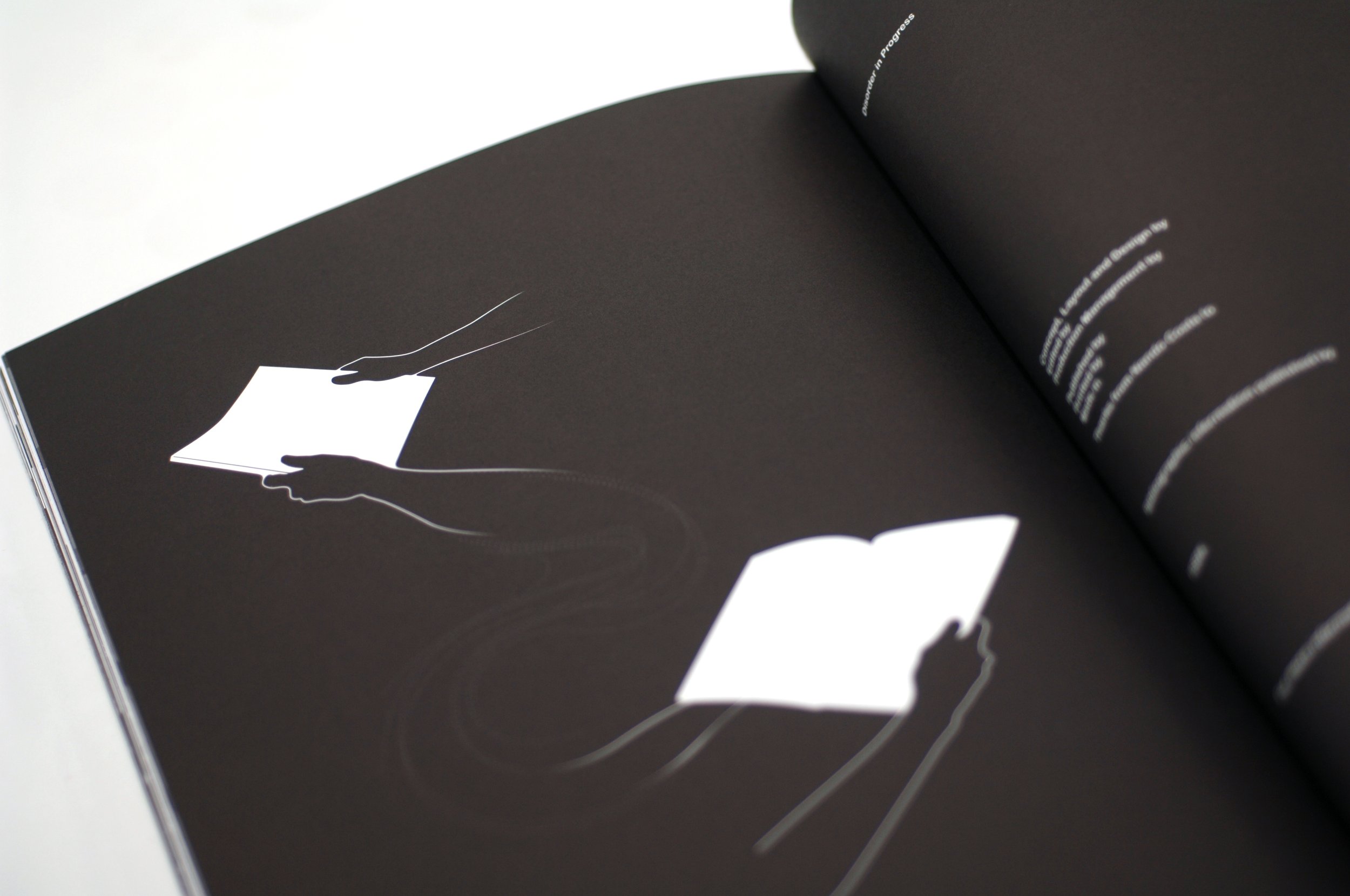
Cover design for Disorder in Progress, the second book I curated for Gestalten.


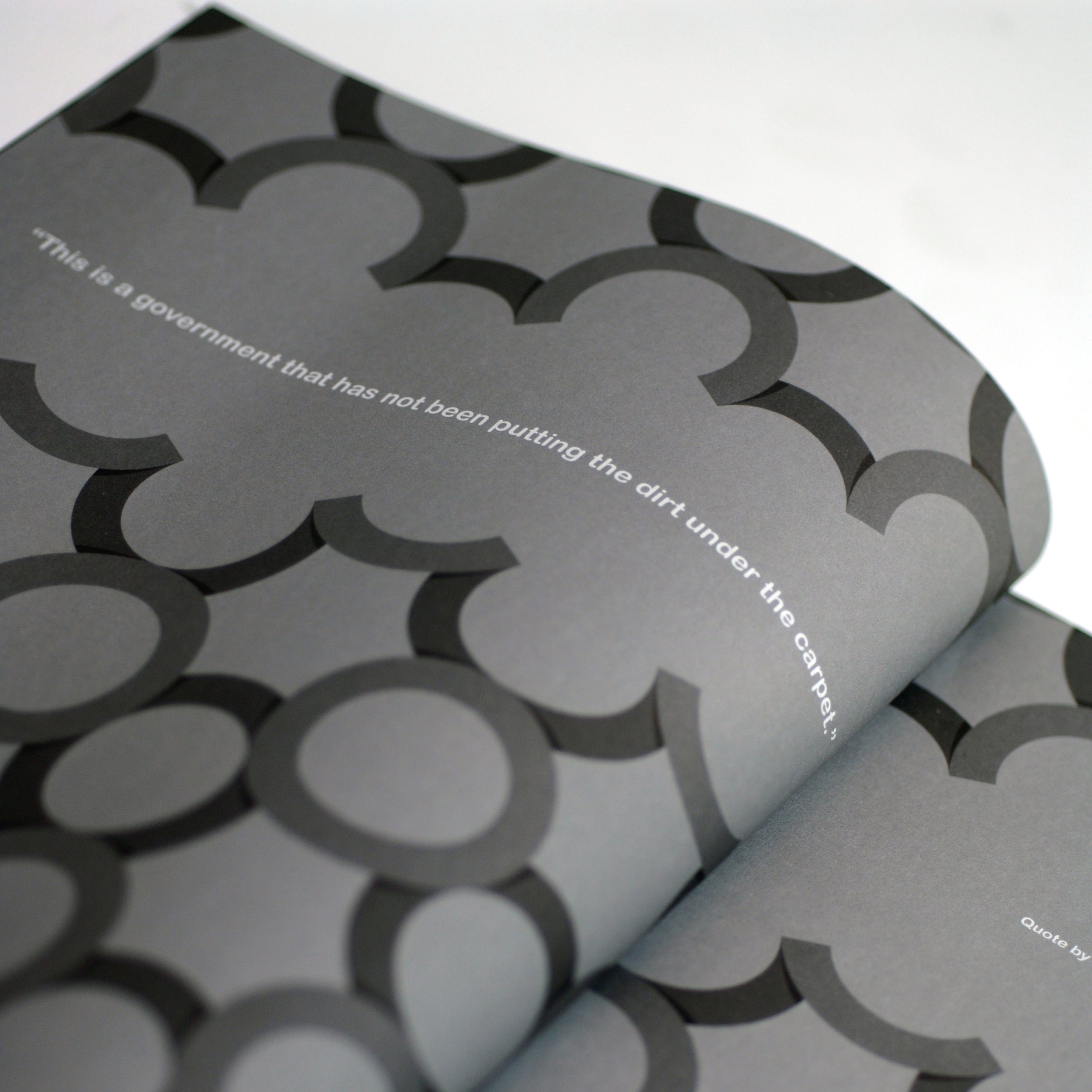
Two illustrations for the book Latino.
A self-portrait for eDesign Magazine, and below are illustrations for Brazilian magazine Simples created in collaboration with Linn Olofsdotter.
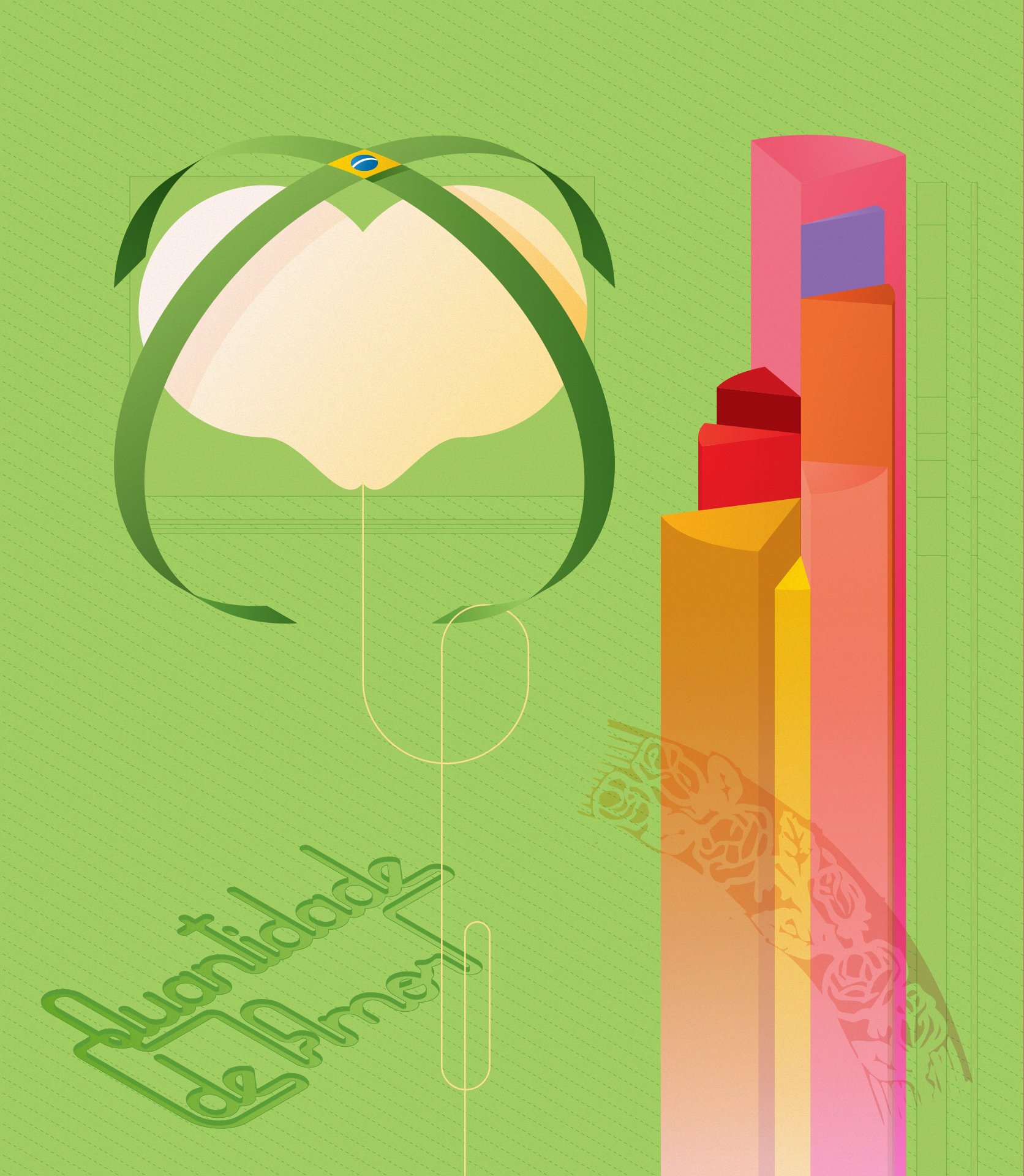
An illustration for Brasil-Inspired book
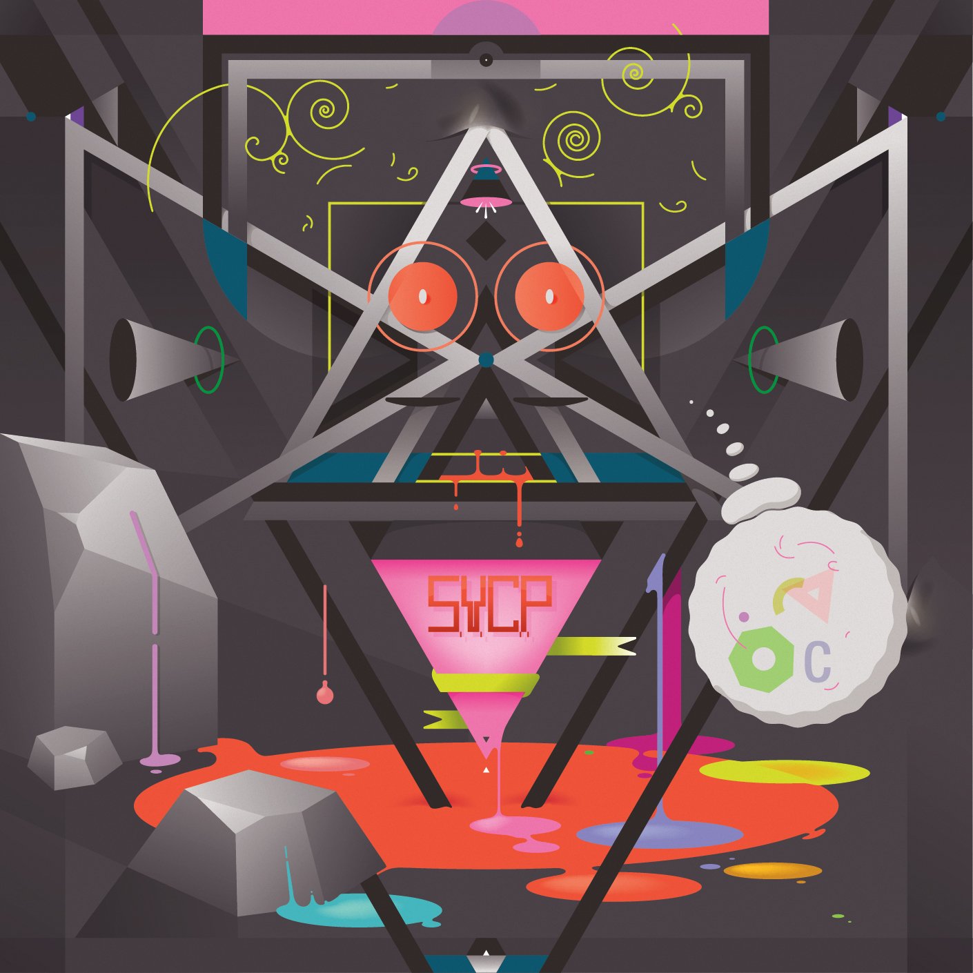
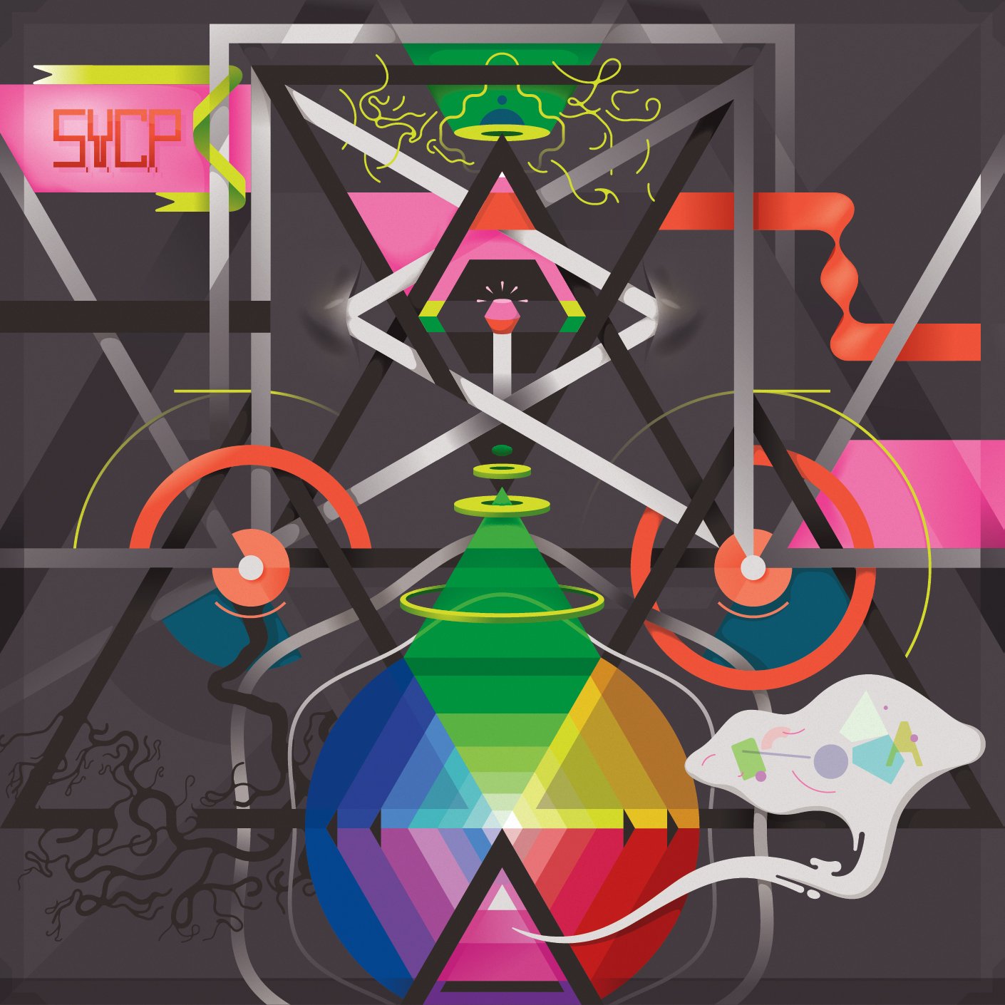
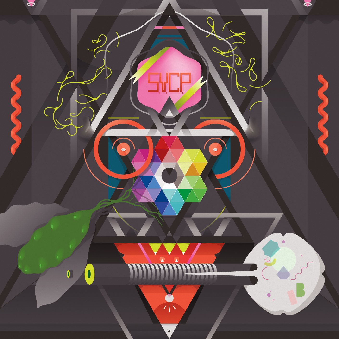
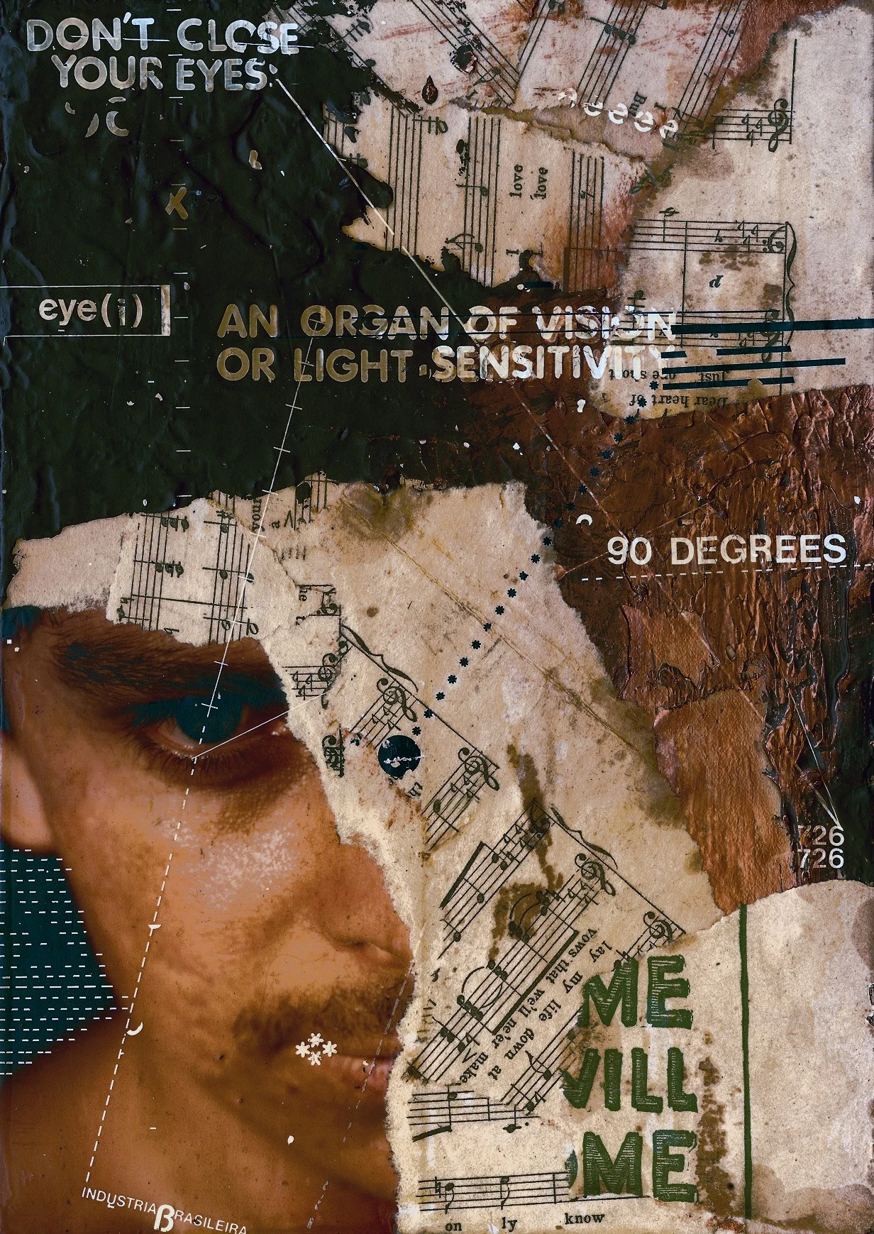
While the aesthetic of my illustration work has mostly included clean, smooth lines that come naturally to the process of drawing with vector lines, every so often I enjoyed exploring rougher, more textural look as well. Below are some of the things I experimented with.
Sensitive - Acrylic paint, ink, paper, photography and Letraset
Self-portrait - Ink on paper and acetate
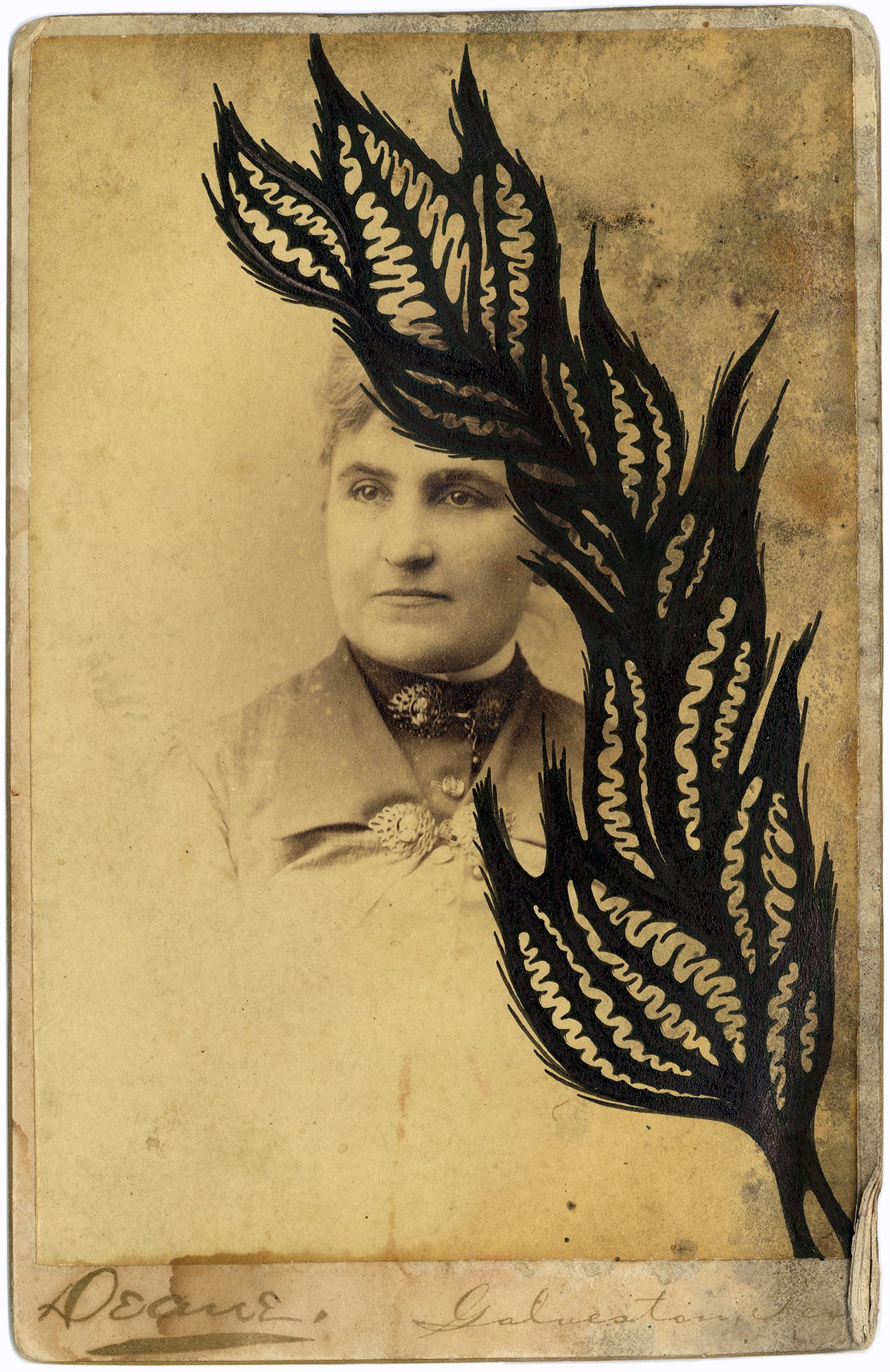
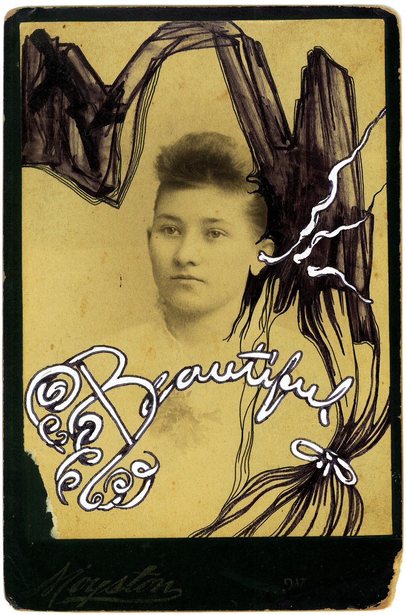
A series of typographic sketches and doodles over found vintage photographs.

