Motion Graphics Archive
Much of my career is marked by experiences I’ve accumulated creating for animation and live-action projects. The years I spent in these fields were integral helping me develop my own point of view, which I still apply to the work I do to this date in branding and user experience.
Since I transitioned to focus more on UX in 2013, the world of CGI and motion graphics has evolved dramatically, with tools like Cinema 4D and Houdini, as well as renderers like Octane and Redshift taking hold of the industry, and empowering independent artists and small teams to achieve results that were limited to much larger operations. It’s an exciting space to be part of.
So, while many of these projects are a little embarrassing when compared to today’s standards of animation and visual effects, I’m still proud of how they have helped shape me as a designer, creative director and influence the decisions I get to make in today’s projects.
The first video seen here is a reel I put together in late 2012. Further below is a compilation of some individual projects, which I designed, animated and/or directed, from 2000 to 2012. They are stacked in chronological order, starting with the most recent.
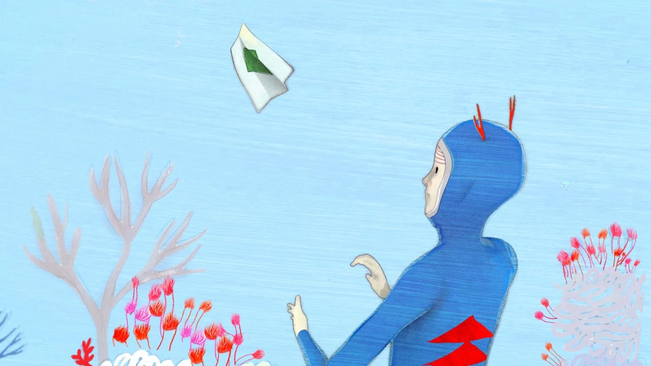
“Whalesong” for Modest Mouse
In 2009 I had the opportunity to direct a music video for Modest Mouse. The treatment included a variety of film and animation techniques, include high-speed video and stop motion, as well as lots of low-fi motion graphics. In the end, it turned out to be an incredible canvas for experimentation and learning.
FITC Title Sequence
I was invited by design conference FITC to create an animated title sequence featuring the names of all their 2013 event speakers.
My concept for this sequence was inspired by the way an entomologist carefully curates their collection, selecting a wide variety of specimens spanning across many distinct species. Similarly, the organizer for an event like FITC goes through such process.
After carefully choosing and collecting all my specimens, I had them professionally mounted and begun working on their environments. The small sets were inspired by Polyhedra origami and built to appear as if they had been made by the "collector" seen in the sequence. I also wanted them to symbolize different land masses as if different species lived in different continents / islands.
As the sequence progresses and he begins to remove each insect, a collection is unravelling, working as a metaphor for the curation of FITC.
The link below is a showcase of the 76 unique typographic designs I created for the opening title sequence of the FITC 2013 Toronto event. The graphic adornments around the speakers' names were inspired by the pins used by entomologists when setting the permanent position of the insects being mounted.
I handled the filming, editing, and animation and the music was created by Omega Code. The insects mounted by Don Ehlen & Phaedra Dunko
Artist Series for Target
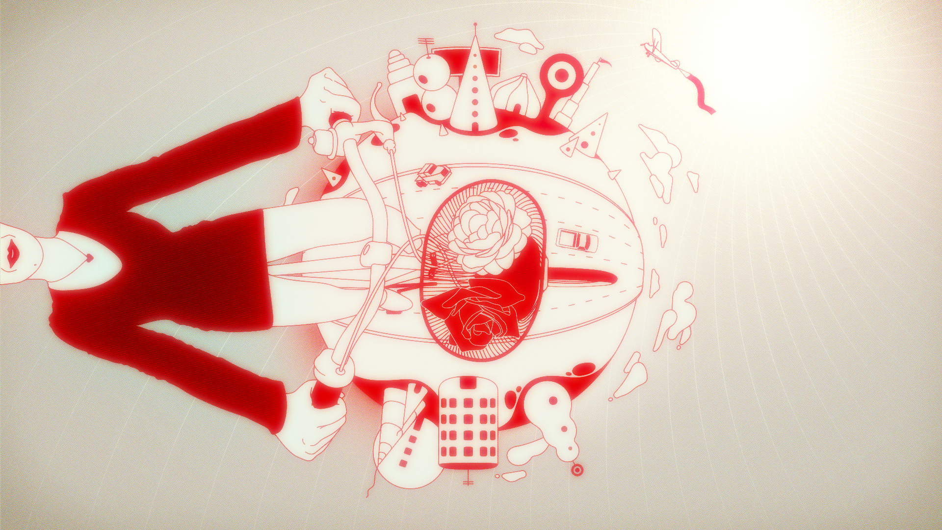
This was one of my first collaborations with animation studio Shilo, I created this short animation for Target as an artistic interpretation on the theme "Surprise & Delight in Red & White".
The spot is currently being showcased on an array of large screens at Californian event venue LA Live along with animations by different artists.
Kirby for Nintendo
Co-directed along with Richard Hickey and produced with an amazing team at Superfad, the spot features Nintendo's character Kirby in a newly developed game where everything is made out of yarn and fabric.
“The Right Blend” for Scott Naturals
Scott Naturals was a rare chance for me and the team at Bent to explore the commercial and artistic possibilities of Strata Cut animation technique with a series of stenciled out paper sheets, which were lined up in deep continuing space.
This Strata Stencil idea was first explored by animator Javen Ivey in his 2006 thesis project ‘My Paper Mind’ at Pratt, partly inspired by Bent’s partner David Daniels’ original plasticine technique.
I was brought into the project as a director to design and conceptualize with David using “Paper Mind’ as an influence, but not an ultimate destination. Together, we created a more complex and highly produced space. Executing it all in CG as opposed to by hand, was an absolute production necessity due to timing and content changes up to the very end of the short deadline.
We explored both negative and positive spaces in the stencil effect, and also introduced a very unique “Rolodex” effect that was made out of animated cut-out layers overlapping each other over a long camera shot. The clean factor of CG forced us to find ways to add irregularities to the paper, as well as and color and exposure shifts to bring back more of the ‘folk’ accessibility and ‘handmade charm’ to the audience.
Creating some of the silhouetted stenciled shapes in CG also allowed us to do some interesting slight perspective changes. It’s brief and underplayed but helps the subliminal flow and clarity of each scene.
We used a physical (practically shot) paper towel roll at the end from which pull out with the assistance of a motion-controlled camera. This assured the realism we were looking for in the end product tableau, while continuing the flow and drama of a continuous camera move coming out from the CG world.
In its essence the project was highly technical and demanded constant collaboration between our compositing and CG teams, but it allowed us enough creative space to experiment and innovate in many ways.
“Hyperwarm” for Nike
Chrome Spot for Google
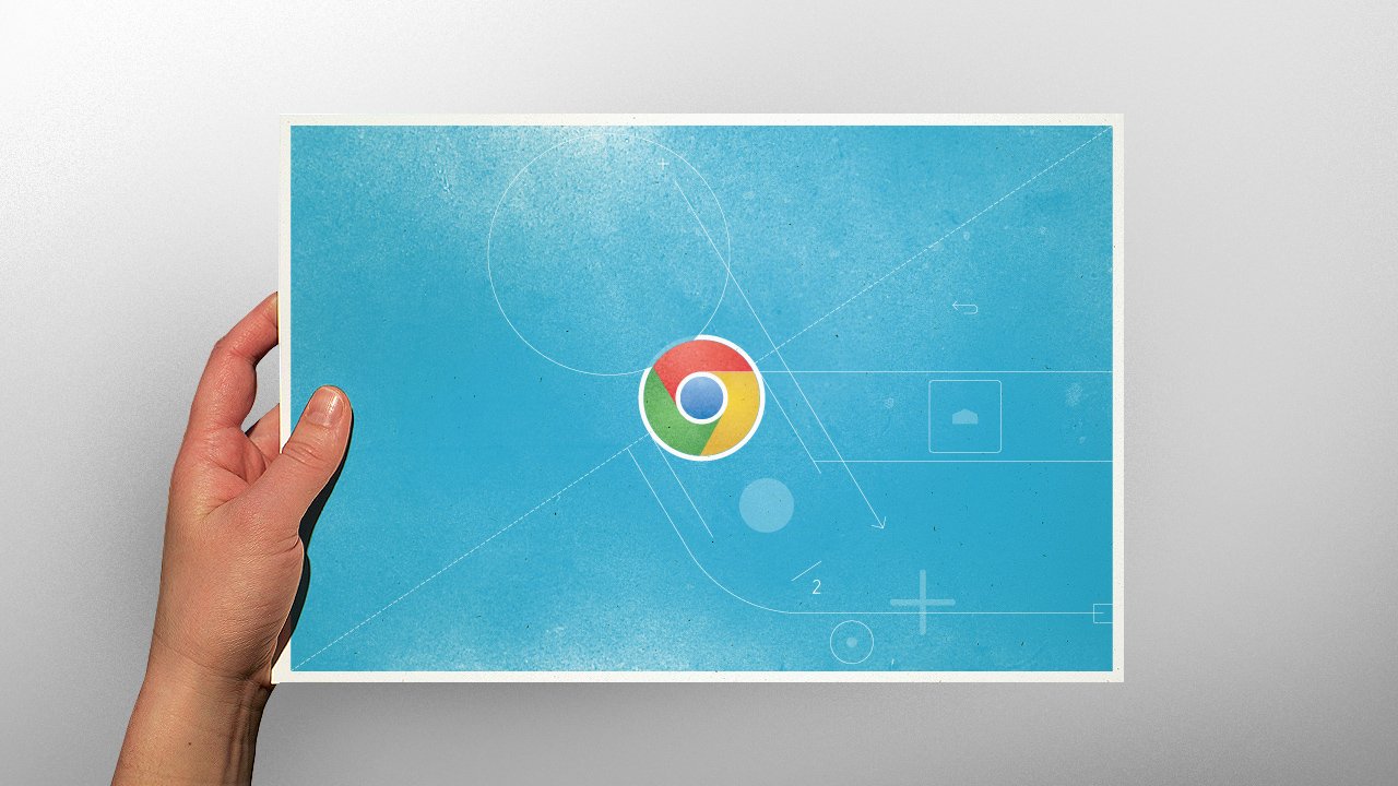
Created entirely in stop motion, this little spot for Google Chrome introduced me to a whole new animation technique.
Nike 6.0
This Nike Surf video was probably one of the shortest and yet most labor-intensive animations I’ve ever been involved with. The production process was so much fun! As shown above in this little behind the scenes video, we used electrical cables to create an animated wave in a stop-motion process.
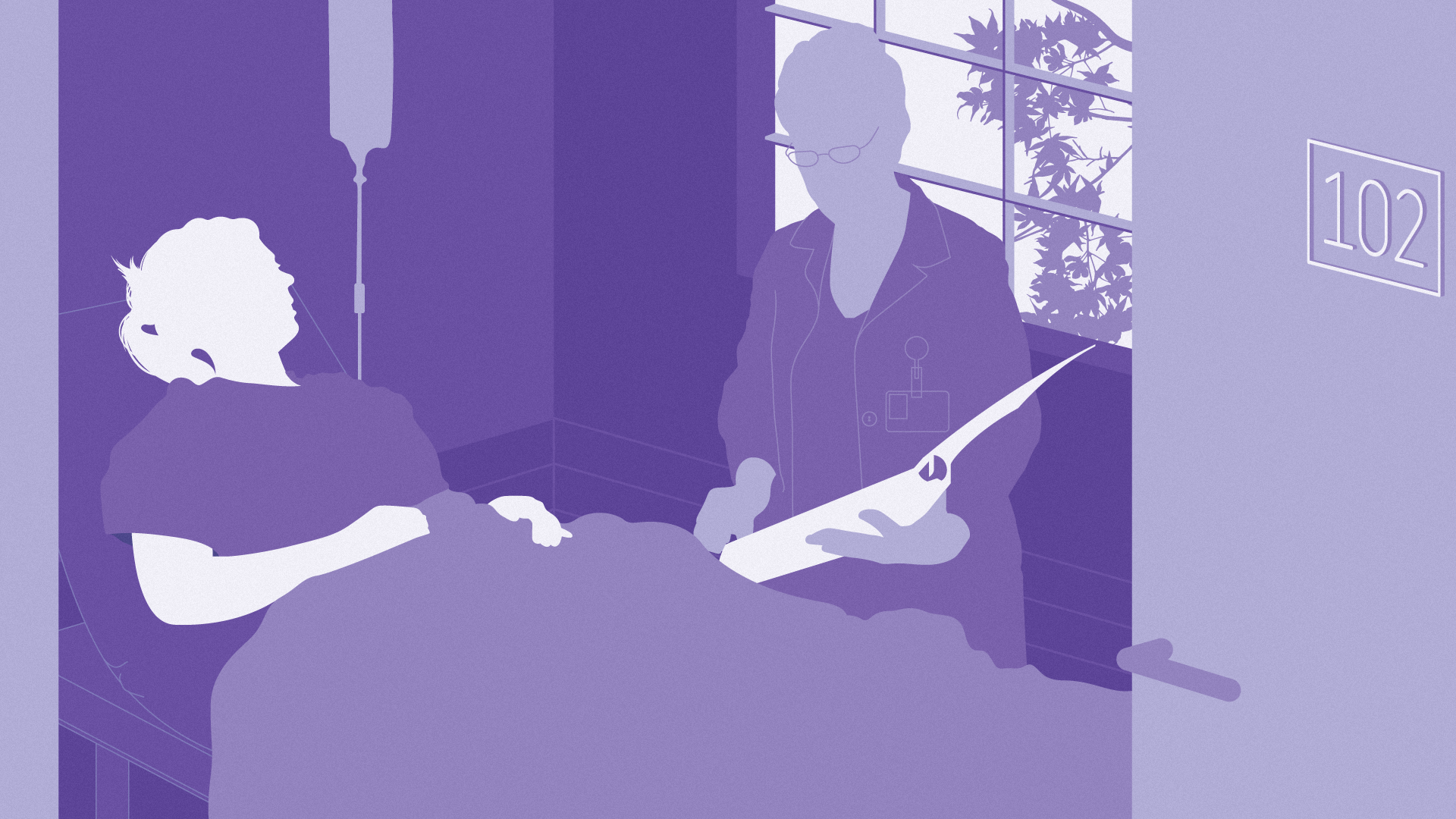
As in many other fields of design, working in the animation means coming up with ideas and visual treatments that often never get produced. These style frames for Premera made around 2006 aimed at a
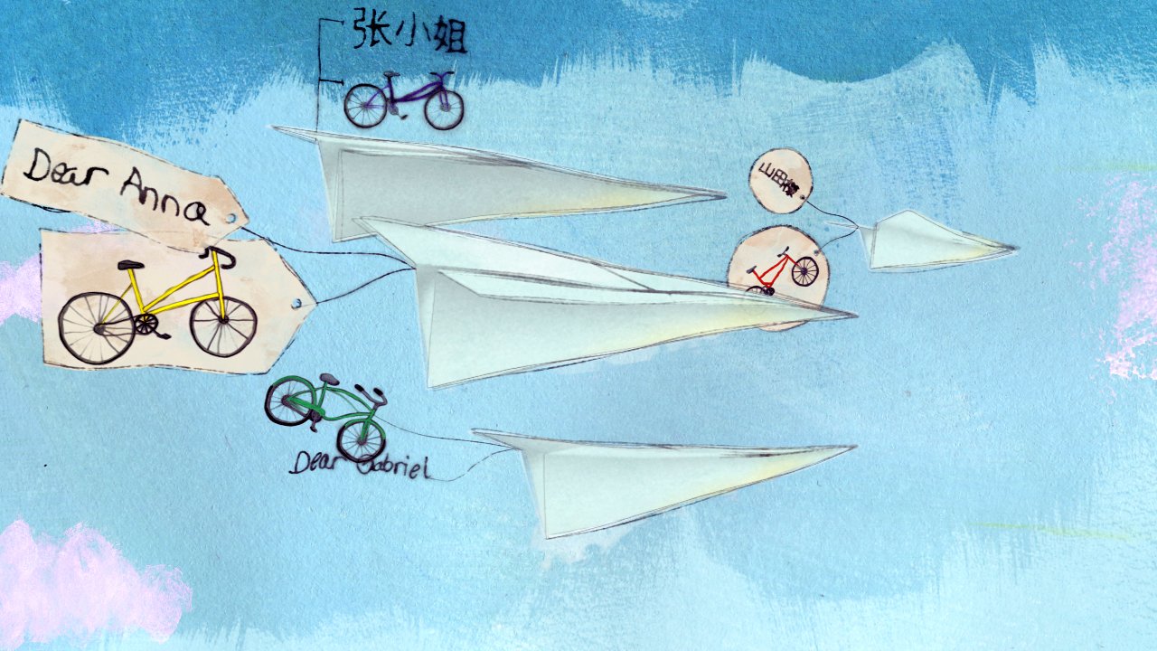
“Paper Airplane” for PGI
In 2008, my animation studio Nervo created this animation for the communications technology company, Premiere Global Services.
The story, illustrated by Portland artist Betsy Walton, follows a woman sending out her email and receiving feedback in a rather whimsical way.
FOX Japan
In 2008, I was invited by the FOX network to create the identity of one of their new channels to be launched in South America and Japan. Entitled "Fox Movies", the channel's content would feature Sci-fi and Horror content.
My approach was based on the concept "The Other Side", which refers to stereotypes in science fiction material such as speculations of another dimension, very much like the “upside down” in “Stranger Things”).
Concrete blocks populating the various scenes of grassy fields behave as symbols for traversing the so called "Other Side" and were loosely inspired by artist Donald Judd.
During the production of these animations, I had the pleasure of collaborating with processing artist Robert Hodgin to create a complex flock of birds entangled in strings. Robert used a single bird cycle that we've created to create an application that allowed us to control and generate animations of the flock in an intricate flight dance. After some compositing and styling these animations became a key component of the channel's horror segment.
The music and sound design were created by Plastiq Phantom. By playing, sampling and processing eerie sounds created from a violimba and various kalimbas, then further sending the signals through an array of analog gear such as reel to reel players, Moog synthesizers and pedals, Darrin created more than 20 different original tracks for the channel's identity.
Below are some of the original style frames we designed for the project.
“Assembly” for Fuel TV
This network ID was created for North American Cable channel FuelTV. For this piece, I was charged with creating an animation spotlighting FMX, one of the Network's most featured sports.
The animation showcases a stylized CG miniature model of a motorcycle. After being loaded with fuel the bike expands up to a standard sized bike and is eventually ridden by the one who's assembled it.
Music by Darrin Wiener of Plastiq Phantom.
“Liquid Gold” for Budweiser
Directed in collaboration with Linn Olofsdotter and produced by Lobo animation studio, this TV spot was the debut for Budweiser Select.
CNX
Animation for TV channel CNX created at my old design studio Nakd, in Rio de Janeiro.
Illustrations by Eduardo Recife from MisprintedType and music by Darrin Wiener of Plastiq Phantom.
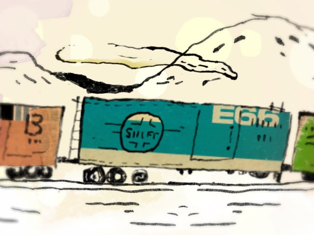
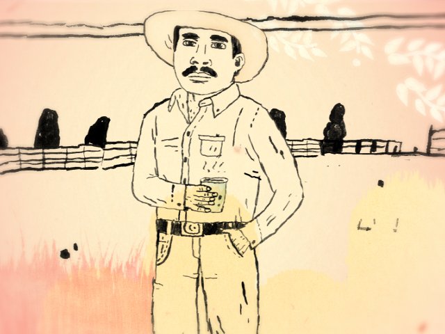
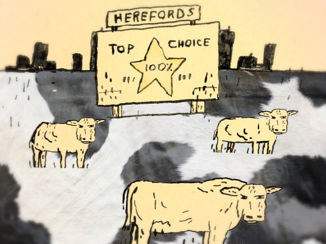
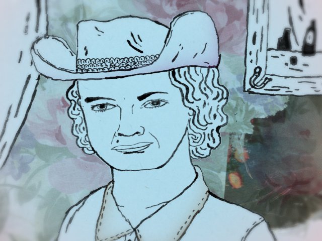
CMT
A short animated promo for the Country Music Television channel, which I directed in 2003 while at Nakd.tv, my studio in Rio de Janeiro.
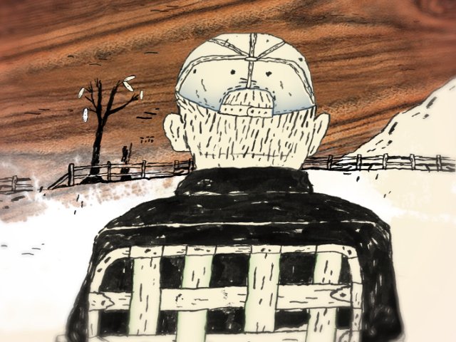


Defective
This 60" animated short film was created by using solely still and moving footage from Getty Image's vast database. It was inspired by personal absurdly surreal dream sequences.
K10K & Squarepusher
Created for the late design blog K10K.net, this piece on the left was in fact the first animation I’ve ever created. I used Macromedia Flash as a tool to fuse some photography, video and animation bits. Music crafted by Carlos Bela.
Then, in an effort to learn more about animation, I created this piece on the right for a competition for Warp Records in the year 2000. Faturing the song “My Red Hot Car” by Squarepusher.
The whole animation was designed in Adobe Illustrator and later sliced and animated frame by frame in Flash. It was the last Flash animation I worked on, since at the time I was already transitioning into After Effects and other broadcast software packages. This is still one of my favorite pieces as it help me discover animation in many ways.

